Create a style and logo - with care - for bikes
Contest details:
Silver
- Contest holder: Annie
- Category: Logo & stationery
- Total budget: € 349.00
- Start date : 21-05-2013 22:42
- Ending date : 31-05-2013 22:26
- Status : Ended
- Required formats: jpg,psd,ai
- Relevant files: None
-
Available languages:


- Number of designs: 111
-
Response rate:
low high
Needs:
Services may be extended in the future to selling (customised) bikes and fixies.
Logo will in first place be used for business card, flyer and FB page. Later for website and company vehicle or stickers on bikes.
Company description:
BiciCare:
- Bici stands for Bicycle and comes from Italian (the bike repair man is Italian)
- Care stands for attention and care for the bike (a unique selling point)
Description:
Does your bike need a bit of Care? BiciCare maintains and repairs your bike with attention; as if it was our own bike. And we are happy to come your way, so you save yourself some time and trouble. Your bike is our Care: BiciCare!
Services:
Now: reparations, healthcheck, Care maintenance, mounting online ordered bikes, accessory fixing, service contracts for company or hotel bikes.
Last but not least, the entrepeneur was a professional chef for 15 years. He is making a careerswitch. We may take this theme on board with e.g. pictures to show tools of both professions. Connection is precision, perfection, passion.
Target group:
People in Amsterdam, living or working who own a bike and want to take care of it. They like the convenience of a repair service on location. All ages, but mostly 25-50, online and on social media.
Colors, favourites and other requirements
We are thinking of 2 typefaces for the word BiciCare.
Bici: professional, precise, stands for the bike and the tools
Care: Warm and soft, for the caring and attention
Logo must be self explanatory and better than current similar services.
Most competitors use a bike or a wheel and a lot of orange colour is used. So please NO orange.
It can be a bit playful, but needs to be stylish too.
Possible direction we were thinking for later on the web or banners: white bike on white background, sterile and clean with warm logo (not red as too much red cross alike). Other ideas welcome.
arago24
-
-
No comments
-
This contest is finished. Its not possible to reply anymore.
-
-
-
No comments
-
This contest is finished. Its not possible to reply anymore.
-
-
-
No comments
-
This contest is finished. Its not possible to reply anymore.
-
-
-
No comments
-
This contest is finished. Its not possible to reply anymore.
-
-
-
No comments
-
This contest is finished. Its not possible to reply anymore.
-
-
-
Description by designer arago24:
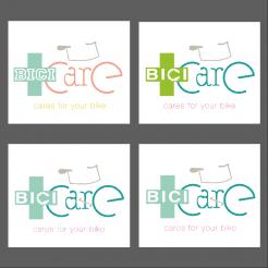
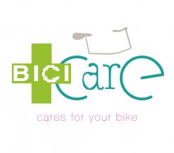
Hello! I'm back with some new proposals, simplified regarding my first design. I made some test to integrate a chainring in the bici police. I also tried to different fonts for the bici technical part. Some tests are with and others without the pedalboard. I also tried different colors assembly. Please feel comfortable in telling me what you like and what you don(t like. Sincerely,
Arago24 -
This contest is finished. Its not possible to reply anymore.
-
-
-
Description by designer arago24:
Hi
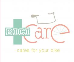
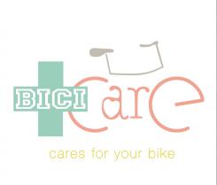
Here is my proposal for your logo, based on your brief. My logo integrates a stylistic bike in the name bici care, with a touch of humour (pedalboard on the r of care). The font used for BICI is regular and straight (technical part of your activity) while the font used for care is round, manual to emphasize the care you take and the handmade, customised side of your service. Please let me know how you feel with my proposal, which of course I can modify to feet your expectation (I'm sorry for my english which is not very good!...).With Regards,
Arago24 -
Annie says :
Thanks for your design. Your English is great, dont worry! The logo has nice details, but overall it's also too many things happening which makes the whole too messy in my opinion. The red cross is especially disturbing, it asks too much attention.
-
arago24 says
Thanks for your return. You're right, it's too complicated. I'm going to rework and simplify.Good night!
-
This contest is finished. Its not possible to reply anymore.
-

