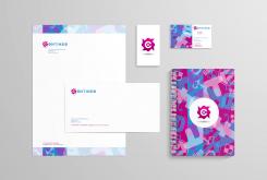
CREATIVE LOGO + STATIONERY FOR NEW SOCIAL MEDIA COMPANY!
Contest details:
Silver
- Contest holder: Contineo
- Category: Logo & stationery
- Total budget: € 349.00
- Start date : 10-08-2013 18:55
- Ending date : 26-08-2013 18:46
- Status : Ended
- Required formats: jpg,psd,ai,pdf
- Relevant files: None
-
Available languages:


- Number of designs: 115
-
Response rate:
low high
Needs:
We should be pleased when the company name is also involved into the logo.
Furthermore we prefer a logo which has a meaning like Social Media and/or Contineo (=connecting in Latin).
Company description:
The appearance from Contineo should be:
- Creative
- Innovative
- Fresh
- Sleek
- Reliable
- Could be Playful
Target group:
The target group from Contineo are other companies for which Social Media activities are interesting. This target group can further be specified as small and medium companies.
Colors, favourites and other requirements
- It should be nice when some colors from existing Social Media are processed into the design.
- Logo should have a meaning like Contineo (connecting, Latin) or/and Social Media.
- Name Contineo should be involved in logo.
- It should be nice when the logo or related item fits in a rectangle (for FB etc.)
Some nice logo's for inspiration:
- https://99designs.nl/logo-design/store/48550 (Very nice, only the colors are less nice)
- https://99designs.nl/logo-design/store/21678 (little to ordinary)
- https://99designs.nl/logo-design/store/32474 (probabily a little to playful)
DutchDesigners
-
-
Description by designer DutchDesigners:
I see you already awarded someone with 5 stars, so this is probably made for nothing.
-
Contineo says :
ENG:
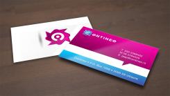
Thank you very much! This is not made for nothing. We think the design is very good, it is looking beautiful. There are a little small things which can be changed, but we will contact you when we made our final choice in about 1/1,5 week. When you have got any ideas in the meantime we are looking forward to them (probably a unique idea for the business card, it would be nice when the business card is very creative?)..
NL:
Dit visitekaartje vinden we erg mooi. Er zijn wellicht enkele kleine dingetjes welke verandert kunnen worden maar het behoord absoluut tot de kanshebbers. Deze kiezen we over 1/1,5 week wanneer we u verder zullen contacteren. Misschien heeft u in de tussentijd wel nog een heel uniek idee voor visitekaartje, want deze mag iets unieker. -
DutchDesigners says
Okay, thanks guys (and gals). Maybe if I have the time next week. Mind you, it's only 200 euros...
-
Contineo says :
ENG: You're welcome. Just see if something comes up! It's still a contest and the only things we do is giving feedback to the designers so everyone can make their designs as good as possible. It is the responsibility of the designer to decide the amount of time they put in.
Do you know how it goes when the contest is over? Do we get contact information to send the documents, is it still possible to ask the designer to change something?
NL: Geen dank. Kijk maar of er een goed idee bij je op komt( wat als je ene kaartje vouwt of tegen elkaar legt bijv). Het enige wat wij doen is feedback geven richting de designers zodat zij hun input kunnen perfectioneren om zo meer kans te maken om de wedstrijd te winnen. Het is de keuze van de designer hoeveel tijd deze erin wil steken natuurlijk.
Weet jij hoe het gaat als de wedstrijd voorbij is? Krijgen we dan de contact gegevens van de designer en is het dan nog mogelijk om kleine aanpassingen te vragen aan de designer? -
DutchDesigners says
I don't know Contineo, I haven't won a contest yet. But I think, hope, that after the contest it's up to the client and the designer. I can't think of a reason why modifications wouldn't be possible. I always make it my priority to accommodate my clients, unless, of course, the demands become unreasonable. But I have never had issues with that (apart from clients not paying at all).
-
This contest is finished. Its not possible to reply anymore.
-
-
-
Description by designer DutchDesigners:
Another backside for the business card. I choose to keep the front the same, simply because it's a strong statement.
I have in mind a paper type that is textureless and ultra white, preferably with a matte varnish, to deepen the colors (and of course to protect against dirt).
Even better would be to have the card cut with rounded corners,example: http://www.hybridlava.com/wp-content/uploads/10-Clean-Business-Card.jpg But that is more a question of budget. -
Contineo says :
ENG: It looks like a really nice design, however we liked the other one more, also because of the commonalities with the rest of the stationary design! We assume the tips about the paper type are also applicable on the previous design?
Thanks for your submission!
NL: Het design ziet er erg mooi uit! Toch vinden we het vorige design mooier omdat het ook beter aansluit bij de huisstijl die je gebruikte.
Bedankt voor je inzending! -
DutchDesigners says
ENG: Thank you for your feedback. You must see my proposals as follows. I present to you some ideas I have That means that after the contest you tell me what you like and don't like in all designs, and after that I will try to incorporate all your remarks and ideas into a final proposal for all elements. That's how I imagine it. So what I am posting here might look ad hoc, but the final design will have a uniform look.
Thanks again.
PS Do you want this in Dutch as well? -
Contineo says :
Sounds like a proper plan!
No we don't need everything in Dutch, but we want to give the feedback in Dutch as well for some designers which don't fully understand the englisch comments we are giving. -
This contest is finished. Its not possible to reply anymore.
-
-
-
Description by designer DutchDesigners:
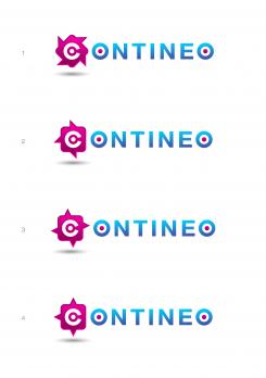
Beste Contineo, hier wat variaties op het social media symbool. 1. is de oorspronkelijke. Op deze manier aan alle zijden een puntje, zoals bij 3., is mijns inziens niet goed, omdat er visueel te veel afstand ontstaat tussen de C en de andere de letters. Mvg. Anneke Auer
-
Contineo says :
NL:
Beste Anneke, Hartelijk dank voor de inzending. We vinden het nog steeds een mooi logo, echter de huidige logo's zijn niet echt een verbetering op het origineel. We missen de link nog een beetje met Social Media, wellicht is het een goed idee om deze in de huisstijl terug te laten komen. Logo an sich is niets mis mee.
ENG:
Thank you again for the submission. We still think the logo is nice, however these logo's are not really an improvement over the first logo. We still miss the link with Social Media, maybe it is a good idea to represent this in the corporate design. The logo however looks nice. -
This contest is finished. Its not possible to reply anymore.
-
-
-
Contineo says :
NL: Bedankt voor je designs! We vinden het een leuk logo. Het roze bevalt ons erg goed. We zien alleen de link tussen onze naam en/of social media niet echt terug komen.
ENG: Thank you for the designs! We like the logo, especially the pink accents. We only miss somekind of link with our name or social media.
Keep up the good work! -
DutchDesigners says
Dank voor de waardering! Ik heb het symbooltje gemaakt van 4 gedraaide vierkante social media tekstballonnen (zoals deze: http://png.findicons.com/files/icons/2137/twitter/128/twitter_11.png ) op elkaar. Maar misschien is dat niet meer duidelijk. Ik zal me er over buigen.
Het symbooltje doet ook denken aan een 'continue' draaiend windmolentje, en dat vormt de link met de naam. -
This contest is finished. Its not possible to reply anymore.
-
-
-
Contineo says :
NL: We vinden dit ook leuk, maar de andere vinden we mooier. Voornamelijk omdat er al een "C" in het logo zit en daarna de bedrijfsnaam ook weer met een "C" begint.
ENG: We also liked this one, however the other one was better. Mainly because the logo contains a "C" and underneath it the name also starts with a "C".
Thanks! -
This contest is finished. Its not possible to reply anymore.
-

