Design a Logo for a Burger Take-away and Menu
Contest details:
- Contest holder: SandoriBV
- Category: Logo & stationery
- Total budget: € 250.00
- Start date : 02-02-2015 09:42
- Ending date : 09-02-2015 09:40
- Status : Ended
- Required formats: jpg,psd,ai,pdf
- Relevant files: None
-
Available languages:


- Number of designs: 66
-
Response rate:
low high
Needs:
IMPORTANT:
-no clipart logos that one can just easily find via google;
-we are looking for something memorable
-simple does not mean simplistic
-the symbol of Hambrugeria does not necessarily have to be a clipart burger (an Apple logo of the computer is not an apple company!)
-we look for a creative and innovative design
Company description:
We are opening our first hamburger take-away place called Hamburgeria (in a series of several over the next 2 years). The concept of our place focuses on offering customers a proper hand-made burger, not the typical fast-food burger with processed meat. All our burger ingredients are fresh with no added colors, preservatives, no GMO, no MSG; as well as a variety of different fresh buns. Besides offering customers a healthy choice, we are also an environmentally-friendly business.
Target group:
the usual customers of a healthy take-away
Colors, favourites and other requirements
-no animal inspired logos;
-SIMPLE, FRESH, INSPIRED, TASTY - are some keywords to start with;
-if you wish you can think of a symbol that would represent our business;
- we have a preference for black color, we find that it always goes good with other colors: yellow, green, red or orange
- the source of inspiration for our burger recipes were our travels to different parts of the world, hence each burger comes from a different country!
- the menu offers a selection of beef, chicken, lamb, vegetarian and 50/50 burgers
- besides the burgers the menu will contain: snacks&sides, drinks, desserts
- we will have a two-sided menu (same menu in 2 languages)
V.
-
-
SandoriBV says :
Here, we really enjoyed the logos in the second row.
-they look a bit like for a hotel
-maybe to place the name in a straight line? not a wave?
-the H is great, but maybe to transform it into less hotel-like? -
This contest is finished. Its not possible to reply anymore.
-
-
-
No comments
-
This contest is finished. Its not possible to reply anymore.
-
-
-
SandoriBV says :
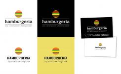
we find this a better option and we like the last 3 entries that you have submitted.
Here we particularly liked how our name was displayed. However, the burger symbol above, which is portrayed originally, resembles a bit the travel destination commercials. Any ideas how to twist it around? -
This contest is finished. Its not possible to reply anymore.
-
-
-
No comments
-
This contest is finished. Its not possible to reply anymore.
-
-
-
SandoriBV says :
can you transform this logo in vintage? or vector?
-
V. says
Thank you for your feedback. I will make this design more vintage.
with kind regards,
Viola vd Akker -
This contest is finished. Its not possible to reply anymore.
-
-
-
SandoriBV says :
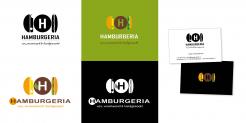
Dear V.,here's our feedback:
1. we like the use of H but we don't like how the patty looks like
2. the logo on green looks best in terms of color combinations
any other variations for this? -
This contest is finished. Its not possible to reply anymore.
-

