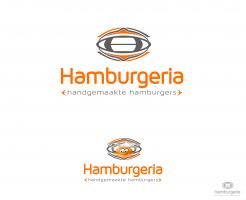
Design a Logo for a Burger Take-away and Menu
Contest details:
- Contest holder: SandoriBV
- Category: Logo & stationery
- Total budget: € 250.00
- Start date : 02-02-2015 09:42
- Ending date : 09-02-2015 09:40
- Status : Ended
- Required formats: jpg,psd,ai,pdf
- Relevant files: None
-
Available languages:


- Number of designs: 66
-
Response rate:
low high
Needs:
IMPORTANT:
-no clipart logos that one can just easily find via google;
-we are looking for something memorable
-simple does not mean simplistic
-the symbol of Hambrugeria does not necessarily have to be a clipart burger (an Apple logo of the computer is not an apple company!)
-we look for a creative and innovative design
Company description:
We are opening our first hamburger take-away place called Hamburgeria (in a series of several over the next 2 years). The concept of our place focuses on offering customers a proper hand-made burger, not the typical fast-food burger with processed meat. All our burger ingredients are fresh with no added colors, preservatives, no GMO, no MSG; as well as a variety of different fresh buns. Besides offering customers a healthy choice, we are also an environmentally-friendly business.
Target group:
the usual customers of a healthy take-away
Colors, favourites and other requirements
-no animal inspired logos;
-SIMPLE, FRESH, INSPIRED, TASTY - are some keywords to start with;
-if you wish you can think of a symbol that would represent our business;
- we have a preference for black color, we find that it always goes good with other colors: yellow, green, red or orange
- the source of inspiration for our burger recipes were our travels to different parts of the world, hence each burger comes from a different country!
- the menu offers a selection of beef, chicken, lamb, vegetarian and 50/50 burgers
- besides the burgers the menu will contain: snacks&sides, drinks, desserts
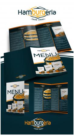
- we will have a two-sided menu (same menu in 2 languages)
BureauKomma
-
-
No comments
-
This contest is finished. Its not possible to reply anymore.
-
-
-
No comments
-
This contest is finished. Its not possible to reply anymore.
-
-
-
Description by designer BureauKomma:
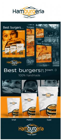
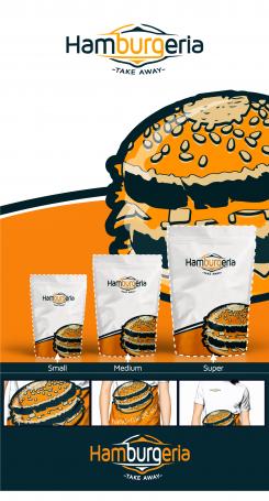
Zoals u ziet het logo verder uitgewerkt en opzettelijk niet voor een burger logo gekozen.
-
This contest is finished. Its not possible to reply anymore.
-
-
-
SandoriBV says :
thank you.
-the new H symbol does not look appealing to us, maybe a totally different one?
-the logo with no background color looks better -
SandoriBV says :
Dear designer, we have updated the brief, it might help steer your design into our direction
-
This contest is finished. Its not possible to reply anymore.
-
-
-
Description by designer BureauKomma:
Goedeavond,
Bij deze mijn voorstel voor uw logo, feedback is van harte welkom, ik ben erg benieuwd wat u er van vind.
Het logo is opgemaakt in adobe illustrator, en is vector based (te vergroten zo groot u wil zonder kwaliteitsverlies) verder aan te leveren in elk bestandsformaat.
Mocht dit logo u bevallen kan ik eventueel een vrijblijvend huisstijl voorstel voor u doen.
m.v.g. koos, Art-Director - BureauKomma -
SandoriBV says :
Dear Koos, what a positive and sunny logo! Here is our feedback:
1. we like the color and the letter-type (of the above logo), could we see it in black as well?
2. we find the sketch of the happy burger in the logo below pleasantly lovely; however, some reactions in our management team were that it may be interpreted as childish. Could you re-define it or offer another option maybe?
3. the sketch in the above logo resembles too much an eye or a rugby ball
4. please omit the sub-heading -
This contest is finished. Its not possible to reply anymore.
-

