Design a Logo for a Burger Take-away and Menu
Contest details:
- Contest holder: SandoriBV
- Category: Logo & stationery
- Total budget: € 250.00
- Start date : 02-02-2015 09:42
- Ending date : 09-02-2015 09:40
- Status : Ended
- Required formats: jpg,psd,ai,pdf
- Relevant files: None
-
Available languages:


- Number of designs: 66
-
Response rate:
low high
Needs:
IMPORTANT:
-no clipart logos that one can just easily find via google;
-we are looking for something memorable
-simple does not mean simplistic
-the symbol of Hambrugeria does not necessarily have to be a clipart burger (an Apple logo of the computer is not an apple company!)
-we look for a creative and innovative design
Company description:
We are opening our first hamburger take-away place called Hamburgeria (in a series of several over the next 2 years). The concept of our place focuses on offering customers a proper hand-made burger, not the typical fast-food burger with processed meat. All our burger ingredients are fresh with no added colors, preservatives, no GMO, no MSG; as well as a variety of different fresh buns. Besides offering customers a healthy choice, we are also an environmentally-friendly business.
Target group:
the usual customers of a healthy take-away
Colors, favourites and other requirements
-no animal inspired logos;
-SIMPLE, FRESH, INSPIRED, TASTY - are some keywords to start with;
-if you wish you can think of a symbol that would represent our business;
- we have a preference for black color, we find that it always goes good with other colors: yellow, green, red or orange
- the source of inspiration for our burger recipes were our travels to different parts of the world, hence each burger comes from a different country!
- the menu offers a selection of beef, chicken, lamb, vegetarian and 50/50 burgers
- besides the burgers the menu will contain: snacks&sides, drinks, desserts
- we will have a two-sided menu (same menu in 2 languages)
MikesDesign
-
-
MikesDesign says
Beste Sandori,
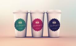
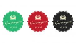
Dit is mijn logo ontwerp.
Ik heb een vintage logo gemaakt, omdat dit volgens mij goed past in uw concept van gezondheid en milieuvriendelijk produceren.
Ik heb 3 varianten gemaakt in verschillende kleuren. Deze kleuren kunt u toepassen op verschillende productsoorten of het soort vlees waar de burger van gemaakt is.
Ik ben benieuwd naar uw feedback.
Met vriendelijke groet,
MikesDesign -
SandoriBV says :
Dear Mike,
We really like the vintage approach. So far we see this as stickers on our packages. How does a logo on our door look like then?
Is it possible to change the letter-type to one that is not Italic?
And a different burger? -
This contest is finished. Its not possible to reply anymore.
-
-
-
No comments
-
This contest is finished. Its not possible to reply anymore.
-


