Design a Logo for a Burger Take-away and Menu
Contest details:
- Contest holder: SandoriBV
- Category: Logo & stationery
- Total budget: € 250.00
- Start date : 02-02-2015 09:42
- Ending date : 09-02-2015 09:40
- Status : Ended
- Required formats: jpg,psd,ai,pdf
- Relevant files: None
-
Available languages:


- Number of designs: 66
-
Response rate:
low high
Needs:
IMPORTANT:
-no clipart logos that one can just easily find via google;
-we are looking for something memorable
-simple does not mean simplistic
-the symbol of Hambrugeria does not necessarily have to be a clipart burger (an Apple logo of the computer is not an apple company!)
-we look for a creative and innovative design
Company description:
We are opening our first hamburger take-away place called Hamburgeria (in a series of several over the next 2 years). The concept of our place focuses on offering customers a proper hand-made burger, not the typical fast-food burger with processed meat. All our burger ingredients are fresh with no added colors, preservatives, no GMO, no MSG; as well as a variety of different fresh buns. Besides offering customers a healthy choice, we are also an environmentally-friendly business.
Target group:
the usual customers of a healthy take-away
Colors, favourites and other requirements
-no animal inspired logos;
-SIMPLE, FRESH, INSPIRED, TASTY - are some keywords to start with;
-if you wish you can think of a symbol that would represent our business;
- we have a preference for black color, we find that it always goes good with other colors: yellow, green, red or orange
- the source of inspiration for our burger recipes were our travels to different parts of the world, hence each burger comes from a different country!
- the menu offers a selection of beef, chicken, lamb, vegetarian and 50/50 burgers
- besides the burgers the menu will contain: snacks&sides, drinks, desserts
- we will have a two-sided menu (same menu in 2 languages)
ThomasCival
-
-
Description by designer ThomasCival:
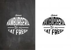
Here you go. The updated logo. I made the Eat fresh pay off a bit smaller. I strongly advice to not make it more small. I'll hope its good for you! Thanks
-
This contest is finished. Its not possible to reply anymore.
-
-
-
No comments
-
This contest is finished. Its not possible to reply anymore.
-
-
-
SandoriBV says :
we really liked this one out of all entries submitted.
May we ask you:
- take out the steam symbol from the logo?
- can you use Hamburgeria instead of Burgeria?
- we can suggest to make eat fresh smaller in size than Hamburgeria -
ThomasCival says
I will make the asked corrections to the logo. I'm away till tomorrownight. I can do this tommorrownight. Thanks for the compliments!
-
SandoriBV says :
as a second option we thought:
-instead of take-away, insert: est. 2015 -
ThomasCival says
Hi Sandori, i was really sure that the award was 250 euro's when i looked yesterday. Why did you increase the award? I will make the changes in this logo when i'll get 250. 150 is not enough for the amount of work.
-
SandoriBV says :
Dear Thomas, we have not done any changes to the price as this is impossible as far as we know. For us it shows 250. It may be a glitch from brandsupply? Maybe you should ask them directly?
-
ThomasCival says
Allright. I believe you. Is it good when i send you the updated design without steam, using the name hamburgeria and with est. 2015 instead of take away, tommorow afternoon. I have some software problems at my home computer. My laptop is on my work, so i can make the changes tommorow.
-
SandoriBV says :
Dear Thomas, this is a contest, so you decide what is best for you and how you want to participate.
-
This contest is finished. Its not possible to reply anymore.
-
-
-
No comments
-
This contest is finished. Its not possible to reply anymore.
-
-
-
No comments
-
This contest is finished. Its not possible to reply anymore.
-


