Design a new logo and corporate identity for D-VELOPMENT | buildings, area's, regions
Contest details:
Silver
- Contest holder: D-VELOPMENT
- Category: Logo & stationery
- Total budget: € 419.00
- Start date : 22-07-2014 10:38
- Ending date : 07-08-2014 10:36
- Status : Ended
- Required formats: jpg,eps,ms word
- Relevant files: None
-
Available languages:


- Number of designs: 170
-
Response rate:
low high
Needs:
It should be nice if you could do something with the D and V, which are my initials. Maybe it is possible to use D-V as a separate logo in adds to the full logo.
D-VELOPMENT relates to buildings, area's and regions. It would be a pré if these three 'levels' are part of the logo as a subtitle.
Businesscards and template design:
The design of the businesscards and templates should be lean and mean as well. Necessary text (like adress, bankaccountnumber, number of the Camber of Commerce, etc) should be on it. The design supports the text.
Do not use logo's or text in the sideline, because I would like to use the full paper width.
Deliverables:
- Digital logo design
- Businesscard design
- MS Word templates for (1) letter/offer, (2) memorandum and (3) report
- Design for an E-mail sign
Reward for winning design is guaranteed.
Company description:
D-VELOPMENT offers real-estate consultancy services for the (re-)development of buildings, area's and regions. Real estate owners (firms/corporations and investors), area development firms, governments (local, regional and national), regional development companies and other consultancy firms are main clients.
Services D-VELOPMENT delivers are: project- and processmanagement, contractmanagement, property management, businesscases, tendermangement, businessdevelopment and permits- and licences management.
About me:
I'm a young and ambicious 26 years old person. I love the build environment and i'm broadly educated (bachelor of build environment and master of real-estate). In addition i'm a creative thinker with communicational skills using an integral approach.
Target group:
Main clients are: real estate owners (firms/corporations and investors), area development firms, governments (local, regional and national), regional development companies and other consultancy firms.
Colors, favourites and other requirements
Colors I like: light green, light blue/turqouise, grey, antracene and white.
I also like logo's with a range of collors, like the DSM logo.
AndreasL
-
-
D-VELOPMENT says :
Hi Andreas,
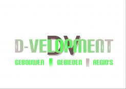
Thanks for the fourth version, although I don't like it. It's kind of kitch and looks like it's developed by using paint for 10 minutes. I'm sorry to say that...
Greets Dave -
This contest is finished. Its not possible to reply anymore.
-
-
-
D-VELOPMENT says :
Hello Andreas,
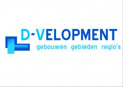
Thanks for the third version. Your designs remain superficial. What do the differnt block combinations mean?
Can you make some 3D models and do something with the DV or another way, like Tjeerd already send me?
Good luck, greets Dave -
This contest is finished. Its not possible to reply anymore.
-
-
-
D-VELOPMENT says :
Hello Andreas,
Thanks for the second version. It's better then the first one, but still too sketchy in my opinion. For some inspiration you might look at the creations the other designers created.
About the subtitel: it must be in Dutch: buildings = 'gebouwen', area's = 'gebieden', regions = 'regio's'. I don't like the separation by komma's. Better use these signs: | .
Good luck, greets Dave -
This contest is finished. Its not possible to reply anymore.
-
-
-
D-VELOPMENT says :
Hello Andreas,
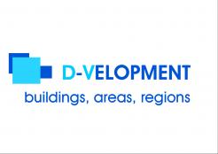
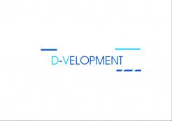
Thanks for the new logo design. This design is too sketchy in my opinion. Try to improve it by adding a subititle (buildings, area's, regions) and mabye use another texttype.
Good Luck, greets Dave -
This contest is finished. Its not possible to reply anymore.
-


