Design a new logo and corporate identity for D-VELOPMENT | buildings, area's, regions
Contest details:
Silver
- Contest holder: D-VELOPMENT
- Category: Logo & stationery
- Total budget: € 419.00
- Start date : 22-07-2014 10:38
- Ending date : 07-08-2014 10:36
- Status : Ended
- Required formats: jpg,eps,ms word
- Relevant files: None
-
Available languages:


- Number of designs: 170
-
Response rate:
low high
Needs:
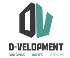
It should be nice if you could do something with the D and V, which are my initials. Maybe it is possible to use D-V as a separate logo in adds to the full logo.
D-VELOPMENT relates to buildings, area's and regions. It would be a pré if these three 'levels' are part of the logo as a subtitle.
Businesscards and template design:
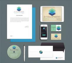
The design of the businesscards and templates should be lean and mean as well. Necessary text (like adress, bankaccountnumber, number of the Camber of Commerce, etc) should be on it. The design supports the text.
Do not use logo's or text in the sideline, because I would like to use the full paper width.
Deliverables:
- Digital logo design
- Businesscard design
- MS Word templates for (1) letter/offer, (2) memorandum and (3) report
- Design for an E-mail sign
Reward for winning design is guaranteed.
Company description:
D-VELOPMENT offers real-estate consultancy services for the (re-)development of buildings, area's and regions. Real estate owners (firms/corporations and investors), area development firms, governments (local, regional and national), regional development companies and other consultancy firms are main clients.
Services D-VELOPMENT delivers are: project- and processmanagement, contractmanagement, property management, businesscases, tendermangement, businessdevelopment and permits- and licences management.
About me:
I'm a young and ambicious 26 years old person. I love the build environment and i'm broadly educated (bachelor of build environment and master of real-estate). In addition i'm a creative thinker with communicational skills using an integral approach.
Target group:
Main clients are: real estate owners (firms/corporations and investors), area development firms, governments (local, regional and national), regional development companies and other consultancy firms.
Colors, favourites and other requirements
Colors I like: light green, light blue/turqouise, grey, antracene and white.
I also like logo's with a range of collors, like the DSM logo.
The Box
-
-
D-VELOPMENT says :
Hi,
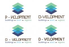
Thanks, I like the upper right corner one the most. Can you show me some different texttypes in that direction?
Thanks,
Greets Dave -
This contest is finished. Its not possible to reply anymore.
-
-
-
D-VELOPMENT says :
Hi,
Thanks. This texttype is nog what i'm looking for. And the underline is too much in this way. Can you show me some other ones?
Greets Dave -
This contest is finished. Its not possible to reply anymore.
-
-
-
No comments
-
This contest is finished. Its not possible to reply anymore.
-
-
-
D-VELOPMENT says :
Hi,
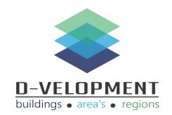
Nice design! And nice colors. The three levels may also be interpreted as the three levels I'm working in: buildings, area's and regions. Can you match te colors of the subtitels with the colors of the squares, by making 'buildings' blue and 'regions' green?
And the texttype of 'D-VELOPMENT' may be more lively and less stiff.
Thanks!
Greets Dave -
This contest is finished. Its not possible to reply anymore.
-
-
-
No comments
-
This contest is finished. Its not possible to reply anymore.
-
-
-
D-VELOPMENT says :
Hi,
Nice alternative design. It looks like 3D floor levels. Can you use some different colors?
And can you show me some different texttypes?
Good luck, greets Dave -
This contest is finished. Its not possible to reply anymore.
-

