Design a new logo and corporate identity for D-VELOPMENT | buildings, area's, regions
Contest details:
Silver
- Contest holder: D-VELOPMENT
- Category: Logo & stationery
- Total budget: € 419.00
- Start date : 22-07-2014 10:38
- Ending date : 07-08-2014 10:36
- Status : Ended
- Required formats: jpg,eps,ms word
- Relevant files: None
-
Available languages:


- Number of designs: 170
-
Response rate:
low high
Needs:
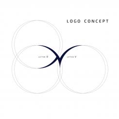
It should be nice if you could do something with the D and V, which are my initials. Maybe it is possible to use D-V as a separate logo in adds to the full logo.
D-VELOPMENT relates to buildings, area's and regions. It would be a pré if these three 'levels' are part of the logo as a subtitle.
Businesscards and template design:
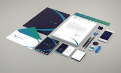
The design of the businesscards and templates should be lean and mean as well. Necessary text (like adress, bankaccountnumber, number of the Camber of Commerce, etc) should be on it. The design supports the text.
Do not use logo's or text in the sideline, because I would like to use the full paper width.
Deliverables:
- Digital logo design
- Businesscard design
- MS Word templates for (1) letter/offer, (2) memorandum and (3) report
- Design for an E-mail sign
Reward for winning design is guaranteed.
Company description:
D-VELOPMENT offers real-estate consultancy services for the (re-)development of buildings, area's and regions. Real estate owners (firms/corporations and investors), area development firms, governments (local, regional and national), regional development companies and other consultancy firms are main clients.
Services D-VELOPMENT delivers are: project- and processmanagement, contractmanagement, property management, businesscases, tendermangement, businessdevelopment and permits- and licences management.
About me:
I'm a young and ambicious 26 years old person. I love the build environment and i'm broadly educated (bachelor of build environment and master of real-estate). In addition i'm a creative thinker with communicational skills using an integral approach.
Target group:
Main clients are: real estate owners (firms/corporations and investors), area development firms, governments (local, regional and national), regional development companies and other consultancy firms.
Colors, favourites and other requirements
Colors I like: light green, light blue/turqouise, grey, antracene and white.
I also like logo's with a range of collors, like the DSM logo.
Wilko
-
-
No comments
-
This contest is finished. Its not possible to reply anymore.
-
-
-
No comments
-
This contest is finished. Its not possible to reply anymore.
-
-
-
D-VELOPMENT says :
Hi Wilko,
Like you say, this is al logo to differentiate. I need to think about it if I realy like it... I hope you understand and don't mind. I will let you know later ok?
Greets Dave -
Wilko says
Of course Dave ! I totally understand.
-
This contest is finished. Its not possible to reply anymore.
-
-
-
Wilko says
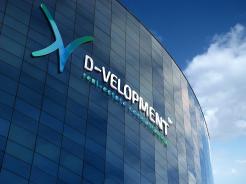
I tried to make something different. Many real estate logos are similar, with a roof, buildings and so on. The goal here is to differentiate your firm.
-
This contest is finished. Its not possible to reply anymore.
-
-
-
No comments
-
This contest is finished. Its not possible to reply anymore.
-
-
-
D-VELOPMENT says :
Hi Wilko,
Thanks for your design! I like the concept and how you worked it out. But will people recognise this logo for a real estate consultantcy firm? Maybe is too pointed, which some people may scare off. Can you show me how it looks like when it is more bold?
Thanks, Greets Dave -
This contest is finished. Its not possible to reply anymore.
-
-
-
No comments
-
This contest is finished. Its not possible to reply anymore.
-
-
-
No comments
-
This contest is finished. Its not possible to reply anymore.
-
-
-
Description by designer Wilko:
Hello,
Here is my design for your new corporate identity.
I hope you will enjoy my work as much as I enjoyed working on your project.
I await your feedback and I remain at your disposal.
Sincerely
WILKO -
This contest is finished. Its not possible to reply anymore.
-

