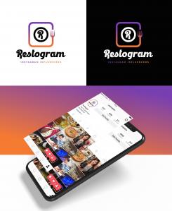
Design a recogniseable and modern logo for an influencer marketing platform connecting restaurants to content creators.
Contest details:
Silver
- Contest holder: FerdiG
- Category: Logo & stationery
- Total budget: € 459.00
- Start date : 10-12-2020 14:59
- Ending date : 17-12-2020 00:00
- Status : Ended
- Relevant files:
-
Available languages:


- Number of designs: 118
-
Response rate:
low high
Needs:
It is important to note that Instagram may not be the only channel.
Other requirements for the design are as follows:
- for presentation on website, social media and possibly other channels
- for a platform that connects restaurants with instagram influencers
- logo with recogniseable vignet
Thanks in advance for your effort and creativity!
Company description:
Restogram - influencer marketing
Target group:
Restaurant owners and Generation Z
Colors, favourites and other requirements
We are looking for tight designs with sharp lines like a Sans Serif, we don't like to Script or Serif fonts. Use Kano Typeface or Raleway BOLD as inspirations.
BadalHossain
-
-
No comments
-
This contest is finished. Its not possible to reply anymore.
-
-
-
No comments
-
This contest is finished. Its not possible to reply anymore.
-
-
-
No comments
-
This contest is finished. Its not possible to reply anymore.
-
-
-
No comments
-
This contest is finished. Its not possible to reply anymore.
-
-
-
BadalHossain says
here is high quality images view presentation: https://pasteboard.co/JEqPeXh.jpg
-
FerdiG says :
Dear Badal, thank you so much for your input and designs. We definitely like the logo that is separated with the fork. We do however think that the dark red colour looks a bit old fashioned and we would like to step away a bit from the instagram emblem. In addition, we think we prefer a sharper font instead of an italic font. It represents an online dashboard and platform and therefore should appear like a software solution more so than a restaurant. Thank you once again!
-
This contest is finished. Its not possible to reply anymore.
-
-
-
FerdiG says :
Dear Badal, thank you so much for your input and designs. We definitely like the logo that is separated with the fork. We do however think that the dark red colour looks a bit old fashioned and we would like to step away a bit from the instagram emblem. In addition, we think we prefer a sharper font instead of an italic font. It represents an online dashboard and platform and therefore should appear like a software solution more so than a restaurant. Thank you once again!
-
This contest is finished. Its not possible to reply anymore.
-

