Design logo and corporate identity for freelance web editor
Contest details:
Bronze
- Contest holder: ndekievit
- Category: Logo & stationery
- Total budget: € 319.00
- Start date : 26-02-2014 12:51
- Ending date : 12-03-2014 12:47
- Status : Ended
- Required formats: jpg,psd,ai,pdf
- Relevant files: None
-
Available languages:


- Number of designs: 81
-
Response rate:
low high
Needs:
Company description:
I'm an independent web editor. My company will be called Zimot. Companies and individuals can ask me for: writing copy, setting up adwords campaigns, creating a content strategy. I also make small websites and advise companies on using social media. In short, a variety of activities.
Zimot stands for, Zat ik maar op Texel (I wish a was on Texel) That's my favorite island. And the pay-off is: "Your online conscience. The idea is: hire me and I take care of it properly.
Target group:
Small and large businesses. And individuals.
Colors, favourites and other requirements
I like Pistachio-green, light tones (grey, blue, orange). I also find retro style beautiful. And I would also like to see a modern look, because I will be busy with new media. Nature Themes (shapes and colors) I like very much, especially if they are simple and without too many lines.
Grapedistrict (wine company) has a nice logo I think. I also find beautiful. Logo Twitter And I also find this style super: http://www.atelieroost.nl/ en http://www.hetbos.nl/
Wilko
-
-
No comments
-
This contest is finished. Its not possible to reply anymore.
-
-
-
No comments
-
This contest is finished. Its not possible to reply anymore.
-
-
-
Description by designer Wilko:
Hi Nathalie,
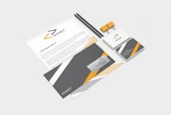
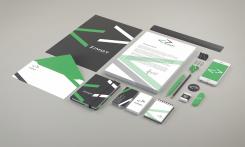
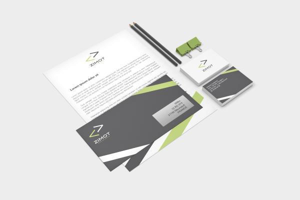
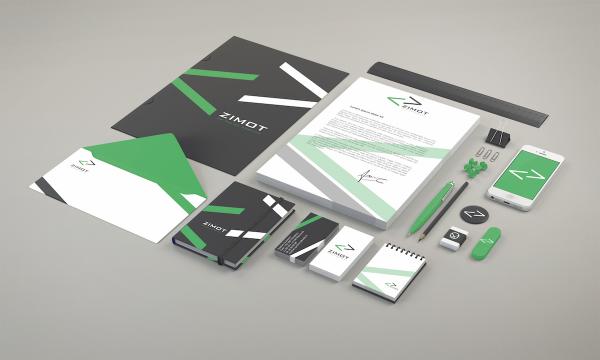
this is the last version fo your corporate identity.
Regards.
Wilko -
This contest is finished. Its not possible to reply anymore.
-
-
-
Description by designer Wilko:
Ok thank you ! Here is a corporate identity style with the orange logo.
-
ndekievit says :
Thanks Wilko. Is it possible to change the font a little bit. Especially the 'o' seems to me a bit too square. I do like the green one. Regards Nathalie
-
This contest is finished. Its not possible to reply anymore.
-
-
-
Description by designer Wilko:
here is a different icon
-
This contest is finished. Its not possible to reply anymore.
-
-
-
No comments
-
This contest is finished. Its not possible to reply anymore.
-
-
-
Description by designer Wilko:
Hi Nathalie,
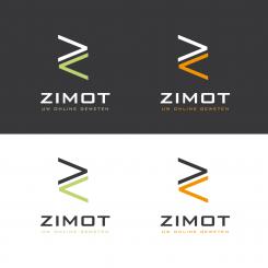
I am glad you like my design. Here is 4 different color combinations.
In my opinion the Pistachio-green is very attractive and the orange too. Orange color means creativity and trust. This is important to be distinctive and the colors are the best way for it. Your corporate identity must be unique with a clean and meaning logo. -
ndekievit says :
I like your design very much. You are now very high on my list. The contest will end next week and then I will make up make my mind. Thanks.
-
This contest is finished. Its not possible to reply anymore.
-
-
-
ndekievit says :
Hoi Wilko, ik vind dit al echt heel erg mooi. Ik twijfel alleen even over de kleur. Heb jij nog een idee over eventuele andere kleuren die mooi zouden kunnen zijn?
Dank en groeten, Nathalie -
This contest is finished. Its not possible to reply anymore.
-
-
-
No comments
-
This contest is finished. Its not possible to reply anymore.
-
-
-
No comments
-
This contest is finished. Its not possible to reply anymore.
-

