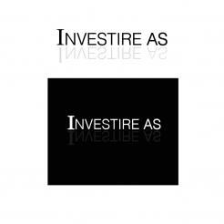
Design logo for investment company
Contest details:
- Contest holder: erich
- Category: Logo & stationery
- Total budget: € 300.00
- Start date : 28-06-2012 10:13
- Ending date : 12-07-2012 10:08
- Status : Ended
- Required formats: jpg,ai,pdf
- Relevant files: None
-
Available languages:

- Number of designs: 89
-
Response rate:
low high
Needs:
The company is a small privately owned company who mainly focus on real estate investments (office buildings).
We are looking for a discrete logo which may use the letter "i" (this is not a requirement).
Company description:
Target group:
Colors, favourites and other requirements
Luke_Looijen
-
-
Description by designer Luke_Looijen:
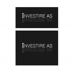
you have a good sense for design, i like it better this way to..
the grey tints make it look more professional.
i made the design with 2 different background shapes, depends on your taste what you will choose.
greeting,
Luke -
Luke_Looijen says
it's displayed a bit darker then it is in my file...
this is the color code: http://www.color-hex.com/color/414042 -
This contest is finished. Its not possible to reply anymore.
-
-
-
Description by designer Luke_Looijen:
i'm glad to hear the positive reactions,
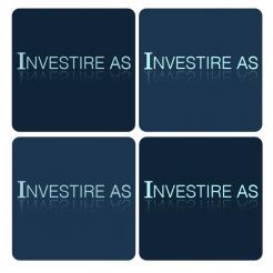
i've included 4 different color styles.
- 2 font colors
- 2 background colors
i hope this is what you had in mind.
greetings,
Luke -
Luke_Looijen says
the website makes the color look different, it's more towards grey than this..
-
erich says :
Maybe it looks better in greys. Could you try it with a very light grey the main name, a darker grey for the solid reflection and the background in really dark grey. Make the box not square (like the first on you made) with straight edges please.
-
This contest is finished. Its not possible to reply anymore.
-
-
-
Description by designer Luke_Looijen:
i have included the following samples:
- 3 different color styles
- 2 different reflection styles
- 2 different background styles
I am looking forward to hear your reaction
greetings,
Luke
-
erich says :
The response from one of the shareholders is quite positive.
Could you try to make the blue gray sample even darker. Then instead of a solid white font for the main name, may be tune it to a very light blueish grey color. -
This contest is finished. Its not possible to reply anymore.
-
-
-
Description by designer Luke_Looijen:
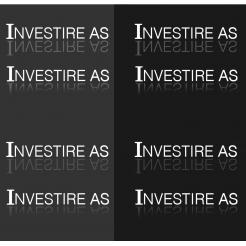
i have included 2 shades of grey. you can also go with a dark blue grey or brow grey if u like.
thank you for your quick reply's by the way.
greetings,
Luke -
Luke_Looijen says
the darkest grey look almost black on the website, it is a little lighter in my design.
-
erich says :
Thank you. Dark blue gray could be nice. Could you split the different shades into seperate logos so that I could show my shareholders the "real" thing?
-
This contest is finished. Its not possible to reply anymore.
-
-
-
Description by designer Luke_Looijen:
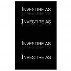
i have included 2 different values of reflections and for both values one gradient and one solid reflection.
(i hope the website will display the designs at a good quality..)
i look forward to your reaction.
greetings,
Luke -
erich says :
I like the both. So far your suggestion are by far the best.
Could you change the black color to dark grey? -
Luke_Looijen says
sure, will be done in a moment..
-
This contest is finished. Its not possible to reply anymore.
-
-
-
Description by designer Luke_Looijen:
My name is Luke,
i have designed a clean and chique logo..
if you like the concept or if you would like to adjust something, please let me know.
i hope to hear from you. -
erich says :
I like your design, however, there is a competing Norwegian company with a similar design http://www.newsec.no/.
Maybe if you make the mirror-effect more visible it will appear more different? Maybe we could use a really dark grey color instead of black?
What do you think. -
Luke_Looijen says
thank u for your reaction.
i will work something out with some grey instead of black, or maybe a few shades of grey.
i will have a look at the reflections too.
i'm going to post a few different designs as soon as possible.
greetings,
Luke -
erich says :
Can you just start with making the reflection more visible? Maybe that will do the difference.
-
This contest is finished. Its not possible to reply anymore.
-

