DigitalMouse
Contest details:
Gold
- Contest holder: mcabaraux
- Category: Logo & stationery
- Total budget: € 449.00
- Start date : 18-12-2012 23:38
- Ending date : 18-01-2013 23:22
- Status : Ended
- Required formats: jpg,psd,ai,pdf,dot,xls
- Relevant files: None
-
Available languages:


- Number of designs: 150
-
Response rate:
low high
Needs:
In fact the following elements are needed for this project:
1) Logo
2) Color scheme (to be used in a website)
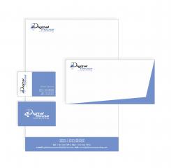
3) Template for business card
4) Template for word documents (letter header ...)
5) Same as for word but for excel (used for the invoicing)
Company description:
Our company is active in the IT Consultancy market.
This includes:
- Application developement
- Functional Analysis
- ...
We are acting as Freelance directly on site (at the customer) or remotly depending on the customer needs.
Target group:
Well all companies having needs for developers, analysts, ...
Colors, favourites and other requirements
There are no restrictions as such for the logo and the design. Even if we were maybe thinking about some color scheme with "blue".
For the logo maybe a "mascot" might be "cool" in order to differentiate ourseleves from the other companies --> just keep in mind the name of the company "Digital Mouse Consulting".
We also think that the name should appear in the logo even if you create a "mascot".
To be a bit more precise, we are looking for something appealing, catchy, dynamic.
Don't hesitate to submit the logo first, this will allow us to choose which projects will have to be completed (color scheme, templates, ...)
Simke
-
-
Simke says
Ok, no problem. I did it. What do you say now?
-
mcabaraux says :
Hi,
Ok thanks this is good now.
BRs,
Michaël -
This contest is finished. Its not possible to reply anymore.
-
-
-
mcabaraux says :
Hi,
Ok blue is ok now ...
Could please put back the little "cubes" under the D of digital mouse ? And keep this blue then ? -
mcabaraux says :
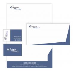
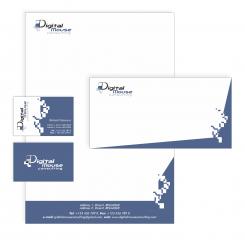
Little something extra for document template could you please keep the footer only with the blue and remove the blue on right side ?
Best Regards,
Michaël -
This contest is finished. Its not possible to reply anymore.
-
-
-
mcabaraux says :
Hi,
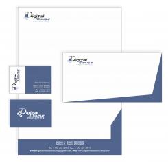
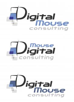
Sorry to come back on this again. But we think that another blue would be better. In the three first logo you have made we would like you to use the "blue" of the first logo (the top one of the three).
The rest is ok like that.
Best Regards,
Michaël -
Simke says
It's ok, don't apologise! Now I'm sending the newest solution. :)
-
This contest is finished. Its not possible to reply anymore.
-
-
-
Simke says
Ok, I'm sorry, I didn't realised at first what you were talking about.
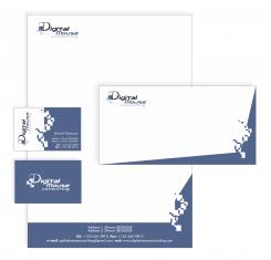
White blocks which I removed was something that reminds me a bit on some "digital things", and gray blocks which you can see on logo symbolise mouse clicking. Would you like me to keep it on logo or I should remove it also? -
This contest is finished. Its not possible to reply anymore.
-
-
-
mcabaraux says :
Hello,
Looks nice ...
But as mentionned before the drawing (white blocks) looks a bit too much. We don't really know what they represent. Would it be possible to remove it and to keep the last colour scheme ?
BRs,
Michaël -
This contest is finished. Its not possible to reply anymore.
-
-
-
No comments
-
This contest is finished. Its not possible to reply anymore.
-
-
-
No comments
-
This contest is finished. Its not possible to reply anymore.
-
-
-
No comments
-
This contest is finished. Its not possible to reply anymore.
-
-
-
mcabaraux says :
Hi,
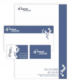
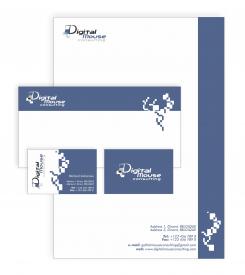
The logo is nice but I have small issue with the templates (business cards, ...). The drawing on the side is a bit strange.
Best Regards,
Michaël -
Simke says
Hello!
Do you think about the back side of the business card? If you are, that is ok. If I use logo on a blue surface, colours of the logo should be a bit different. If you would like, I can fix it and made logo in negative on the other side of the business card and on the envelopes also.
You can also tell me, what hue of the blue I should use, lighter or darker blue? Which one do you prefer? -
mcabaraux says :
I would say back side in negative yes. For the blue the darker one.
Brs,
Michaël -
Simke says
Hello again!
I made some corrections on my negative logo. Hope you will like it. -
This contest is finished. Its not possible to reply anymore.
-

