Empty Hands
Contest details:
Silver
- Contest holder: Bitchy mum
- Category: Logo & stationery
- Total budget: € 419.00
- Start date : 01-08-2014 15:26
- Ending date : 25-08-2014 15:22
- Status : Ended
- Required formats: jpg,ai,pdf
- Relevant files: None
-
Available languages:


- Number of designs: 31
-
Response rate:
low high
Needs:
This is the idea for my logo (attached files). I played with the original picture, penciled the colours in etc.
I will start a massage salon. I offer traditional body massage and the Chinese Tuina massage, which is very energetic, thorough and works on the meridians and acupuncture points. Besides that there is always this ‘extra’ thing that hands can do, which we don’t always understand. This is why I first thought of naming my salon something like ‘magical realism’. I attached a picture of a painting which really appeals to me. In the end I chose for the name ‘Empty Hands’. Empty hands literally translated into Japanese is Karate. Karate resembles the enormous power of hands without weapons or tools. Personally, karate has convinced me of my own power, and great awareness.
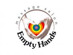
The attached pictures are my own hands on my son’s head. The colours are the chakra/energy colours. The colours (from inside to outside) are: gold, violet, indigo, blue, green, yellow, orange and red).
My idea is to create depth in the colours whereby the middle (gold) is on top. The colours could either go ‘in’ or maybe come out.
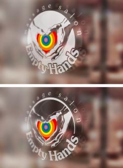
I would prefer the hands to be my own hands. I would also like to make a ‘window-sticker’ from the logo later on.
My preference would be a stand alone logo.
The following letter type appeals to me: Microsoft Word – Harrington.
With regards to the business card I have no particular idea yet, so please feel free.
Really anxious to see what you can come up with!
Kind regards,
Patricia Heitman
Company description:
See above
Target group:
Anyone who sees beyond the limitations of Western Medicines.
Colors, favourites and other requirements
mikidejanovic
-
-
No comments
-
This contest is finished. Its not possible to reply anymore.
-
-
-
No comments
-
This contest is finished. Its not possible to reply anymore.
-
-
-
Bitchy mum says :
thank you. Still like the black the best. Can you give me one more example with a dark brown colour for the text?
Otherwise, I am pleased with the logo.
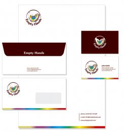
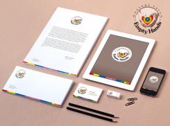
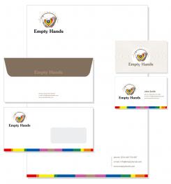
Once I am certain about the text colour (dark brown or black), can you please show me a business card, letter and envelope.
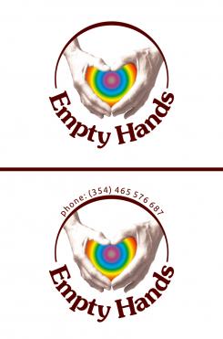
Can you also show me a simple example of the logo, with a telephone number on top, where it used to say Massage Salon. To see how this would be for a sticker.
Also for the window example (the 2nd picture) can you show me what it would look like with the latest adjustments.
Thank you very much! -
This contest is finished. Its not possible to reply anymore.
-
-
-
Bitchy mum says :
Oops! No, I don't like the text in gold. You had a different colour though with the other logo where the Empty Hands were not in the circle.
I think the hands had a little less shadow?
We're almost there, do you have any more suggestions? -
This contest is finished. Its not possible to reply anymore.
-
-
-
No comments
-
This contest is finished. Its not possible to reply anymore.
-
-
-
Description by designer mikidejanovic:
Did I understand you correctly? Did you mean like this?
-
Bitchy mum says :
Hi! Yes you understood correctly, thanks. Although it looks better with the text on top, I don't want the text. I'd like to be able to use the brand, also if it's not massage.
The gold doesn't really look like gold to me?
In your earlier examples, you used a softer colour for the text, could you show me that again in what we have now please?
-
This contest is finished. Its not possible to reply anymore.
-
-
-
No comments
-
This contest is finished. Its not possible to reply anymore.
-
-
-
No comments
-
This contest is finished. Its not possible to reply anymore.
-
-
-
Bitchy mum says :
super! Dit gaat het volgens mij echt wel worden.
Wat de kleuren betreft, herken ik niet alle kleuren. voor de zekerheid, de kleuren moeten zijn (van binnen naar buiten) goud , violet, indigo, blauw, groen, geel, oranje en rood. je hebt niet gereageerd of het mogelijk is diepte te cre-eren, is dit omdat het niet haalbaar is? Is het wel mogelijk de kleuren iets natuurlijker in elkaar over te laten gaan alsjeblieft. het is nu te zeer afgebakend, ik zou het graag 'regenboogachtig' in elkaar over zien gaan.
Graag nog een voorbeeld zonder de tekst massage salon (vooral voor het raam logo)
Ook graag nog een voorbeeld met alleen de handen (met kleuren).
Ook de kleuren aan de rand van het visite kaartje geheel overeen laten komen met die in de handen. -
This contest is finished. Its not possible to reply anymore.
-
-
-
Bitchy mum says :
Ik vind het een leuk idee zo. Zou je mij ook kunnen laten zien hoe dit er uit komt te zien met het ronde logo. En kun je me ook alleen de handen (met de kleuren) laten zien. Is het mogelijk de handen wat lichter te maken, maar de contouren duidelijk te houden? (Vooral voor gebruik bij een eventuele raamsticker, zodat de handen iets transparanter worden.) Is hrt ook mogelijk diepte in de kleuren te krijgen? Sorry voor het late antwoord
-
This contest is finished. Its not possible to reply anymore.
-
-
-
Bitchy mum says :
Mooi
-
This contest is finished. Its not possible to reply anymore.
-
-
-
Bitchy mum says :
Mooi
-
This contest is finished. Its not possible to reply anymore.
-
-
-
Bitchy mum says :
Niet mijn ding
-
This contest is finished. Its not possible to reply anymore.
-

