I want to stand out in diversity
Contest details:
Silver
- Contest holder: OOK Innovatie
- Category: Logo & stationery
- Total budget: € 419.00
- Start date : 19-08-2014 10:15
- Ending date : 02-09-2014 10:10
- Status : Ended
- Required formats: jpg,ai,pdf
- Relevant files: None
-
Available languages:


- Number of designs: 114
-
Response rate:
low high
Needs:
Company description:
Target group:
Colors, favourites and other requirements
rizol
-
-
Description by designer rizol:
Hello,
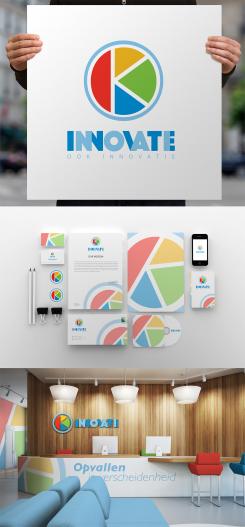
I'm happy to present you the full version of the OOK Inovatie branding identity style.
I hope you enjoy it. -
OOK Innovatie says :
Thank you for all the different styles. You have a very interesting design.
-
rizol says
My pleasure) I'm happy you like it.
-
This contest is finished. Its not possible to reply anymore.
-
-
-
No comments
-
This contest is finished. Its not possible to reply anymore.
-
-
-
No comments
-
This contest is finished. Its not possible to reply anymore.
-
-
-
No comments
-
This contest is finished. Its not possible to reply anymore.
-
-
-
Description by designer rizol:
OOK as a symbol of time for Innovation
-
This contest is finished. Its not possible to reply anymore.
-
-
-
Description by designer rizol:
I tried to do my best to keep the idea we had and make the logo original and stylish.
-
This contest is finished. Its not possible to reply anymore.
-
-
-
Description by designer rizol:
As an alternative - a version for business cards to stand out)
-
HMS says
http://seeklogo.com/2ok-logo-607.html
-
OOK Innovatie says :
bijna dezelfde logo
-
HMS says
http://img.artlebedev.com/everything/kaluga/ok.gif
-
HMS says
Maybe practically solved but not original.
-
rizol says
One can spend time and find something similar in the world. The funny thing is that it is a logo of some Ukrainian designer. I live in Ukraine too but I have never seen this logo before. As I can understand there is a symbolic man in the logo in form of Okey. I tried to find out smth about the brand - it doesn't exist as far as I can see. I made the logotype specially for OOK Innovatie.
-
rizol says
that's my drafts and the process of creating the logo
https://www.dropbox.com/s/mm3tlv25rb2fhlw/ook.jpg?dl=0 -
OOK Innovatie says :
ok thank you. no worries
-
This contest is finished. Its not possible to reply anymore.
-
-
-
Description by designer rizol:
Style for the second logo)
-
This contest is finished. Its not possible to reply anymore.
-
-
-
Description by designer rizol:
More detailed presentation of the logo
-
This contest is finished. Its not possible to reply anymore.
-
-
-
OOK Innovatie says :
Heel aardig alternatief van je andere ontwerp. Leuk!
-
OOK Innovatie says :
Sorry english now. Very nice alternative design
-
rizol says
Dankjewel)
-
This contest is finished. Its not possible to reply anymore.
-
-
-
Description by designer rizol:
I tried to understand more what you're looking for.
Introducing you the new design.
Hope you enjoy it! -
rizol says
The logotype in circle consists of two letters "O" and "K" inside of them forming "OOK".
-
OOK Innovatie says :
This is a very intriguing design. Thank you. Really different from the others.
-
This contest is finished. Its not possible to reply anymore.
-
-
-
OOK Innovatie says :
Ik vind deze kleuren beter dan de blauw, geel en rood in het andere ontwerp van je
-
This contest is finished. Its not possible to reply anymore.
-
-
-
No comments
-
This contest is finished. Its not possible to reply anymore.
-
-
-
Description by designer rizol:
Hallo!
Ik spreek een klein bijtje Nederlands. Ik hoop ik heb u goed begrijpen) -
OOK Innovatie says :
yes, you have understood me perfectly. Thank you
-
This contest is finished. Its not possible to reply anymore.
-
-
-
OOK Innovatie says :
Spreekt me wel aan. Is een overtreffende trap mogelijk door bv verrassend maar passend kleur gebruik? De verscheidenheid zit in de 'ster' - het is nog niet heel erg opvallend.
-
This contest is finished. Its not possible to reply anymore.
-

