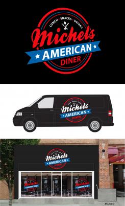
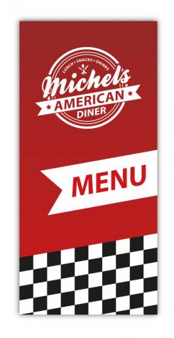
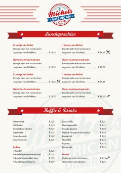
I would like a powerful, striking and distinctive logo especially with corporate identity and design for facade and car advertising and the menu.
Contest details:
Silver
- Contest holder: horeca82
- Category: Logo & stationery
- Total budget: € 419.00
- Start date : 23-09-2014 11:37
- Ending date : 07-10-2014 11:33
- Status : Ended
- Required formats: jpg,ai,pdf
- Relevant files: None
-
Available languages:


- Number of designs: 60
-
Response rate:
low high
Needs:
I start an American Diner in Steenwijk and point it in according to the American style years 50-60 the Interior: Red banks with white band, black and white checked floor, chairs and bar stools in turquoise and yellow.
The name is: Michel's American Diner.
Who makes for me the winning design!!
Company description:
I start an American Diner in Steenwijk and point it in according to the American style years 50-60 The Interior: Red banks with white band, black and white checked floor, chairs and bar stools in turquoise and yellow and blackstone black tables.
In the attractive lunchroom I serve coffee, drinks and delicious lunch dishes.
In another part of my case is a comprehensive snack bar
Target group:
The audience is wide and not tied to age.
Anyone who likes good food is more than welcome.
Colors, favourites and other requirements
Red is the main color in the Interior and which I would like to see back in a design.
Further colors, I leave it to your understanding.
OnwijsReclame
-
-
No comments
-
This contest is finished. Its not possible to reply anymore.
-
-
-
No comments
-
This contest is finished. Its not possible to reply anymore.
-
-
-
Description by designer OnwijsReclame:
Michel zo zou je de blokken bijvoorbeeld kunnen combineren als vormgevingselement!
-
FDesign says
Mooi werk
-
This contest is finished. Its not possible to reply anymore.
-
-
-
Description by designer OnwijsReclame:
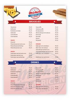
lunchmenukaart concept voorbeeld
-
This contest is finished. Its not possible to reply anymore.
-
-
-
Description by designer OnwijsReclame:
concept snackkaart
-
This contest is finished. Its not possible to reply anymore.
-
-
-
Description by designer OnwijsReclame:
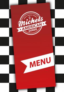
voorbeeld menu kaart voorkant op een geblokte tafel liggend... stuur morgen even een opzet voor de binnenkant!
-
This contest is finished. Its not possible to reply anymore.
-
-
-
No comments
-
This contest is finished. Its not possible to reply anymore.
-
-
-
No comments
-
This contest is finished. Its not possible to reply anymore.
-
-
-
horeca82 says :
Dank je wel voor je inspanningen
-
This contest is finished. Its not possible to reply anymore.
-
-
-
horeca82 says :
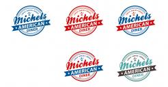
Prachtig logo.Lijkt me mooi om deze in verschillende kleurstellingen te zien.Eigen inbreng is welkom.
-
This contest is finished. Its not possible to reply anymore.
-
-
-
No comments
-
This contest is finished. Its not possible to reply anymore.
-
-
-
horeca82 says :
Dit kleurgebruik spreekt me denk ik wel aan
-
This contest is finished. Its not possible to reply anymore.
-
-
-
horeca82 says :
Eenzijdig kleurgebruik spreekt me minder aan
-
This contest is finished. Its not possible to reply anymore.
-
-
-
horeca82 says :
Is dit voor de menukaart?
-
This contest is finished. Its not possible to reply anymore.
-
-
-
horeca82 says :
Ziet er al goed uit Dennis en dan vooral het eerste logo. Sta er pas sinds vanmiddag op dus kijk nog wel even wat er nog meer voorbij gaat komen. groetjes Michel
-
This contest is finished. Its not possible to reply anymore.
-

