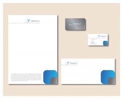
Intelligent, strak en pakkend logo + business card voor een dynamisch it-bedrijf
Contest details:
- Contest holder: Velocity
- Category: Logo & stationery
- Total budget: € 189.95
- Start date : 09-05-2015 11:51
- Ending date : 30-05-2015 11:40
- Status : Ended
- Required formats: jpg,ai,pdf
- Relevant files: None
-
Available languages:


- Number of designs: 44
-
Response rate:
low high
Needs:
Who is Velocity-it
Velocity-it is a young and dynamic company, which specializes in delivering Java backend development capability to software houses and multinational companies. They also develop php and Java solutions for smaller companies and start-ups.
Where do they stand for
Providing high quality software development capacity and complete software solutions. The core values “reliability”, “quality”, “innovation” and “deliver by agreement”, determine our approach.
Look and feel
First of all we are a young and dynamic software company. We have the brains, the discipline and energy to deliver high quality software. We are born for innovation and entrepreneurship.
The contest
Design the logo and business card. We also want the design for our homepage and content page. So find our second contest if you want to develop our complete house style.
Company description:
Target group:
Colors, favourites and other requirements
At least blue
nikola1122
-
-
nikola1122 says
Hello,
Here is my idea for Stationery. If you want to change something, just say. I'm open for any suggestions!
Best regards,
Nikola Markovic -
This contest is finished. Its not possible to reply anymore.
-
-
-
Velocity says :
Looking very cool but what is it?
-
nikola1122 says
Hello,
It is a silhouette of a man with his arm raised and it should resemble the letter V. The grey "orbit" about silhouettes represents "IT touch". I hope that you understand. :) -
This contest is finished. Its not possible to reply anymore.
-


