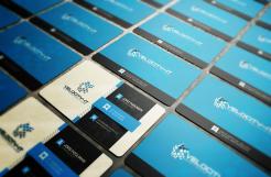
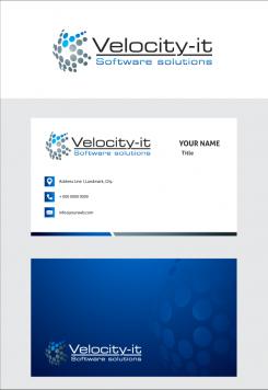
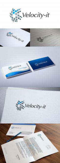
Intelligent, strak en pakkend logo + business card voor een dynamisch it-bedrijf
Contest details:
- Contest holder: Velocity
- Category: Logo & stationery
- Total budget: € 189.95
- Start date : 09-05-2015 11:51
- Ending date : 30-05-2015 11:40
- Status : Ended
- Required formats: jpg,ai,pdf
- Relevant files: None
-
Available languages:


- Number of designs: 44
-
Response rate:
low high
Needs:
Velocity-it is a young and dynamic company, which specializes in delivering Java backend development capability to software houses and multinational companies. They also develop php and Java solutions for smaller companies and start-ups.
Where do they stand for
Providing high quality software development capacity and complete software solutions. The core values “reliability”, “quality”, “innovation” and “deliver by agreement”, determine our approach.
Look and feel
First of all we are a young and dynamic software company. We have the brains, the discipline and energy to deliver high quality software. We are born for innovation and entrepreneurship.
The contest
Design the logo and business card. We also want the design for our homepage and content page. So find our second contest if you want to develop our complete house style.
Company description:
Target group:
Colors, favourites and other requirements
At least blue
golei
-
-
No comments
-
This contest is finished. Its not possible to reply anymore.
-
-
-
Description by designer golei:
font option
-
This contest is finished. Its not possible to reply anymore.
-
-
-
No comments
-
This contest is finished. Its not possible to reply anymore.
-
-
-
Velocity says :
You are quick :-). I like the shiny/glimmy part in the centre of the logo. I think that's enough. It's just a touch of it. In the business card however, the shiny/glimmy part is too much. I would like to have a business card where I can present myself clear but without showing off:
* IT
* Innovative
* Quality
* Bright/clever
P.S. I do not like the italic font. Please also put "Software solutions" in the logo.
-
This contest is finished. Its not possible to reply anymore.
-
-
-
Velocity says :
No sorry, I like your first design better. With the logo on the left. I think this font makes it less professional. Too much blue and too fat. Can you try it again but with the other logo and with the quote "Software solutions". I think the logo says that we are a clever IT company and that we are innovative. The font should finish it by giving a feeling of quality and professionalism.
Can you also design the business card as it is part of the contest? -
This contest is finished. Its not possible to reply anymore.
-
-
-
Velocity says :
I like what you did with the logo, the word Velocity-it is not in harmony with the logo.
-
This contest is finished. Its not possible to reply anymore.
-
-
-
No comments
-
This contest is finished. Its not possible to reply anymore.
-
-
-
No comments
-
This contest is finished. Its not possible to reply anymore.
-
-
-
No comments
-
This contest is finished. Its not possible to reply anymore.
-

