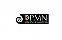
KPMN...... fibonacci and the golden ratio
Contest details:
- Contest holder: Victor
- Category: Logo & stationery
- Total budget: € 420.00
- Start date : 23-11-2014 23:13
- Ending date : 27-12-2014 23:00
- Status : Ended
- Required formats: jpg,eps,gif,pdf
- Relevant files: None
-
Available languages:


- Number of designs: 110
-
Response rate:
low high
Needs:
The letters which have to be used in the logo are: KPMN
The official name (which should not be in the logo) is: koopman duurzaam advies
We have no preference for color. The logo must be applicable in black / white and dia-positive.
In terms of design must the Fibonacci sequence and the golden ratio incorporated into the logo (see the requirements).
The logo must have also the descriptor "natuurlijk duurzaam” (natural sustainable).
Design words
Stylish, innovative, confident, young and fresh accompanied by high quality
Company description:
KPMN is a starting consulting company that owners of existing property advises how his/her building/property can be preserved. Preservation of a building for a better use of energy through sustainable equipment, energy saving measures and awareness of the users.
Target group:
Building owners, municipalities, real estate investors, housing associations, industry, etc. all with existing buildings.
Colors, favourites and other requirements
The colors should support the stationery and are free to fill in.
Favourite logos: National Geographic, Apple, Chanel, Audi
What an absolute requirement (must have) is that the logo is designed with natural beauty. The golden ratio and the Fibonacci series are key concepts in it! The descriptor and the philosophy of the company, are based on that. The advice which is given by KPMN must contain a natural logic, natural beauty and natural sustainability. The logo supports that advice.
See also:
http://www.youtube.com/watch?v=aBzAO72NuIc
http://revoseek.com/apple/apple-golden-ratio-golden-rectangle-fibonacci-sequence-design/
http://www.youtube.com/watch?v=ahXIMUkSXX0
http://www.banskt.com/blog/golden-ratio-in-logo-designs/
http://www.youtube.com/watch?v=2pbEarwdusc
johnmar
-
-
Description by designer johnmar:
Goedendag
Bedankt voor uw feedback.
Hierbij nog een ander voorstel.
Met vriendelijke groet
Johnmar -
This contest is finished. Its not possible to reply anymore.
-
-
-
Description by designer johnmar:
Goedendag,
Hierbij een ander voorstel van mij.
Met vriendelijke groet
Johnmar -
Victor says :
Beste Johnmar,
Als ik eerlijk ben vind ik het logo te saai in uitstraling (bijv standaard font, voorspelbare opzet) en de kleur vinden we niet stijlvol. Lukt het je om daar iets mee te doen en eea te veranderen?
mvrgr,
Victor -
This contest is finished. Its not possible to reply anymore.
-
-
-
Description by designer johnmar:
Goedendag,
Hierbij een voorstel voor uw logo.
Ik ben benieuwd naar uw reactie over dit ontwerp.
Met vriendelijke groet
Johnmar -
This contest is finished. Its not possible to reply anymore.
-


