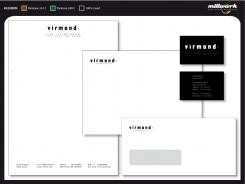
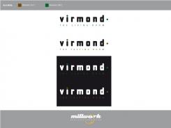
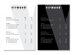
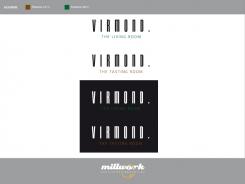
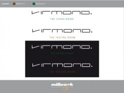
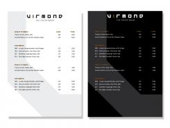
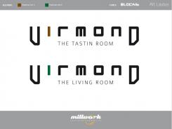
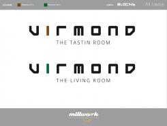
Lettering/logo and menu template for restaurant
Contest details:
- Contest holder: mvirmond
- Category: Logo & stationery
- Total budget: € 400.00
- Start date : 07-07-2013 11:38
- Ending date : 31-07-2013 11:34
- Status : Ended
- Required formats: jpg,ai,
- Relevant files: None
-
Available languages:


- Number of designs: 83
-
Response rate:
low high
Needs:
What we need is a graphic design of the names ("Virmond.", "The Tasting Room", "The Living Room"). This can be just the words themselves nicely designed or it can be supplemented with a logo. Furthermore, we are looking for a menu template (just one page), illustrating font types, placement of logo etc., so that it all looks nice and appealing.
Company description:
Our two guestrooms are right next to each other. Combined, we will offer up to 100 seats.
Out positioning: We are offering high quality food (from fresh ingredients, all home-made, meat from happy animals etc.) at a reasonable price. Our atmosphere is meant to be rather uncomplicated (no tablecloths, somewhat relaxed service), but nevertheless professional. Our wine offering is designed for individualists: We will be selling wine from small, unknown producers who work with a lot of passion to make quality wines.
Target group:
Target customers: Primarily business people. In the immediate vicinity there are large office buildings (insurance and tech companies). In other words our customers will range from "suit and tie" to call center agents. Furthermore, we mean to appeal to people living in the area. That would typically be above median income people, aged 30-50.
Colors, favourites and other requirements
Generally no restrictions.
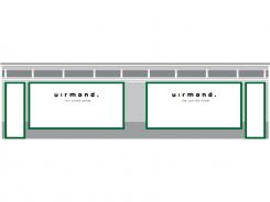
Lettering/logo will have to be fixed in a particular horizontal area in the shopping window. That means a portrait format would be difficult.
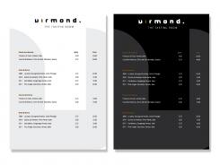
Thoughts on the menu: Front page will feature some 20 dishes, each with a recommended wine. Back page will feature some 20 wines, each with a recommended dish. Menu will be printed on heavy paper - without much further ado.
Millwork
-
-
Millwork says
It's not easy to make a right design for you....
-
This contest is finished. Its not possible to reply anymore.
-
-
-
No comments
-
This contest is finished. Its not possible to reply anymore.
-
-
-
No comments
-
This contest is finished. Its not possible to reply anymore.
-
-
-
Description by designer Millwork:
a second new typeface.
-
This contest is finished. Its not possible to reply anymore.
-
-
-
Description by designer Millwork:
For now some completely different: a new typeface!
-
mvirmond says :
I think it's a beautiful design - but not right for my concept.
imagine the "living room" as a very relaxed place, with self-service, wildly different types on furniture, almost a bit "alternative" style. it can't go with a minimalist & modernist logo like this.
similarly for the tasting room: imagine a room with lots of natural material - natural wood, open stone. it needs something a little different -
This contest is finished. Its not possible to reply anymore.
-
-
-
No comments
-
This contest is finished. Its not possible to reply anymore.
-
-
-
No comments
-
This contest is finished. Its not possible to reply anymore.
-
-
-
mvirmond says :
different, but still not quite what I'm looking for...
-
This contest is finished. Its not possible to reply anymore.
-
-
-
mvirmond says :
very nice use of colors!
-
This contest is finished. Its not possible to reply anymore.
-
-
-
mvirmond says :
i prefer the first one...
-
bahador.shirazian says
nice job...
-
Millwork says
Thanks, bahador.shirazian.
-
This contest is finished. Its not possible to reply anymore.
-
-
-
DutchDesigners says
Dat vind ik een mooi logo, collega!
-
Millwork says
Dank je wel, Anneke! Leuke reactie! Jij veel succes met deze opdracht, ben benieuwd!
-
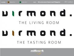
mvirmond says :
not too bad.
I really like how you bring the V and D in a symmetrical shape to one another.
also, i like how it's nice and clean.
however, a bit too modern for my taste. i guess it's the geometrical precision that makes it almost a bit "sci-fi", if you know what i mean.
also, a little spelling mistake there: "Tasting".
Finally, i was going to add a . at the end of Virmond.
-
Millwork says
Thanks, Mvirmond for the feedback!
-
This contest is finished. Its not possible to reply anymore.
-

