Lettering/logo and menu template for restaurant
Contest details:
- Contest holder: mvirmond
- Category: Logo & stationery
- Total budget: € 400.00
- Start date : 07-07-2013 11:38
- Ending date : 31-07-2013 11:34
- Status : Ended
- Required formats: jpg,ai,
- Relevant files: None
-
Available languages:


- Number of designs: 83
-
Response rate:
low high
Needs:
What we need is a graphic design of the names ("Virmond.", "The Tasting Room", "The Living Room"). This can be just the words themselves nicely designed or it can be supplemented with a logo. Furthermore, we are looking for a menu template (just one page), illustrating font types, placement of logo etc., so that it all looks nice and appealing.
Company description:
Our two guestrooms are right next to each other. Combined, we will offer up to 100 seats.
Out positioning: We are offering high quality food (from fresh ingredients, all home-made, meat from happy animals etc.) at a reasonable price. Our atmosphere is meant to be rather uncomplicated (no tablecloths, somewhat relaxed service), but nevertheless professional. Our wine offering is designed for individualists: We will be selling wine from small, unknown producers who work with a lot of passion to make quality wines.
Target group:
Target customers: Primarily business people. In the immediate vicinity there are large office buildings (insurance and tech companies). In other words our customers will range from "suit and tie" to call center agents. Furthermore, we mean to appeal to people living in the area. That would typically be above median income people, aged 30-50.
Colors, favourites and other requirements
Generally no restrictions.
Lettering/logo will have to be fixed in a particular horizontal area in the shopping window. That means a portrait format would be difficult.
Thoughts on the menu: Front page will feature some 20 dishes, each with a recommended wine. Back page will feature some 20 wines, each with a recommended dish. Menu will be printed on heavy paper - without much further ado.
Mapstone88
-
-
Description by designer Mapstone88:
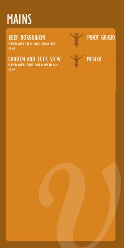
I also reworked the menu format to make it simpler. As you can see each dish as a recommended wine to the left highlighted by the corkscrew symbol.Should get approx ten dishes on this side. with a bifold format menu we can easily fit 20 dishes and have room on the back for further info if you wish
-
This contest is finished. Its not possible to reply anymore.
-
-
-
Description by designer Mapstone88:
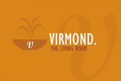
I also reworked the living room logo. Replaced the fork with the dish to fit in more appropriately with your menu. Replaced the flames also with softer steam lines. Hope you like the improvements
-
This contest is finished. Its not possible to reply anymore.
-
-
-
Description by designer Mapstone88:
Hi
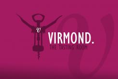
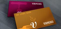
Following your feedback i have reworked my proposal. ditched the old style corkscrew for a more modern style to help lose the traditional vide. This image also shows how it can work horizobtally for your windows and business cards etc.
Kind Regards
Anthony -
This contest is finished. Its not possible to reply anymore.
-
-
-
Description by designer Mapstone88:
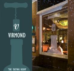
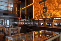
This image shows how the logo could work in a window, also had a play around with colour varaitions to show you what can be achieved.
-
This contest is finished. Its not possible to reply anymore.
-
-
-
No comments
-
This contest is finished. Its not possible to reply anymore.
-
-
-
No comments
-
This contest is finished. Its not possible to reply anymore.
-
-
-
Description by designer Mapstone88:
Hi agagin,
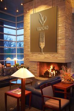
i have created some more imagery to help vusualize how my proposal can be utilized. Hope you like them -
mvirmond says :
very nice!
-
This contest is finished. Its not possible to reply anymore.
-
-
-
Description by designer Mapstone88:
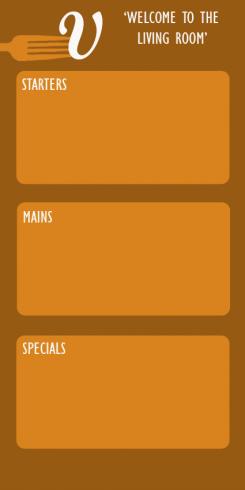
Here is the back view of the virmond living room menu. Depending on the size of the menu/variet of dishes on offer we may b=nned to go for a differnt menu format (open up style) dpending on the content to go in the menu itself, but this should give you an idea of whats possible with this propsoal. Agaion any feedback would be greatly appreciated
Anthony -
This contest is finished. Its not possible to reply anymore.
-
-
-
Description by designer Mapstone88:
Here is my proposal for the virmond living room. I went for a a format/layout that tied in with the tasting room but used fork imagery instead. You said you serve hearty food and that to me conjures images of hot food hence the steam imagery. Once again the 'V' is incorporated. i went for a warm rustic colour but again this can be adapted to suit.
-
mvirmond says :
i like your thoughts on this.
two issues here: this is a place which will mostly feature spoons, rather than forks. and the flame is not really the right association (although I can see where you are coming from). it reminds me too much of an open grill I guess.
also, again, the vertical format is less than ideal. -
This contest is finished. Its not possible to reply anymore.
-
-
-
Description by designer Mapstone88:
Here is a draft of the back of the wine menu. I went for wine stain imagery so the imagery was subtle on this side as not to take away from the content
-
mvirmond says :
a bit too playful - could be slightly simpler and more classic
also, the format needs to have space for quite a few items -
This contest is finished. Its not possible to reply anymore.
-
-
-
Description by designer Mapstone88:
Hi,
Please find attached my proposal for virmond tasting room. Ive gone for a rustic old fashioned corksrew with the 'V' symbol on the cork. I think the V is simple but distinctive and can be the theme of the whole project. With the colour i went again with rustic deep shade, but the colour can be adapted to suit easily depending on your preference. I hope you like it. Feel free to feedback if possible
Kind regards,
Anthony -
mvirmond says :
great design - thanks a lot.
I like the simple design and clear shapes.
Maybe a bit too much on the traditional side (with this old school cork screw), but still very nice overall.
the vertical design poses a bit of a problem as my windows only have a narrow horziontal area for printing.
the name is "Virmond.", not "Virmond", by the way.
-
Mapstone88 says
Great. Thank you so much for your feedback. I have a few ideas as to how I can get over the horizontal window issue and some ideas to make the proposal less traditional also. I will get back to it ASAP. Thanks again
-
This contest is finished. Its not possible to reply anymore.
-

