Lettering/logo and menu template for restaurant
Contest details:
- Contest holder: mvirmond
- Category: Logo & stationery
- Total budget: € 400.00
- Start date : 07-07-2013 11:38
- Ending date : 31-07-2013 11:34
- Status : Ended
- Required formats: jpg,ai,
- Relevant files: None
-
Available languages:


- Number of designs: 83
-
Response rate:
low high
Needs:
What we need is a graphic design of the names ("Virmond.", "The Tasting Room", "The Living Room"). This can be just the words themselves nicely designed or it can be supplemented with a logo. Furthermore, we are looking for a menu template (just one page), illustrating font types, placement of logo etc., so that it all looks nice and appealing.
Company description:
Our two guestrooms are right next to each other. Combined, we will offer up to 100 seats.
Out positioning: We are offering high quality food (from fresh ingredients, all home-made, meat from happy animals etc.) at a reasonable price. Our atmosphere is meant to be rather uncomplicated (no tablecloths, somewhat relaxed service), but nevertheless professional. Our wine offering is designed for individualists: We will be selling wine from small, unknown producers who work with a lot of passion to make quality wines.
Target group:
Target customers: Primarily business people. In the immediate vicinity there are large office buildings (insurance and tech companies). In other words our customers will range from "suit and tie" to call center agents. Furthermore, we mean to appeal to people living in the area. That would typically be above median income people, aged 30-50.
Colors, favourites and other requirements
Generally no restrictions.
Lettering/logo will have to be fixed in a particular horizontal area in the shopping window. That means a portrait format would be difficult.
Thoughts on the menu: Front page will feature some 20 dishes, each with a recommended wine. Back page will feature some 20 wines, each with a recommended dish. Menu will be printed on heavy paper - without much further ado.
Creator
-
-
Description by designer Creator:
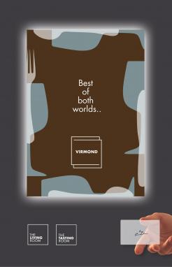
And this could be a presentation guide for the Virmont "groupe".
Most regards, Ted -
This contest is finished. Its not possible to reply anymore.
-
-
-
Description by designer Creator:
Thanks for the appreciation, not much time left to show how this could evolve and develop but I try to give you a "glance" of what is possible. If you want to see more you could send me a private message with your emailadress so it gives me a little more time to perfection.
Good luck with your choice! -
Creator says
So you see the front of the menucard and the back. If people are in the Living room they will get the winecard I can imagine with the vicaversa message on the back (to invite them in the restaurant).
Most regards, Ted -
This contest is finished. Its not possible to reply anymore.
-
-
-
Description by designer Creator:
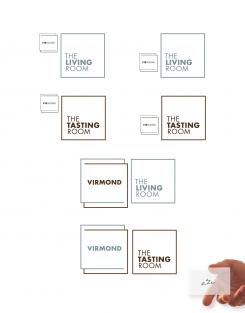
And from there on all possible combinations can be made...
-
This contest is finished. Its not possible to reply anymore.
-
-
-
Description by designer Creator:
Dear MVirmond,
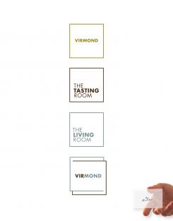
Hereby I present my idea for your compagny(s). No shiny mockups to let you surrender, just a simple basic idea. With the boxes standing for "rooms".
2 options for Virmont. The first (top) is a differentiation in colour. The one on the downside is a mixture from the 2 in the middle. I hope it appeals to your need.
Looking forward to your reaction
Most Regards
Ted -
This contest is finished. Its not possible to reply anymore.
-


