Logo and corporate identity for
Contest details:
- Contest holder: Lumerro
- Category: Logo & stationery
- Total budget: € 150.00
- Start date : 05-10-2014 09:58
- Ending date : 09-10-2014 12:00
- Status : Ended
- Required formats: jpg,ai,pdf
- Relevant files: None
-
Available languages:


- Number of designs: 32
-
Response rate:
low high
Needs:
As already mentioned, the name of our company "Lumerro" with the accompanying slogan "Light up your world" The logo should not be too crazy, we prefer to see our name in a distinctive color and letter combination instead of all kinds of "additions" but let this not stop you to come up with creative ideas. We would like to see a stylish logo but not with curly letters or something.
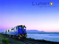
There are two images that have been added, these two images we want to use in our advertising frequently. Our website will also be inspired by these colors. It is therefore a must that the logo combines with the picture. One of the images is the orignal file you can use the other is an example of an idea what we had to combine our own logo and image. This combination we want to use in our booth at trade shows.
The reason that we chose to use this image is that there is a train on it which obviously needs no further explanation, but more importantly in the picture you have beautiful light and that is exactly what we are trying to simulate.
Company description:
Lumerro is a specialist in making electronics that simulate day and night cycles for modelrailroads. things like mimicking sunrises and starry skies. Currently we are expanding our products to simulate different weather conditions and corresponding sound. A good example is a thunderstorm, complete with thunder and lightning. The addition of sound makes it possible to get even more on the layout. Now we can add singing birds and noisy streets
Target group:
Our target group are people who are into in railroading / model trains. The focus is primarily on modeling associations and individuals with a large railroad at home. These are often older men but we see that the younger generation model railroaders is specially interested in our products. Many of our customers are in Germany, but we sell throughout Europe.
Colors, favourites and other requirements
The logo must combine with the added image.
The slogan "Light up your world" should also have a place.
No crazy additions to the logo as trains or suns.
The focus is on the design of a logo, but we also need a stationery, business cards and a favicon. It would also be useful if you could create a color scheme. Our website (and other promotional materials)
V.
-
-
Description by designer V.:
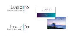
Bij dit ontwerp verbeelden de beide 'r'en de rails/wissel.
Met vriendelijke groet,
Viola vd Akker -
Lumerro says :
Best een leuk idee kun je is proberen om van de "Wissels" een meer in het oogspringend sybool te maken. Kleurstelling bevalt me trouwens.
-
This contest is finished. Its not possible to reply anymore.
-
-
-
Lumerro says :
Met dat felle groen er bij staat moeier als de vorige kleurstellingen vind ik.
-
This contest is finished. Its not possible to reply anymore.
-
-
-
Description by designer V.:
Beste opdrachtgever,
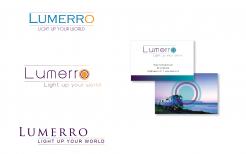
bijgaand een voorstel voor het logo voor Lumerro. De lijnen boven en onder de tekst stellen b.v. de rails voor. De O een licht.
Ik heb er ook een weergave bijgemaakt voor een visitekaartje.
Met vriendelijke groet,
Viola vd Akker -
Lumerro says :
De bovenste en onderste logos vind ik zelf niet zo veel. Wel vind ik het subtile oranje in die streep goed staan. De middelste kan wel werken maar mischien is het logo te algemeen, mischien kun je er nog een variaties op bedenken.
In ieder geval vind ik het visiete kaartje er netjes uitzien qwa kleur en indeling. -
This contest is finished. Its not possible to reply anymore.
-


