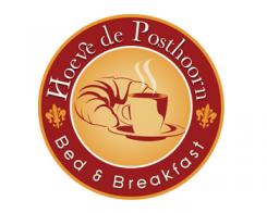
Logo and corporate identity for Bed and Breakfast
Contest details:
Silver
- Contest holder: cocange
- Category: Logo & stationery
- Total budget: € 349.00
- Start date : 20-09-2013 19:16
- Ending date : 04-10-2013 19:08
- Status : Ended
- Required formats: jpg,ai,pdf
- Relevant files: None
-
Available languages:


- Number of designs: 58
-
Response rate:
low high
Needs:
Company description:
In the middle of the the Green Heart is farm 'Hoeve de posthoorn' A monumental farm on the river bank of the Old Rhine. Here guests will be pampered and surprised!
'Hoeve de Posthoorn' features two monumental guestaccomodations with privacy and comfort. Each with a unique decor and atmosphere.
'Het HooiHuys'(1-6 persons) is a former haystack and named the best B & B in 2013 in the highest category 5 classifactie tulips in June 2013.
'De Deel' (1-5 persons) is arranged on the spot where once stood the cows in the barn.
Breakfast
An important part of the Bed & Breakfast. We serve a delicious breakfast with regional products and farm-fresh eggs from our own chickens.
swimming pool
The former milking parlor has been converted to a heated outdoor pool with a terrace with comfortable lounge chairs.
Størvatt hottubs
Both accommodations have a wood fired hot tub for guests to rent.
packages
We offer our guests different, fully catered packages: hiking package, sculpture workshop, pamper with a massage or a boattour on the Old Rhine. And a special wedding package!
Future: we are always looking for future expansion with the keywords pamper and surprise are decisive. Future buildings will need to have a monumental background and get a country chic décor.
For more information: www.hoevedeposthoorn.nl
Target group:
The target group is very versatile:
- families
- friends
- couples
The average age of the person who booked the range of 40 - 45 years.
Social class: A - B1 and B2
Colors, favourites and other requirements
NO: image of a horn!
and no wood patron!
DO: freedom of the designer
rapnex
-
-
cocange says :
Thank you for you design. Its nice but not special. We are looking for a unique fresh and modern design.
maybe you can adapt the logo a bit and place a chicken on the inside (popping out of the circle) and change the colors (the green from our business cards?). and how does it look with a modern font? -
cocange says :
Sorry too much starbucks, coffee house logo; not B&B
-
This contest is finished. Its not possible to reply anymore.
-

