Logo and Design for Catering Company
Contest details:
Gold
- Contest holder: mvirmond
- Category: Logo & stationery
- Total budget: € 449.00
- Start date : 02-10-2012 18:08
- Ending date : 12-10-2012 17:55
- Status : Ended
- Required formats: jpg,psd,für Visitenkarten, Broschüren und Guidelines sind möglich: Word, Pages, PDF, Powerpoint oder Keynote
- Relevant files: None
-
Available languages:


- Number of designs: 221
-
Response rate:
low high
Needs:
Specifically, final submissions should include:
- Logo
- Color scheme (e.g. for our website)
- Brief guidelines für using logo, colors and fonts
- Template for business cards
- Template for brochures
You may initially submit just the logo. We will provide feedback on a regular basis. If we like the logo (4-5 stars) you can submit the remaining elements later (however, please submit them BEFORE the competition finishes).
Company description:
We are offering catering for companies/offices in central Switzerland (esp. Kanton Zug).
In particular, we offer lunch options (initially salads, sandwiches, juices, desserts), at a later stage potentially expanding into other product groups and services/delivery times. All orders are placed online.
We aim to position ourselves with high quality, fresh, tasty, healthy/light products, at a very affordable price.
Additional brand attributes include: regional (central Switzerland), innovative, reliable, clean/hygienic.
Our brand name includes "essen" (German for food), "essence" as well as "sense"/"senses".
Target group:
Our target customers are business people/office workers in central Switzerland, i.e. above average income, appreciative of quality, international mix.
We aim to target in particular those customers who are looking for high quality, healthy food.
Colors, favourites and other requirements
There are no restrictions for the logo design, we are open to all suggestions.
If the logo does not contain the brand name "essense" (capital letter spelling still tbd) in writing, your suggestion should also include a graphic design for the actual brand name.
The color scheme should include a suggestion which colors (RGB codes or similar) to use for background, highlighting, buttons, writing etc.
Guidelines should outline in a few bullet points how to use logo and color scheme (e.g. which background colors can the logo be placed on), as well as a suggestion for one (or more) font types (ideally standard fonts), and potentially other suggestions (at your discretion).
The brochure template will be used primarily for a summary of our offering and the company, presumably in a simple A4-portait-format - so this is not a flyer or anything fancy. Just simple application of the above logo and design (same for business card)
mikidejanovic
-
-
Description by designer mikidejanovic:
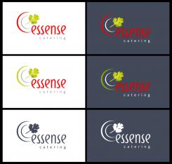
Logo variation
-
This contest is finished. Its not possible to reply anymore.
-
-
-
No comments
-
This contest is finished. Its not possible to reply anymore.
-
-
-
Description by designer mikidejanovic:
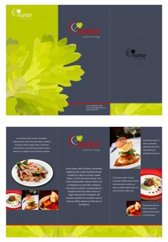
Template for brochures
-
This contest is finished. Its not possible to reply anymore.
-
-
-
Description by designer mikidejanovic:
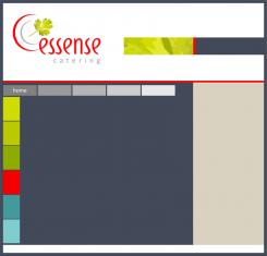
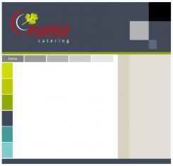
Color Scheme for website
-
mvirmond says :
that could work - nice
what if we were to do a white header and footer instead? I like that combination as well -
This contest is finished. Its not possible to reply anymore.
-
-
-
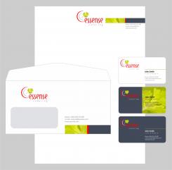
mvirmond says :
very nice. i didn't actually ask for an envelope design but I appreciate the effort.
nice idea with the coriander/red/grey bar. I like it. -
This contest is finished. Its not possible to reply anymore.
-
-
-
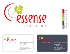
Description by designer mikidejanovic:
This is a logo and business card. I work and materials. Tell me if I'm going in the right direction in terms of color
-
mvirmond says :
you do. i think the strong red and green contrast nicely with each other, both on the white and the grey background. looks very professional.
I also quite like the business card design. not too crowded, clean, professional. nice job.
I am unsure about the color scheme. I mean I like the colors but I am wondering: for designing the website I assume I might need some more subtle colors as well (for backgrounds for example). otherwise pretty good! -
This contest is finished. Its not possible to reply anymore.
-
-
-
No comments
-
This contest is finished. Its not possible to reply anymore.
-
-
-
mvirmond says :
the upper version is quite nice - one of my absolute favorites so far.
Love the coriander leaf and the hint of a plate logo - very fresh, very subtle.
and a nice font. Maybe you can make the colors a bit more powerful (that's what I liked about the other design with the grey/red colors).
Apart from that, I would suggest you expand the design into the full set (colors, business cards etc.).
the lower version is a bit boring I find. -
This contest is finished. Its not possible to reply anymore.
-
-
-
mvirmond says :
Great style as well. Overall, I like the later version better. But maybe there's a merged version of the two. I find it very nice how the leaf sticks out of the e. plus I love the colors of the lower version - very powerful.
-
This contest is finished. Its not possible to reply anymore.
-
-
-
mvirmond says :
love the hand written font style - but not the logo
-
mvirmond says :
again, maybe you can make something more of the hand drawn style. I think that's very up to date. But overall, the logo won't make final selection
-
This contest is finished. Its not possible to reply anymore.
-
-
-
No comments
-
This contest is finished. Its not possible to reply anymore.
-
-
-
No comments
-
This contest is finished. Its not possible to reply anymore.
-
-
-
No comments
-
This contest is finished. Its not possible to reply anymore.
-
-
-
mvirmond says :
we like the font style and the open E.
but it looks more like hot food with the waves going up. -
This contest is finished. Its not possible to reply anymore.
-

