Logo and Design for Catering Company
Contest details:
Gold
- Contest holder: mvirmond
- Category: Logo & stationery
- Total budget: € 449.00
- Start date : 02-10-2012 18:08
- Ending date : 12-10-2012 17:55
- Status : Ended
- Required formats: jpg,psd,für Visitenkarten, Broschüren und Guidelines sind möglich: Word, Pages, PDF, Powerpoint oder Keynote
- Relevant files: None
-
Available languages:


- Number of designs: 221
-
Response rate:
low high
Needs:
Specifically, final submissions should include:
- Logo
- Color scheme (e.g. for our website)
- Brief guidelines für using logo, colors and fonts
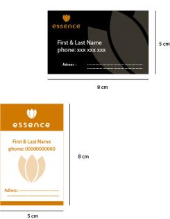
- Template for business cards
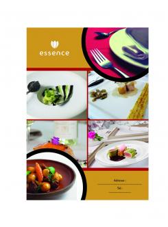
- Template for brochures
You may initially submit just the logo. We will provide feedback on a regular basis. If we like the logo (4-5 stars) you can submit the remaining elements later (however, please submit them BEFORE the competition finishes).
Company description:
We are offering catering for companies/offices in central Switzerland (esp. Kanton Zug).
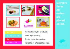
In particular, we offer lunch options (initially salads, sandwiches, juices, desserts), at a later stage potentially expanding into other product groups and services/delivery times. All orders are placed online.
We aim to position ourselves with high quality, fresh, tasty, healthy/light products, at a very affordable price.
Additional brand attributes include: regional (central Switzerland), innovative, reliable, clean/hygienic.
Our brand name includes "essen" (German for food), "essence" as well as "sense"/"senses".
Target group:
Our target customers are business people/office workers in central Switzerland, i.e. above average income, appreciative of quality, international mix.
We aim to target in particular those customers who are looking for high quality, healthy food.
Colors, favourites and other requirements
There are no restrictions for the logo design, we are open to all suggestions.
If the logo does not contain the brand name "essense" (capital letter spelling still tbd) in writing, your suggestion should also include a graphic design for the actual brand name.
The color scheme should include a suggestion which colors (RGB codes or similar) to use for background, highlighting, buttons, writing etc.
Guidelines should outline in a few bullet points how to use logo and color scheme (e.g. which background colors can the logo be placed on), as well as a suggestion for one (or more) font types (ideally standard fonts), and potentially other suggestions (at your discretion).
The brochure template will be used primarily for a summary of our offering and the company, presumably in a simple A4-portait-format - so this is not a flyer or anything fancy. Just simple application of the above logo and design (same for business card)
akbour said
-
-
No comments
-
This contest is finished. Its not possible to reply anymore.
-
-
-
No comments
-
This contest is finished. Its not possible to reply anymore.
-
-
-
No comments
-
This contest is finished. Its not possible to reply anymore.
-
-
-
mvirmond says :
much better. could even be something. i like the smiling lips, that's a completely new idea for this contest. not yet a 4- or 5*-rating, but it has some potential
-
This contest is finished. Its not possible to reply anymore.
-
-
-
No comments
-
This contest is finished. Its not possible to reply anymore.
-
-
-
No comments
-
This contest is finished. Its not possible to reply anymore.
-
-
-
mvirmond says :
wow - you're still not spelling "essense" correctly, and we're still not a restaurant but a pure play caterer...
-
This contest is finished. Its not possible to reply anymore.
-
-
-
Description by designer akbour said:
meaning:
range, or
chef hat.
signification :
fourchette,ou bien
chapeau de chef cuisinier -
mvirmond says :
thanks for the suggestion -
you still spell essense incorrectly (i would suggest you update your earlier design with the correct spelling at some point). plus we do catering, not a restaurant.
finally, the black and white is not what we are looking for...
so sorry, but this one really does not work for me -
This contest is finished. Its not possible to reply anymore.
-
-
-
No comments
-
This contest is finished. Its not possible to reply anymore.
-
-
-
No comments
-
This contest is finished. Its not possible to reply anymore.
-
-
-
mvirmond says :
not sure i understand the logo
-
mvirmond says :
not sure i understand the logo
-
This contest is finished. Its not possible to reply anymore.
-
-
-
mvirmond says :
love the simplicity and the fresh colors.
-
mvirmond says :
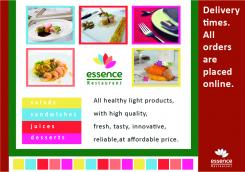
nice design. and I think the full design set really brings the whole thing to life quite nicely. I don't see it in the top 3 yet, but it still has potential to win. So I'll keep it at 4 stars for now.
-
mvirmond says :
again, I would correct the spelling if you want to have any chance of winning this...
-
This contest is finished. Its not possible to reply anymore.
-
-
-
mvirmond says :
i get idea of high quality - but i think the french lily is just too oldfashioned. we need to come across as young, fresh and not pompous.
-
This contest is finished. Its not possible to reply anymore.
-
-
-
mvirmond says :
not sure i get the logo
-
This contest is finished. Its not possible to reply anymore.
-

