Logo and Design for Catering Company
Contest details:
Gold
- Contest holder: mvirmond
- Category: Logo & stationery
- Total budget: € 449.00
- Start date : 02-10-2012 18:08
- Ending date : 12-10-2012 17:55
- Status : Ended
- Required formats: jpg,psd,für Visitenkarten, Broschüren und Guidelines sind möglich: Word, Pages, PDF, Powerpoint oder Keynote
- Relevant files: None
-
Available languages:


- Number of designs: 221
-
Response rate:
low high
Needs:
Specifically, final submissions should include:
- Logo
- Color scheme (e.g. for our website)
- Brief guidelines für using logo, colors and fonts
- Template for business cards
- Template for brochures
You may initially submit just the logo. We will provide feedback on a regular basis. If we like the logo (4-5 stars) you can submit the remaining elements later (however, please submit them BEFORE the competition finishes).
Company description:
We are offering catering for companies/offices in central Switzerland (esp. Kanton Zug).
In particular, we offer lunch options (initially salads, sandwiches, juices, desserts), at a later stage potentially expanding into other product groups and services/delivery times. All orders are placed online.
We aim to position ourselves with high quality, fresh, tasty, healthy/light products, at a very affordable price.
Additional brand attributes include: regional (central Switzerland), innovative, reliable, clean/hygienic.
Our brand name includes "essen" (German for food), "essence" as well as "sense"/"senses".
Target group:
Our target customers are business people/office workers in central Switzerland, i.e. above average income, appreciative of quality, international mix.
We aim to target in particular those customers who are looking for high quality, healthy food.
Colors, favourites and other requirements
There are no restrictions for the logo design, we are open to all suggestions.
If the logo does not contain the brand name "essense" (capital letter spelling still tbd) in writing, your suggestion should also include a graphic design for the actual brand name.
The color scheme should include a suggestion which colors (RGB codes or similar) to use for background, highlighting, buttons, writing etc.
Guidelines should outline in a few bullet points how to use logo and color scheme (e.g. which background colors can the logo be placed on), as well as a suggestion for one (or more) font types (ideally standard fonts), and potentially other suggestions (at your discretion).
The brochure template will be used primarily for a summary of our offering and the company, presumably in a simple A4-portait-format - so this is not a flyer or anything fancy. Just simple application of the above logo and design (same for business card)
mrun
-
-
Description by designer mrun:
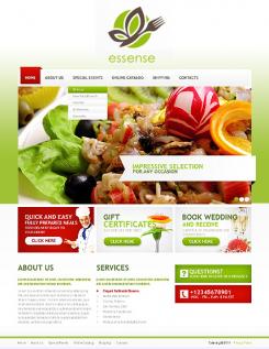
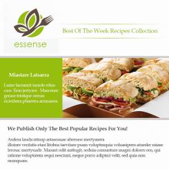
website template 1
-
mvirmond says :
very nice! light, fresh, yet intense.
if i had to criticise something, i would say it lacks a bit of creativity. red and green are such obvious colors... but i have to say i like it nevertheless -
mrun says
hi there,
i do really appreciate your comments and criticisms!!
unfortunatelly, i can't upload any more files coz i reached the limit (15 files) allowed by this website!!!
if i have the chance to win, i promise i wont disappoint you and even exceed your expectations ;o)
i'm a very skilled designer with over 10 years of experiences, i know in and out the e-commerce field, i'm currentelly the IT managing directer of a Spanish company based in Spain and noth of Afarica, here are some of my latest work :
http://www.vafameg.com/
http://www.kamagra-center.com/
http://www.3dp-online.com/
http://www.arcadtechnologie.com/
http://grogodeal.com/deals/ --> (under construction)
http://www.transcal-he.com/
and many many more...so please don't hesitate to contact me for any inquiry you may have and discuss any possible future cooperation.
yassine (aka mrun)
yassine.bouchrit@gmail.com
wishing you good luck and success in your business !!!
-
This contest is finished. Its not possible to reply anymore.
-
-
-
Description by designer mrun:
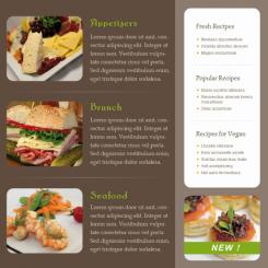
brochure template page 2 version B
-
This contest is finished. Its not possible to reply anymore.
-
-
-
Description by designer mrun:
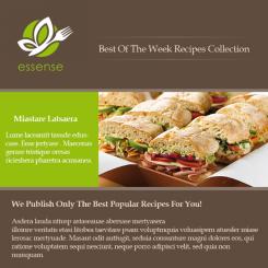
brochure template page 1 version B
-
This contest is finished. Its not possible to reply anymore.
-
-
-
Description by designer mrun:
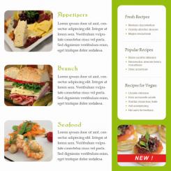
brochure template page 2 version A
-
mvirmond says :
i think i prefer this over the brown version.
could you also comment on the exact color scheme used? -
This contest is finished. Its not possible to reply anymore.
-
-
-
Description by designer mrun:
brochure template page 1 version A
-
mvirmond says :
love it. could you please comment on the font type used?
-
This contest is finished. Its not possible to reply anymore.
-
-
-
Description by designer mrun:
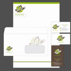
sample letter head
-
mvirmond says :
nice!
-
This contest is finished. Its not possible to reply anymore.
-
-
-
Description by designer mrun:
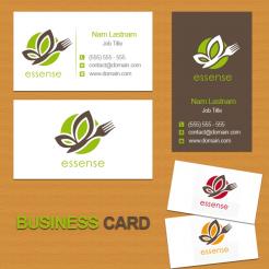
business card template
-
mvirmond says :
a bit too playful i find. I have a preference for really simple, almost minimalistic business cards.
-
This contest is finished. Its not possible to reply anymore.
-
-
-
Description by designer mrun:
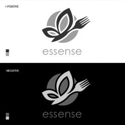
logo monochromatic
-
mvirmond says :
what if you could use black, white and actual color?
-
This contest is finished. Its not possible to reply anymore.
-
-
-
Description by designer mrun:
logo color sheme
Please copy and paste the link below into your web browser to see all these designs in a good resolution :
http://www.smatechnologie.com/essense/ -
This contest is finished. Its not possible to reply anymore.
-
-
-
mrun says
click on this link to see the HD version :
http://www.smatechnologie.com/essense/proposition_b4.jpg -
This contest is finished. Its not possible to reply anymore.
-
-
-
mrun says
click on this link to see the HD version :
http://www.smatechnologie.com/essense/proposition_b3.jpg
-
This contest is finished. Its not possible to reply anymore.
-
-
-
mrun says
click on this link to see the HD version :
http://www.smatechnologie.com/essense/proposition_b2.jpg
-
This contest is finished. Its not possible to reply anymore.
-
-
-
mrun says
click on this link to see the HD version :
http://www.smatechnologie.com/essense/proposition_b1.jpg
-
mvirmond says :
One of my favorites so far. Love the butterfly/fork combination as well as the color sets (and it would be easy to play around with additional colors).
May I suggest that you expand this into the full design set (with business card templates and everything)? Would like to see it as part of the final selection. -
mrun says
Thanks a million for choosing my crea!!
The butterfly is a strong symbol of the variety of what you offer and the butterfly/fork combination shows easily your activity and that you’re offering food that comes from Mother Nature!!
The concept of this creation is widely open for the future of your activity and as you said it would be easy to play around with additional colors and for example specify each color for different categories, deserts, salads and so one!!!
I promise that I will exceed your expectation ;o)
Sorry for my terrible english ! -
This contest is finished. Its not possible to reply anymore.
-
-
-
mrun says
click on this link to see the HD version :
http://www.smatechnologie.com/essense/proposition_a2.jpg
-
mvirmond says :
it's quite nice I think. the yin/yang gives it a very nice spiritual aspect. But not quite nice enough to make my top 3-4 selection at this point. I would like to keep it as a 4* rating for now.
-
This contest is finished. Its not possible to reply anymore.
-
-
-
mrun says
click on this link to see the HD version :
http://www.smatechnologie.com/essense/proposition_a1.jpg
-
This contest is finished. Its not possible to reply anymore.
-

