Logo and Design for Catering Company
Contest details:
Gold
- Contest holder: mvirmond
- Category: Logo & stationery
- Total budget: € 449.00
- Start date : 02-10-2012 18:08
- Ending date : 12-10-2012 17:55
- Status : Ended
- Required formats: jpg,psd,für Visitenkarten, Broschüren und Guidelines sind möglich: Word, Pages, PDF, Powerpoint oder Keynote
- Relevant files: None
-
Available languages:


- Number of designs: 221
-
Response rate:
low high
Needs:
Specifically, final submissions should include:
- Logo
- Color scheme (e.g. for our website)
- Brief guidelines für using logo, colors and fonts
- Template for business cards
- Template for brochures
You may initially submit just the logo. We will provide feedback on a regular basis. If we like the logo (4-5 stars) you can submit the remaining elements later (however, please submit them BEFORE the competition finishes).
Company description:
We are offering catering for companies/offices in central Switzerland (esp. Kanton Zug).
In particular, we offer lunch options (initially salads, sandwiches, juices, desserts), at a later stage potentially expanding into other product groups and services/delivery times. All orders are placed online.
We aim to position ourselves with high quality, fresh, tasty, healthy/light products, at a very affordable price.
Additional brand attributes include: regional (central Switzerland), innovative, reliable, clean/hygienic.
Our brand name includes "essen" (German for food), "essence" as well as "sense"/"senses".
Target group:
Our target customers are business people/office workers in central Switzerland, i.e. above average income, appreciative of quality, international mix.
We aim to target in particular those customers who are looking for high quality, healthy food.
Colors, favourites and other requirements
There are no restrictions for the logo design, we are open to all suggestions.
If the logo does not contain the brand name "essense" (capital letter spelling still tbd) in writing, your suggestion should also include a graphic design for the actual brand name.
The color scheme should include a suggestion which colors (RGB codes or similar) to use for background, highlighting, buttons, writing etc.
Guidelines should outline in a few bullet points how to use logo and color scheme (e.g. which background colors can the logo be placed on), as well as a suggestion for one (or more) font types (ideally standard fonts), and potentially other suggestions (at your discretion).
The brochure template will be used primarily for a summary of our offering and the company, presumably in a simple A4-portait-format - so this is not a flyer or anything fancy. Just simple application of the above logo and design (same for business card)
IQBrands
-
-
Description by designer IQBrands:
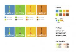
And finally: discription of colours, fonts and design-elements.
-
mvirmond says :
we like the colors and like the font.
however, could you add a few suggestions for even lighter background colors in addition?
futhermore, if myriad is not available, which really standard font would you revert to? -
IQBrands says
If Myriad is not available you can use the free Google font: Lato or Source Sans pro. You can find these fonts at: http://www.google.com/webfonts.
-
This contest is finished. Its not possible to reply anymore.
-
-
-
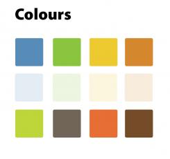
Description by designer IQBrands:
Dear mvirmond,
I have added a set of light colours to the standard set. -
mvirmond says :
rgb codes?
-
IQBrands says
Dear mvirmond,
great to hear you like all the designs! If you mark me as the winner of this contest, brandsupply wil send me an upload link for the designs.
I will package all designs, add rgb and/or cmyk codes and upload the files.
If you need any adjustments, just let me know (I'll send you an email address).
Thanks!! :-) -
This contest is finished. Its not possible to reply anymore.
-
-
-
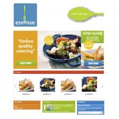
Description by designer IQBrands:
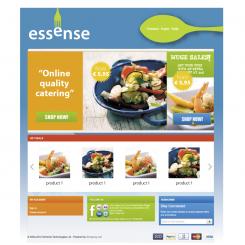
And website "Light" V2...
-
mvirmond says :
i love it.
would you be able to transfer hi-resolution files of all these designs? if yes, how would be do that? could you upload them to a public site? would you need an email adress? -
This contest is finished. Its not possible to reply anymore.
-
-
-
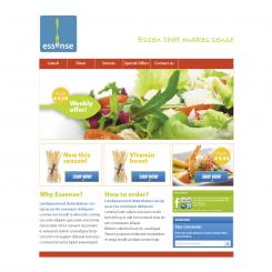
Description by designer IQBrands:
A "Light" version of the website ;-)
-
This contest is finished. Its not possible to reply anymore.
-
-
-
Description by designer IQBrands:
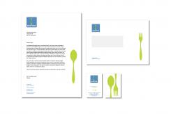
Dear mvirmond, please find herewith the adjusted businesscard. A bit more minimalistic and no print on the back.
-
This contest is finished. Its not possible to reply anymore.
-
-
-
Description by designer IQBrands:
And a scetch of how the website could look like...
-
mvirmond says :
very nice indeed. although we were thinking something even lighter, fresher. maybe on a white background instead of this intense blue. what do you thing?
-
This contest is finished. Its not possible to reply anymore.
-
-
-
Description by designer IQBrands:
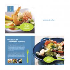
And.... the brochure.
-
mvirmond says :
love it
-
This contest is finished. Its not possible to reply anymore.
-
-
-
Description by designer IQBrands:
Dear mvirmand,
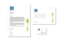
Please find herewith the stationary design for Essense. -
mvirmond says :
love the letterhead and envelope. for the business car, could you think of something a but more "minimalistic" and classic? probably portrait format, maybe just 1-sided print?
-
This contest is finished. Its not possible to reply anymore.
-
-
-
Description by designer IQBrands:
Dear mvirmond,
Please find herewith the altered design for essense.
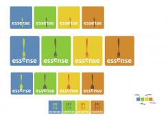
I have used new colours to represent the seasons and used a spoon as an alternative for the fork.
Hope you like it! ;-) -
mvirmond says :
love it. this is great stuff.
i "downgraded" your previous design to 3*, because we now have the right color set for this one.
I suggest you use this as the basis for the remaining elements of the job.
Color set will be interesting: keep in mind we are looking to design a website with a color set (which cannot change easily, so it should be the same all year). so we need colors for highlighting, for buttons, for background, shading etc. -
franky says
nice banning my logo (even that it was a free vector) and than using my color idea for summer autum etc....
-
This contest is finished. Its not possible to reply anymore.
-
-
-
Description by designer IQBrands:
Please find herewith an adjusted design for Essense.
-
mvirmond says :
one of my favorites so far!
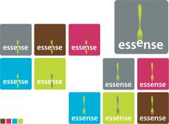
as a variation of this theme, we were thinking: change the color set to reflect the 4 seasons, so we could use them accordingly. And maybe make the word essense more unique in terms of design and then use the fork (or spoon, or chopsticks) in sort of a playful way, to have some variety. what do you think? -
IQBrands says
Dear mvirmond,
Thanks for the feedback! Good to hear you like the idea sofar. I'll use your comments to improve the logo ;-) -
mvirmond says :
Continues to be one of my absolute favorites! Esp. the version where the fork picks up the "e". Makes it fun, places the right emphasis, almost like an exclamation mark.
May I suggest you take this upper right version as a starting point, delete the rest, and develop a new color set and variations. I really don't like the magenta/mulberry or the cyan/blue. I find them too artificial for a food company. Like I said, colors that reflect the seasons could be nice. Or other variations. I think the logo really really lends itself to making variations. And since we are looking to introduce variety in our foods as well, this is much appreciated. Plus, as I suggested before, having variations with spoon, chopsticks or whatever else comes to your mind, would be great!
Happy to give additional feedback on any new version. However, please keep in mind that the contest will end soon, and I need the full submission set (with business card template and everything - see contest description) if I am to pick a winner. And I would very much like to see this design as part of the (very small) final selection to choose from. -
IQBrands says
Dear MVirmond, Great to hear you still like the designs! I will show you a few variations and design all requested items. Would be great to be part of the final selection...
-
This contest is finished. Its not possible to reply anymore.
-
-
-
Description by designer IQBrands:
Please find herewith my logodesign for Essense.
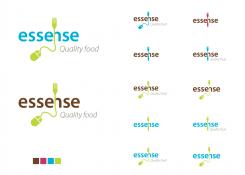
The logo symbolises the connection between online (ordering) and the food (fork). -
mvirmond says :
i like the idea, but the design is just not it. with the mouse and wire it just become a bit too "techie"
-
This contest is finished. Its not possible to reply anymore.
-

