Logo and Design for Catering Company
Contest details:
Gold
- Contest holder: mvirmond
- Category: Logo & stationery
- Total budget: € 449.00
- Start date : 02-10-2012 18:08
- Ending date : 12-10-2012 17:55
- Status : Ended
- Required formats: jpg,psd,für Visitenkarten, Broschüren und Guidelines sind möglich: Word, Pages, PDF, Powerpoint oder Keynote
- Relevant files: None
-
Available languages:


- Number of designs: 221
-
Response rate:
low high
Needs:
Specifically, final submissions should include:
- Logo
- Color scheme (e.g. for our website)
- Brief guidelines für using logo, colors and fonts
- Template for business cards
- Template for brochures
You may initially submit just the logo. We will provide feedback on a regular basis. If we like the logo (4-5 stars) you can submit the remaining elements later (however, please submit them BEFORE the competition finishes).
Company description:
We are offering catering for companies/offices in central Switzerland (esp. Kanton Zug).
In particular, we offer lunch options (initially salads, sandwiches, juices, desserts), at a later stage potentially expanding into other product groups and services/delivery times. All orders are placed online.
We aim to position ourselves with high quality, fresh, tasty, healthy/light products, at a very affordable price.
Additional brand attributes include: regional (central Switzerland), innovative, reliable, clean/hygienic.
Our brand name includes "essen" (German for food), "essence" as well as "sense"/"senses".
Target group:
Our target customers are business people/office workers in central Switzerland, i.e. above average income, appreciative of quality, international mix.
We aim to target in particular those customers who are looking for high quality, healthy food.
Colors, favourites and other requirements
There are no restrictions for the logo design, we are open to all suggestions.
If the logo does not contain the brand name "essense" (capital letter spelling still tbd) in writing, your suggestion should also include a graphic design for the actual brand name.
The color scheme should include a suggestion which colors (RGB codes or similar) to use for background, highlighting, buttons, writing etc.
Guidelines should outline in a few bullet points how to use logo and color scheme (e.g. which background colors can the logo be placed on), as well as a suggestion for one (or more) font types (ideally standard fonts), and potentially other suggestions (at your discretion).
The brochure template will be used primarily for a summary of our offering and the company, presumably in a simple A4-portait-format - so this is not a flyer or anything fancy. Just simple application of the above logo and design (same for business card)
Ilki
-
-
mvirmond says :
not quite it - with plates, cutlery and glasses, one could think we offer tablewares, not food.
-
This contest is finished. Its not possible to reply anymore.
-
-
-
mvirmond says :
nice, but there are too many other great ones already. this one won't make it... sorry
-
This contest is finished. Its not possible to reply anymore.
-
-
-
Description by designer Ilki:
Hier nochmal eine andere Variation.
-
This contest is finished. Its not possible to reply anymore.
-
-
-
Description by designer Ilki:
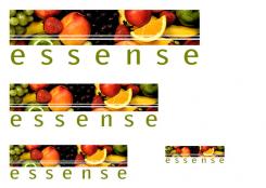
Hier habe ich die Form des Bildfensters verändert.
-
This contest is finished. Its not possible to reply anymore.
-
-
-
Description by designer Ilki:
Hier habe ich das Bildfenster nochmal vergrößert.
-
This contest is finished. Its not possible to reply anymore.
-
-
-
Description by designer Ilki:
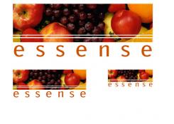
Schön das sie danach fragen, hier habe ich das erste Design nochmal in 3 Verschiedenen Größen hochgeladen, wobei diese größen im Druck selbst bei einer Visitenkarte nicht entsehen wird.
-
This contest is finished. Its not possible to reply anymore.
-
-
-
Description by designer Ilki:
Guten Tag,
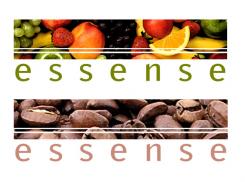
hier habe ich ein Design für sie entworfen, was sehr flexibel ist leicht zu verstehen und leicht lesbar.
Die Idee ist das Logo auf ihr Sortiment anpassen zu können, das heisst falls sie eine große Kuchentheke haben, können die Früchte durch Kuchen ersetzt werden, genauso geht das mit Kaffee, Tee, Sandwiches usw.
Der wiedererkennungs Wert bleibt, da der Aufbau immer der Selbe ist.
Ich zeige ihnen hier zwei Entwürfe, einmal den Hauptentwurf und ein Beispiel wo sich das Logo an ihr Sortiment, in diesem Fall Kaffee, anpasst.
Viel Spass und danke schonmal für ihre Antwort.
liebe Grüße
Ilki -
mvirmond says :
schöne idee - beim jetzigen design hätte ich noch das bedenken, dass die bilder in kleinem format nicht mehr erkennbar sind. müsste also etwas größere motive bekommen
-
This contest is finished. Its not possible to reply anymore.
-

