Logo and house style for newborn- and children photographer
Contest details:
Bronze
- Contest holder: corinehogebavel
- Category: Logo & stationery
- Total budget: € 249.00
- Start date : 28-11-2012 14:53
- Ending date : 17-12-2012 14:35
- Status : Ended
- Required formats: jpg,psd,ai,pdf
- Relevant files: None
-
Available languages:


- Number of designs: 108
-
Response rate:
low high
Needs:
Name of the website: Corine Fotografeert
(which means: Corine takes photos)
I'd like to see my name in a graceful font and the word Fotografeert in a more thight font.
Logo and house style will be used for:
website
cards
stationery/envelopes
flyers
gift vouchers
Company description:
I am a freelance photographer, specialized in newborn- and children's photography.
Check www.mynewbornisart.com for the style and colors I like. My work is very similar.
Children's photography will be done on location (woods, beach, old factory, et.)
Target group:
Colors, favourites and other requirements
I love naturals, but als vintage yellow, blue/green, brown and rose.
Inspiration: www.saffronavenue.com
Click Inspiration Gallery, click Color Inspiration.
The mood boards I like:
Vintage Glam (Jun. 01) Lovely!
Old Hollywood Charm (Mar. 07)
Awesome Bouquet (Apr. 20)
My Design A Board (Mar. 02)
Sweet and Saucy (Jan. 09) love the mint/green color
Hollywood Regency (Nov. 08), love the chandelier
Decor8Love (Jun. 04)
I do like vintage patterns, a bird, butterfly of flower may appear in the logo.
Good luck!
Website with vintage colors: www.everythingbloom.com (yellow, blue, grey, brown, pattern in the logo's)
Vega
-
-
Vega says
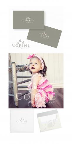
Hi Corina, I made a change in color ... I understand that you like the darker color of stripes in logo you like :), is this the color you're looking for? I made a presentation of envelopes as well, if you would like to edit something else I will be glad to show you. Best rigards, Vega.
-
Vega says
Hi Corine,I forgot something...the rosebud is a little bit smaler(the larges one), if you want me to shrink it a little bit more I will...
-
corinehogebavel says :
Hi Vega,
Looks beautiful! Like the envelope and it's nice to see that the watermark looks great on a photo.
The color you used on the card wasn't the one I meant, but I do like it though!
I meant a sof blue/grey vintage color (indeed like the stripes in the second logo of everytingbloom.com)
Also like the dark and light grey together in the rosebuds. Nicely done.
I think the largest rosebud has a good size this way (it still is a little bit taller than the other one)
I get back to you soon.
Thanks
Corine -
This contest is finished. Its not possible to reply anymore.
-
-
-
Description by designer Vega:
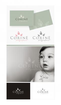
Hi Corina, I did updates on the work as it was written in your instructions, I hope I did not leave anything out. You have a view of the logo on a light gray background,on vintage blue-gray with cream rose buds, transparent logo image and black and white version ... If you have any ideas or suggestions feel free to leave a comment, thanks Vega.
-
corinehogebavel says :
Thanks!
Looks beautiful.
Did you make the largest rosebud a bit smaller?
Watermark looks great. Only the upper color is green on my computer instead of this light blue vintage color. (I like the blue color in the second logo (stripes) at this website: www.everytingbloom.com).
Corine -
This contest is finished. Its not possible to reply anymore.
-
-
-
No comments
-
This contest is finished. Its not possible to reply anymore.
-
-
-
Description by designer Vega:
Hi Corine, thanks for the comment.
I would ask you to leave me instructions in English if possible.
The logo is changed, my idea rosebud in vintage style
as the association of youth, something that has yet to bloom ...
-
corinehogebavel says :
Hi Vega,
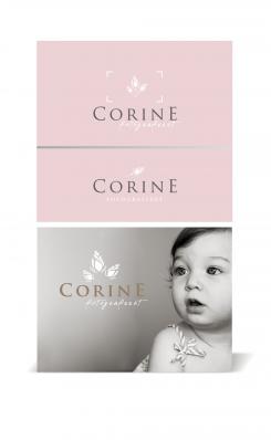
Like the idea of the rosebud very much! It's a beautiful logo. Very stylish, yet simple and clean.
Nice to see fotografeert in a writing font. Like this font a lot.
The one on the grey background looks beautiful to me: nice color for my name, combines with white. Do you think it will look good on a lighter grey background (the one that you used above with the colored flowers) or even a lighter grey. I would like to use a light grey background on my website.
The upper logo with the 'camera'is also nice. Maybe nice on stationery (Rosebuds could be used in different ways on stationery and giftvouchers etc.
The rose color is nice, but not for background color. Maybe for giftvouchers. I am curious if a warm blue/gray vintage color will be nice (look at www.everythingbloom.com I like the blue color in the second logo (with the vintage stripes).
Don't think I will use one of my potographs on my card, so that has to be only the logo.
I also need a watermark to put on my photo's in my webgallery. The one on the grey background will be good I think (maybe a little ligher, so it can be layd over the photo whithout taking important parts away of the photo)
If you have any further questions, please ask me.
Kind regards,
Corine -
corinehogebavel says :
Hi Vega,
After looking at your logo's for a while, I am sure I like the first one the most (with the grey background and child).
I have some specific questions:
Could you make the largest rosebud a little bit smaller? (but still larger than the right one). Think it is a little too big now.
The E can be a little bit closer to the N in my name.
I would like to see my name in the dark grey font you used at the rose background (this one is a little bit thinner than the green font, I like the thinner one and I like it in dark grey)
Would love to see a light grey background (3% black) and a vintage blue background (like I told you in my first mail).
Could you also tell me what this logo would do when I use it in black and white? For example: if I have to copy it for a magazine or flyer?
I'd love to see a housestyle too for my card, stationery, gift vouchers, etc.
Thank you very much.
Kind regards,
Corine -
This contest is finished. Its not possible to reply anymore.
-
-
-
corinehogebavel says :
Beste Vega,
Dit is niet wat ik zoek helaas. Zoals je kunt lezen in de beschrijving moet het een logo zijn dat niet alleen met newborn-fotografie geassocieerd wordt. Ik fotografeer ook kinderen/tieners op locatie en ga in de toekomst wellicht nog uitbreiden met andere soort fotografie.
Mvg,
Corine -
This contest is finished. Its not possible to reply anymore.
-

