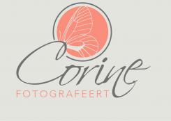
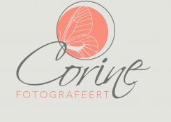
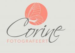
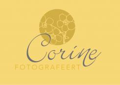
Logo and house style for newborn- and children photographer
Contest details:
Bronze
- Contest holder: corinehogebavel
- Category: Logo & stationery
- Total budget: € 249.00
- Start date : 28-11-2012 14:53
- Ending date : 17-12-2012 14:35
- Status : Ended
- Required formats: jpg,psd,ai,pdf
- Relevant files: None
-
Available languages:


- Number of designs: 108
-
Response rate:
low high
Needs:
Name of the website: Corine Fotografeert
(which means: Corine takes photos)
I'd like to see my name in a graceful font and the word Fotografeert in a more thight font.
Logo and house style will be used for:
website
cards
stationery/envelopes
flyers
gift vouchers
Company description:
I am a freelance photographer, specialized in newborn- and children's photography.
Check www.mynewbornisart.com for the style and colors I like. My work is very similar.
Children's photography will be done on location (woods, beach, old factory, et.)
Target group:
Colors, favourites and other requirements
I love naturals, but als vintage yellow, blue/green, brown and rose.
Inspiration: www.saffronavenue.com
Click Inspiration Gallery, click Color Inspiration.
The mood boards I like:
Vintage Glam (Jun. 01) Lovely!
Old Hollywood Charm (Mar. 07)
Awesome Bouquet (Apr. 20)
My Design A Board (Mar. 02)
Sweet and Saucy (Jan. 09) love the mint/green color
Hollywood Regency (Nov. 08), love the chandelier
Decor8Love (Jun. 04)
I do like vintage patterns, a bird, butterfly of flower may appear in the logo.
Good luck!
Website with vintage colors: www.everythingbloom.com (yellow, blue, grey, brown, pattern in the logo's)
renee
-
-
No comments
-
This contest is finished. Its not possible to reply anymore.
-
-
-
No comments
-
This contest is finished. Its not possible to reply anymore.
-
-
-
No comments
-
This contest is finished. Its not possible to reply anymore.
-
-
-
No comments
-
This contest is finished. Its not possible to reply anymore.
-
-
-
No comments
-
This contest is finished. Its not possible to reply anymore.
-
-
-
corinehogebavel says :
Hello Renee,
Don't like the colors so much (especially the green). The combinition of yellow and blue I like more.
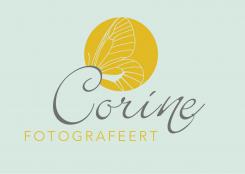
Maybe you can also check the websi: www.everythingbloom.com These colors up above in the different cards I do like a lot. The yellow of Bloom, the blue/white in the second card and the combination of the blue with the grey in the last one art alle beautiful to me. These are real vintage colors I am looking for.
Corine -
This contest is finished. Its not possible to reply anymore.
-
-
-
corinehogebavel says :
Like this one more than the above one, maybe another font for my name? More writing font like the first one.
Regards,
Corine -
corinehogebavel says :
Hello Renee,
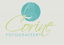
Wanted to tell you that I like the butterfly a lot this way making a connection with the Capital C of my name! The circle presents the lense I asume. Font of FOTOGRAFEERT is beautiful!
Think this is my favorite untill now.
I would love to see some variations with the font of my name (it has to make a connection with the butterfly! This is baeutiful!).
Love to see some other colors as I allready wrote.
Thanks,
Corine
-
corinehogebavel says :
Hello Renee,
Wanted to give you some more feedback, because I keep looking at this design.
Could you make some variations on this one? I was thinking it would be nice to see also a part of a flower in the circle (just like the idea of the butterfly) which connects with my name.
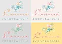
Colors I think would be a possibility are salmon/rose for the butterfly (and/or perhaps flower) and fotografeert, and dark grey for my name. Think this will match better with my style of photography.
Like the font of my name more and more, because of the 'n'which is getting a bit lower.
Love to see your ideas for stationery, gift vouchers etc.
Thanks,
Corine
-
renee says
Hello Corine, thank you for the feedbacks – I just didn't have the time to make some variations, I will come back to this on thursday, before that I won't have time. So pleas be patient …
Renée -
This contest is finished. Its not possible to reply anymore.
-
-
-
No comments
-
This contest is finished. Its not possible to reply anymore.
-
-
-
Description by designer renee:
here come some colour variations …
-
This contest is finished. Its not possible to reply anymore.
-
-
-
corinehogebavel says :
Hallo Renee,
Bedankt voor je inzending.
Erg mooi gedaan. Dit is de stijl die ik zoek. Kleurgebruik mooi!
Voor m'n website wilde ik als achtergrondkleur geen wit gebruiken. Voor het visitekaartje zou het kunnen. Ben wel benieuwd naar een andere achtergrondkleur (bv. heel zacht grijs). Ik vind de grijze achtergrondkleur op de website van Ditte Isager (www.ditteisager.dk) erg mooi. Misschien heb je zelf een idee voor een achtergrondkleur (moet in elk geval niet overheersend zijn, een zachte tint, net van het wit af, passend bij het blauw en geel.
Groet,
Corine -
renee says
sorry, could you please, please send me your note in english? (I'm german and understand a bit but am not sure in everything …
Thanks a lot
Renée -
corinehogebavel says :
Of course..
Thanks for your design. This is the style I am looking for. Love the colors.
For the backgroundcolor of my website I would love to see a soft grey color. I like the white background you used , but would see some variations. Maybe the white color for my cards and another color background for the website. I do like the grey color on the site of Ditte Isager, www.ditteisager.dk. Maybe you have ideas for other colors instead of white (the background has to be a soft color, which matches the blue and yellow). I am also open for other color combinations for the logo.
thanks,
Corine -
This contest is finished. Its not possible to reply anymore.
-

