Logo and housestyle for a start-up consultancy - Ethics at Work
Contest details:
- Contest holder: bartamsterdam
- Category: Logo & stationery
- Total budget: € 250.00
- Start date : 26-02-2012 18:23
- Ending date : 07-03-2012 18:22
- Status : Ended
- Relevant files: None
-
Available languages:

- Number of designs: 48
-
Response rate:
low high
Needs:
Company description:
Target group:
Colors, favourites and other requirements
Egel D
-
-
bartamsterdam says :
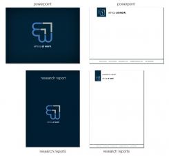
Thank you, this looks good. Can you also come up with a digital letter template and a template for invoices?
-
Egel D says
Thank you for the fast responses. The Font i used is Helvitica Light. I will make the invoice and digital letter template tonight.
Best wishes,
Sander -
This contest is finished. Its not possible to reply anymore.
-
-
-
bartamsterdam says :
Thanks.
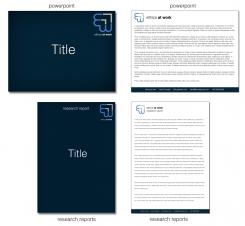
1. For the Powerpoint template, I would like to put the title of the presentation in the middle of the first page. Could you move the logo and name to one of the corners?
2. For the Word template, I also would like the title and author in the middle. Therefore, the logo would have to move.
What font did you use? Helvetica or Arial?
Best wishes,
Bart -
This contest is finished. Its not possible to reply anymore.
-
-
-
bartamsterdam says :
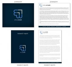
Thank you. I think the logo on second pages is a bit too similar to the Dutch Rijkslogo. Could you use the blue and grey one on a white background? I believe that might look better. Could you also fill the docs with a text in the typeface you propose?
-
This contest is finished. Its not possible to reply anymore.
-
-
-
No comments
-
This contest is finished. Its not possible to reply anymore.
-
-
-
Egel D says
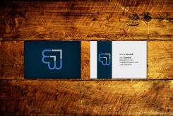
business card example
-
Egel D says
Tomorrow i will make the templates.
Sander -
bartamsterdam says :
I really like what you have done to the back of the business card! Dark blue with the logo. The front is a bit busy - I'd maybe lose the grey in the bottom LH corner and I'm not sure about maybe even getting rid of the blue in the top RH corner.
I don't have a strong opinion about the different blue / grey options as they're quite similar and would have to see them on the template versions.
Looking good so far! -
This contest is finished. Its not possible to reply anymore.
-
-
-
Egel D says
Thanks for the quick response!
Is this more what you imagine?
Sander -
This contest is finished. Its not possible to reply anymore.
-
-
-
bartamsterdam says :
I quite like these. Thank you, Sander.
-
bartamsterdam says :
Can you also come up with letter and invoice templates, a template for research reports, a Powerpoint template and a design for a business card?
-
This contest is finished. Its not possible to reply anymore.
-
-
-
No comments
-
This contest is finished. Its not possible to reply anymore.
-
-
-
Egel D says
Dubble click on the picture for the correct quality.
Sander -
bartamsterdam says :
Dear Sander,
Thank you for your work.
The 2nd of the three doesn't work for me at all (looks like a growth hanging off the end of the name). But the first and third have some potential. What about the first logo but with the words below and bigger (like the third option) but with different colors, like blue and grey? -
This contest is finished. Its not possible to reply anymore.
-
-
-
No comments
-
This contest is finished. Its not possible to reply anymore.
-
-
-
No comments
-
This contest is finished. Its not possible to reply anymore.
-

