Logo and stationery for a crazy project : cross South America by bike !
Contest details:
Silver
- Contest holder: Lescoqsenselle
- Category: Logo & stationery
- Total budget: € 349.00
- Start date : 06-08-2013 15:18
- Ending date : 08-09-2013 15:18
- Status : Ended
- Required formats: jpg,psd,pdf
- Relevant files: None
-
Available languages:


- Number of designs: 96
-
Response rate:
low high
Needs:
Company description:
Association’ description :
“Les coqs en selle” is a French association created in order to manage and promote a crazy project from two bros/friends:
travelling South America by riding bike, through the Andes mountains, from October 2013 to October 2014.
Leaving to meet local people, they will share their stories and experiences on their future website & Facebook’ page: following of their geographical progress in real time, texts, photos & videos, etc.
Explaination of the name « Les coq en selle » :
Besides its identity aspect (tied with France), the rooster is above all a universal and solar symbol, especially in Latin America. It embodies values like courage, personality, masculinity and intelligence. For all of those reasons, we chose the rooster as our emblem.
“En selle” means something like “Let’s go ride bikes!” in French.
So we chose “Les coqs en selle” for its « so proud French » aspect, its self-mockery and offbeat audacious tone, its reference to bike riding and its dynamism! (vs other names like “Alternative route”, “On the road to the Andes mountains”…).
Target group:
Target audience : All the people likely to visit our future website, our Facebook page or the people that we are going to meet in future events (like World tour or bike riding festivals/forums, photo exhibitions..), that is to say :
- Travel or Latin America lovers
- Globe-trotters and/or bike riders
- Open-minded & inquiring minds
- Families / Friends who will take some news
- Future partners of the project (private companies, government subsidies and crowdfunders )
Colors, favourites and other requirements
Graphically: Fun, dynamic, why not unconventional (optional), generous & classy.
Tone : Can be unconventional and/or humorous (why not using caroons cartoons / drawing form) but it has to remain apolitical, sober and serious because it is an ethical project (we have charity and sustainable development objectives…).
Colours : Do not hesitate to use warm shades, referring to Latin America. As you prefer…
Please find more information and illustrations that we liked in the file enclosed.
Othelo
-
-
Othelo says
Dear Jul & Greg,
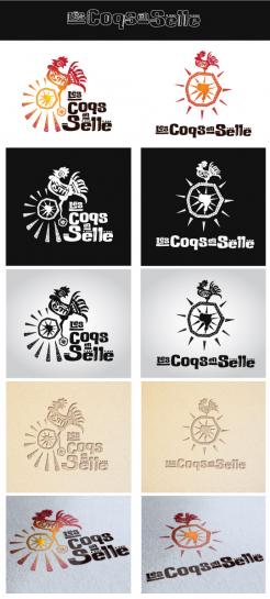
These are two simplified versions of my previous work. Although I simplified them, i tried to keep main aspects from before ( rooster on bicycle, sunshine, South America, and typography ).
Hope you will like one of these solutions.
I'm looking forward to your response.
Thank you in advance,
Best regards,
Vlade
-
maelisa says
bon moi, j'arrete ce concours, respect pour ton travail et bonne chance ! félicitation pour cette probable victoire !
-
eve31 says
Superbe !
-
Lescoqsenselle says :
Thank you for your interesting work Othelo.
We really liked it!
The choice has been really hard but unfortunately we finally decided to keep another artwork.
Thank you for your understanding and good luck for the next contests! -
This contest is finished. Its not possible to reply anymore.
-
-
-
Description by designer Othelo:
Hello.
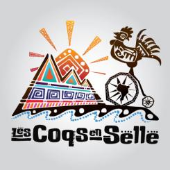
This is my proposal for your brand identity "Les Coqs en Selle".
I gave my best to bring native South American style with it. Hand drawn illustration, showing recognizable latin paterns, with typography adapted to fit illustration above.
Hope you'll find it suitable for your purpose.
Best regards. -
Lescoqsenselle says :
Hello,
Yes indeed we think your proposal is really interesting.
We like all ingredients of it (typography, rooster, mountain, Sun..) but we think that it is too complex. Thus the logo aspect is not present enough.
Would you be to simplify it? Maybe a "round" version (for badges, stickers)?
Also, would you be able to propose a black and white version (for cheaper prints...)
Maybe you could try a few different versions?
Thanks in advance for your efforts,
Best regards,
Jul & Greg -
Othelo says
Hello,
First i would like to thank for your reply, and your compliments to my work.
I'll give my best to modify logo according to your requests. Of course, once we find suitable solution for you, i will provide black and white, outline, and full color versions of your logo.
Best regards,
Vlade -
This contest is finished. Its not possible to reply anymore.
-


