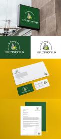
Logo and warm, personal and distinctive corporate identity for our tasting-experience company
Contest details:
Silver
- Contest holder: Heuzinkveld
- Category: Logo & stationery
- Total budget: € 459.00
- Start date : 15-04-2019 21:54
- Ending date : 29-04-2019 00:00
- Status : Ended
- Required formats: jpg,psd,ai
- Relevant files: None
-
Available languages:


- Number of designs: 41
-
Response rate:
low high
Needs:
Because regional products and Old-Dutch liqueurs are on the rise, we want to respond to this by radiating trust, linked to our region: De Achterhoek. As an appendix to this assignment you will find the Achterhoek flag, which can be used free of rights and has only been "official" for one year. Please note: we do not want the flag to be processed 1-on-1 in our house style.
"Trust, recognisability, accessible to hip young people and the elderly, tasteful, tasty" are cries that come to mind when I think about what we want to radiate. It should also be made clear that, in addition to humorous tasting experiences and tasty egg liqueurs, we are also just serious entrepreneurs. I think that "simplicity" does not suit us, but "versatility" (in moderation) does.
Company description:
Company name: De proeverij van Heuzinkveld (it jeans something like: The taste-experience of Heuzinkveld)
We take over the company from our father-in-law/father. 15 years ago he started providing tasting-experiences of and with Old-Dutch liqueurs. The experience is not only about tasting, but also about the wonderful stories that lie behind the origins of these liqueurs. The presentations are full of humor and my father focuses mainly on older ladies (women's associations), business associations and bus companies that arrange day trips. We would like to rejuvenate the presentations and thus appeal to a wider target group.
In addition, my father started making "an egg-liqueur with a taste". My father now offers this during the experiences, but we want to put this product on the market. The intention is to give this egg liqueur a less dusty image (which it had now), without losing the older target group. We have currently developed 23 flavors of which we want to set in The market five in the short term. This will be the main task of our company.
Who are we:
We are Kelvin (22 years old) and Laurens (38 years old). We were married last April. Let's just say we are a young couple on average. Kelvin is the creative man (he is a graduate cook, modest, passionate and wise) and Laurens is the commercial man (graduated psychologist and teacher, but strong in communication, easily approachable and easy speaker). Together we hope to be distinctive with our taste- egg liqueurs and the tasting experiences; there is no such thing yet. Kelvin would also like to add cooking workshops and private cooking to our services and therefore the logo / corporate identity must leave room for other additions that are all related to tasty drinks and beautiful and tastte food.
Target group:
A broad market. We want to appeal to people who are between 30 and 50, but do not run away from the 55+ mg. No 'rich people' image, but people who are curious by nature, earn modal (or have earned), a little vintage audience (people who will find old classics in new jackets interesting) I think now.
Colors, favourites and other requirements
Image and letters:
It would be nice if The letters PvH get color accents, so it’s easy to use in, for example, our business card. yellow ocher seems appropriate to us in combination with turquoise (see appendix 3), but all suggestions are welcome. What we find important is that the logo / corporate identity is not too busy. Cheerful may, but in peace and kindness.
Like some playfulness with letters from the company name (So that we can use the logo with and without the long company name.
-
designer: Reclamez
-
designer: Axel Sonnet
-
designer: Axel Sonnet
-
designer: angelikatoth
-
designer: angelikatoth
-
designer: angelikatoth
-
designer: Sianas
-
designer: DahliDesign
-
designer: LogoDesign.be
-
designer: voortenten
-
designer: FantasyLivia
-
designer: FantasyLivia
-
designer: FantasyLivia
-
designer: Axel Sonnet
-
designer: Axel Sonnet
-
designer: Axel Sonnet
-
designer: Axel Sonnet
-
designer: Axel Sonnet
-
designer: Axel Sonnet
-
designer: Yvaanaaa
-
designer: Yvaanaaa
-
designer: Yvaanaaa
-
designer: Reclamez
-
designer: DahliDesign
-
designer: DahliDesign
-
designer: Patricia
-
designer: Y-graphic design
-
designer: Reclamez
-
designer: Reclamez
-
designer: Reclamez
-
designer: RadvanTong
-
designer: Reclamez
-
designer: DahliDesign
-
designer: Reclamez
-
designer: DahliDesign
-
designer: Reclamez
-
designer: Reclamez
-
designer: Reclamez
-
designer: RadvanTong
-
designer: Reclamez
-
designer: Dividenddesign

