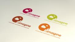
Logo/ CI for a coaching company
Contest details:
Gold
- Contest holder: HMO1978
- Category: Logo & stationery
- Total budget: € 449.00
- Start date : 04-06-2013 15:30
- Ending date : 04-07-2013 15:28
- Status : Ended
- Required formats: jpg,ai,pdf
- Relevant files: None
-
Available languages:


- Number of designs: 150
-
Response rate:
low high
Needs:
The name of the company ist "aimagine".
Focus is on personality analysis and development. Objective is to enable the coachee to accept him-/herself with the given values, preferences, etc. and by this to live a fulfilled and happy life.
UPDATE: Therefore also the name - "imagine" how your life would/ could be if you live and fulfill your "aims". That would be great to incorporate somehow in the logo/ CI.
The logo/ CI should be simple with clear lines and structures. It would be integrate to somehow the following explaination: "self-recognition - self-determination - self-realisation" (German version: "Selbsterfahrung - Selbstbestimmung - Selbstverwirklung"). Ideally I could choose between the English and German version dependant on my coachee; alternatively two options (one English, one German) need to be created.
Company description:
Newly established coachin company with focus on personality development with the help of structured personality profile analyses
Target group:
Individuals/ Teams
Business & Personal Coaching
Colors, favourites and other requirements
I love creativity but it shouldn't be too squiggly
The business concept is about to realise the essence of who you are - following this principle, the logo/ CG should represent stability/ future orientation
Not too screaming colors; rather colors which symbolize warmth/ closeness
visiwerk
-
-
HMO1978 says :
Nice job :-)
-
visiwerk says
Oh ty :P
-
This contest is finished. Its not possible to reply anymore.
-
-
-
Description by designer visiwerk:
Hi Heike,
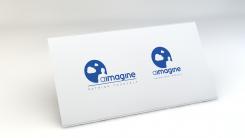
here are some changes, with an alternative subtitle just to give you an impression.
Greetings Chris
-
HMO1978 says :
Good morning Chris - WONDERFUL! I was thinking about your comments and I even think that it can go without any further subtitles - just letting the logo and the name speak. I like very much the merge of the logo with the name (thus the left option)!
Thanks very much - looks really great,
Heike -
This contest is finished. Its not possible to reply anymore.
-
-
-
Description by designer visiwerk:
Dear Heike, thank you for the constructive feedback :). But why do you have to digest it, i think it isnt´t that bad ;)
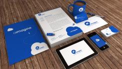
Sooo here is another version of the CI with a strong and guiding blue. Just added and changed few things.
Please be gentle by rating the positioning and so on it isnt´t final yet. Just for previewing you the overall concept.
So hope you like it. If you want to see another color look out for any color code, like (#1051BD), in this composition and give it so me, so i change it again.
Ty Chris
Ps. Meanwhile, the coffee is cold , sorry for that :D -
HMO1978 says :
Hi Ty,
Wonderful - not only the new color scheme but also your quick response!
Really like it - has something of the sky but with much more intensity!!!
Well done.
Enjoy the evening,
Heike -
visiwerk says
Ty i´ll upload a detailed version in the next days.
Good Time
Chris -
HMO1978 says :
Hi Chris,
Just looking over the proposal with a good friend - we really like it. As a question to you: can we increase the focus of the human a bit? Still with clouds etc but that also on the large poster the human is still recognizable?
What do you think?
Thanks in advance,
Heike -
visiwerk says
Hi Heike,
ty for the praise. I guess there are two possibilities the get more focus on the humnan-factor. One: to Center the Human, but then we have to get a new position for the name "aimagne". Second: To resize some elements.
But I don´t think that we get in trouble perceiving the elements on large scale :) But of course we can play around with it.
During the design process i often get in trouble by positioning the subtitle of the logo (self-recognition - self-determination - self-realisation). My advice from the "Designers" point of view you should shorten it and get the essence in one short statement, like "reconsider you" "reconsider yourself" "rethink yourself" or something like that. Just guessing :)
What do you think?
Greetings Chris ;)
-
This contest is finished. Its not possible to reply anymore.
-
-
-
Description by designer visiwerk:
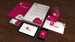
Hello, just to get an idea of the CI.
It isn´t finished yet, but some feedback would help me to get closer to what you a"imageine" :)
Hope you like it so far.
Ty -
HMO1978 says :
Hi Ty,
I like the design at lot - a nice way in displaying what the the purpose of the coaching is! Well done! I'm just not as sure re the colour - could you play a bit with this?
Thanks a lot in advance,
Heike -
HMO1978 says :
Sorry, as another thought/ input: i had a look on the previous colour codes - I prefer rather strong colours (because of readibility) but am not sure whether the magenta is a bit too aggressive?! as said, I'm still digesting :-)
-
This contest is finished. Its not possible to reply anymore.
-
-
-
Description by designer visiwerk:
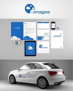
Bildersprache mit viel Wert auf Typografie.
Feedback gewünscht :) -
HMO1978 says :
Wonderful - very imaginative and not only pointing out to the obvious but also the state where the coachee/ the client should end up to - a world where he/ she can dream and live his/ her life.
Well done!
As an idee: Could we get this end state even clearer?! ;-) -
visiwerk says
Oh ty very much, that is what i hoped for :)
So the idea is understood :)
Of course we can work on the final CI as you wish. Just tell me what color do you prefer..so I can go for it.
bye -
This contest is finished. Its not possible to reply anymore.
-

