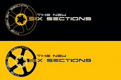
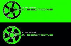
Logo design for a (non-profit) extrem sports website
Contest details:
- Contest holder: -Sebastian-
- Category: Logo & stationery
- Total budget: € 150.00
- Start date : 15-02-2014 10:11
- Ending date : 15-03-2014 10:06
- Status : Ended
- Required formats: jpg,psd,ai,pdf
- Relevant files: None
-
Available languages:


- Number of designs: 68
-
Response rate:
low high
Needs:
The letters SixSections should be dominant in the design. The competition sports Bike Trial is made in 6 sections - that’s were the name comes from. TheNew is the new subdomain after a relaunch of the website. So it’s possible to set it up a bit. The .com should fit to the SixSections letters.
The main goal is to get a „cool" design. Skate and BMX designs are a good hint for you.
Feel free to use a silhouette of a trials rider, or bike parts as graphical elements, such as a chain, a tire tread or a pinion.
Sorry about the small budget, but this is more than the yearly income from Google-Adwords :-(
Company description:
SixSections is reporting (as absolute non profit) about the mostly unknown extrem sport Bike Trial. It reports on events and competitions but it has a clear positions on all topics concerning questions about the sport itself. So a clear and strict design would be best.
Target group:
The site is for the riders and the guys behind them. The riders are between 10 and 30, the minders are between 30 and 60. Most readers should be between 15 and 25 of age.
Colors, favourites and other requirements
Perhaps green, friendly colors. The design should work on bright, dark and on surfaces with high contrast such as sport pictures as a branding in the corner. It should be able to be used in black and white, too.
kaan
-
-
No comments
-
This contest is finished. Its not possible to reply anymore.
-
-
-
No comments
-
This contest is finished. Its not possible to reply anymore.
-


