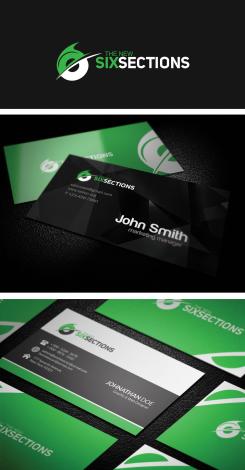
Logo design for a (non-profit) extrem sports website
Contest details:
- Contest holder: -Sebastian-
- Category: Logo & stationery
- Total budget: € 150.00
- Start date : 15-02-2014 10:11
- Ending date : 15-03-2014 10:06
- Status : Ended
- Required formats: jpg,psd,ai,pdf
- Relevant files: None
-
Available languages:


- Number of designs: 68
-
Response rate:
low high
Needs:
The letters SixSections should be dominant in the design. The competition sports Bike Trial is made in 6 sections - that’s were the name comes from. TheNew is the new subdomain after a relaunch of the website. So it’s possible to set it up a bit. The .com should fit to the SixSections letters.
The main goal is to get a „cool" design. Skate and BMX designs are a good hint for you.
Feel free to use a silhouette of a trials rider, or bike parts as graphical elements, such as a chain, a tire tread or a pinion.
Sorry about the small budget, but this is more than the yearly income from Google-Adwords :-(
Company description:
SixSections is reporting (as absolute non profit) about the mostly unknown extrem sport Bike Trial. It reports on events and competitions but it has a clear positions on all topics concerning questions about the sport itself. So a clear and strict design would be best.
Target group:
The site is for the riders and the guys behind them. The riders are between 10 and 30, the minders are between 30 and 60. Most readers should be between 15 and 25 of age.
Colors, favourites and other requirements
Perhaps green, friendly colors. The design should work on bright, dark and on surfaces with high contrast such as sport pictures as a branding in the corner. It should be able to be used in black and white, too.
luckydesign
-
-
-Sebastian- says :
Cool...
-
-Sebastian- says :
Hi luckydesign! I think you made it ;-) I like your design very much. But after a few days I think I like the logo without the pinion most.
So I think everything we have to do is to sum up:
Logo:
The "6" without the pinion and the following letters:
THE NEW
SIXSECTIONS
TheNew.SixSections.com
BC:
Can I get the BC as a Word-File or in any other editable file type to change my address details if possible?
Extra question:
Which font did you use for the logo? So I can use it for the headlines of the web site.
PS: This is my first project on brandsupply. How does it work, that i can make you the winning designer tomorrow? Will there be a pop up for me? -
Soy says
Hello lucky design. Nice job . cheers .
-
Victor Sierra says
Have to agree with soy, nice work - keep it up.
Congrats. -
This contest is finished. Its not possible to reply anymore.
-
-
-
luckydesign says
Dear Sir
I had submitted the desire changes.
Also tell me your Information for business card so that I can presents you a business card design.
Best Regards
Lucky! -
-Sebastian- says :
Looking good!
-
-Sebastian- says :
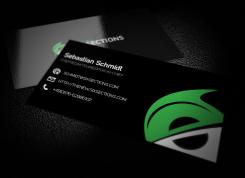
For the BC: I like glossy ones (green/black). For the BC I would prefer the logo without the URL.
The data for the Layout test is:
Name: Sebastian Schmidt
Position: Chefredakteur|editor-in-chief
Mail: Schmidt@SixSections.com
URL: http://TheNew.SixSections.com
Phone: +49(0)176-62986107 -
This contest is finished. Its not possible to reply anymore.
-
-
-
-Sebastian- says :
That's cool! But I think the teeth of the pinion should be outside of the radius of the round body of the "6". The rest is perfect!
I would like to have the URL in the Logo as well
http://TheNew.SixSections.com. Probably it is possible to have it in little Letters under the SIXSECTIONS letters? What do you think? -
This contest is finished. Its not possible to reply anymore.
-
-
-
-Sebastian- says :
Well done. I like this design! Is it possible to have a pinion as the white part of the logo? To make it look more like a bike logo?
-
-Sebastian- says :
And is it possible to make the "6" just a little more visible?
-
luckydesign says
Dear Sir
Thanks for appreciation
I will soon submit the desire changes.
Best Regards
Lucky! -
-Sebastian- says :
For the BC: I like glossy ones (green/black). For the BC I would prefer the logo without the URL.
The data for the Layout test is:
Name: Sebastian Schmidt
Position: Chefredakteur|editor-in-chief
Mail: Schmidt@SixSections.com
URL: http://TheNew.SixSections.com
Phone: +49(0)176-62986107 -
This contest is finished. Its not possible to reply anymore.
-


