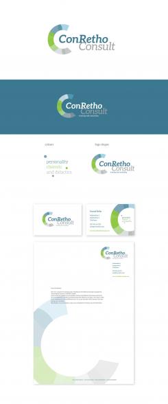
Logo for the training and coaching company ConRetho Consult
Contest details:
Bronze
- Contest holder: conretho
- Category: Logo & stationery
- Total budget: € 319.00
- Start date : 13-02-2015 20:17
- Ending date : 27-02-2015 20:15
- Status : Ended
- Required formats: jpg,psd,ai,pdf
- Relevant files: None
-
Available languages:


- Number of designs: 53
-
Response rate:
low high
Needs:
We are a company for training and consulting in soft skills and change management.
The company name is: ConRetho Consult
We are looking for a logo and have no colors for our corporate identity yet.
Specifically, we are looking for a logo and a template for business cards and a letterhead .
Company description:
Target group:
B2B, Business partner
Colors, favourites and other requirements
Our focuses are seminars on personality, rhetoric and didactics the three areas P-R-D (in German: Persöhnlichkeit - Rhetorik - Didaktik).
We are looking for a modern and serious logo that reflects our 3 areas . The name ConRetho is, moreover, for Conrad Rhetoric and / or con for the latin "with" rhetoric, this may perhaps be visualized.
Mooiniet
-
-
No comments
-
This contest is finished. Its not possible to reply anymore.
-
-
-
Description by designer Mooiniet:
Hello Jennifer,
Thank you for your reaction. I understand you concern about the 'C' and made some changes. Firstly the colour; you can see in both new proposals the difference the use of colour can give. Association with colours are very strong. I also changed the shapes inside the 'C' They were round, now they are more sharp, less playfull and hopefully less 'painty'. Please let me knwo what you think.
Regards!
Jo - Mooiniet -
This contest is finished. Its not possible to reply anymore.
-
-
-
Description by designer Mooiniet:
Hello Conrehto,
Hereby my propsal for a logo and stationairy. I choose to incorporate three colours in the design, each colour reflecting the three methods you use. Blue for personality, green for rhethoric en grey for didactic. These three colours are combined into a circle in whch the namlogo is placed. For a good balnce, a part of the circle is cut of, to form a 'C'. This icon is repeated in the businesscard and stationairy.
Please let me know what u think, alteration are always possible.
Regards,
Jo - Mooiniet -
This contest is finished. Its not possible to reply anymore.
-


