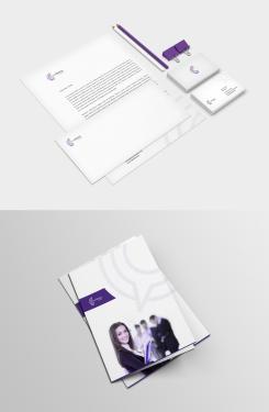
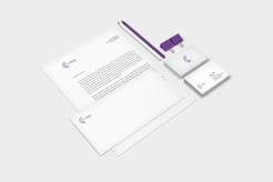
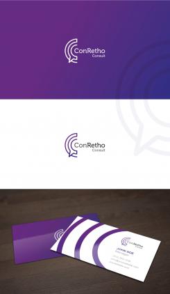
Logo for the training and coaching company ConRetho Consult
Contest details:
Bronze
- Contest holder: conretho
- Category: Logo & stationery
- Total budget: € 319.00
- Start date : 13-02-2015 20:17
- Ending date : 27-02-2015 20:15
- Status : Ended
- Required formats: jpg,psd,ai,pdf
- Relevant files: None
-
Available languages:


- Number of designs: 53
-
Response rate:
low high
Needs:
We are a company for training and consulting in soft skills and change management.
The company name is: ConRetho Consult
We are looking for a logo and have no colors for our corporate identity yet.
Specifically, we are looking for a logo and a template for business cards and a letterhead .
Company description:
Target group:
B2B, Business partner
Colors, favourites and other requirements
Our focuses are seminars on personality, rhetoric and didactics the three areas P-R-D (in German: Persöhnlichkeit - Rhetorik - Didaktik).
We are looking for a modern and serious logo that reflects our 3 areas . The name ConRetho is, moreover, for Conrad Rhetoric and / or con for the latin "with" rhetoric, this may perhaps be visualized.
demetriax
-
-
conretho says :
Perfect! Perfect! and again perfect!!!
Thank you so much :) -
This contest is finished. Its not possible to reply anymore.
-
-
-
Description by designer demetriax:
Sorry, i don't understand about your second request. On which document would u want to see the water mark at the right bottom?
-
conretho says :
Thank you for the cover, it is very good but I think, we will have no text (Seminar Lorem Ipsum...) on it, because we will use it for several seminars and advertisement. Do you think it can be nice without any text?
The water mark on the letter paper should be at the right bottom.
Best wishes -
This contest is finished. Its not possible to reply anymore.
-
-
-
conretho says :
Hey,
thank you very much. Could you please make the picture smaller. It should have only 1/3 of the vertical space on the front page. Therefore the white section with the Icon can be bigger. And on the paper (not at the font page) the water mark please at the right corner and down on the bottom.
Thank you very much and best regards -
This contest is finished. Its not possible to reply anymore.
-
-
-
conretho says :
Dear Demetria,
it looks beautiful. And I really prefer the purple version. It`s unique. At the first proposal it was just to much and to colorful. Thank you! At the first version you had some kind of water mark (this big icon in light grey). Would you be so kind and put this on the business card and the paper. Furthermore we want to design a folder for our seminars. For this can you design the cover as well. If the contest is over and we choose your design, is it possible to come in contact with you? We want to design the folder and a layout for the homepage. Thank you so much! Have a good day.
Regards
Jennifer -
This contest is finished. Its not possible to reply anymore.
-
-
-
No comments
-
This contest is finished. Its not possible to reply anymore.
-
-
-
No comments
-
This contest is finished. Its not possible to reply anymore.
-
-
-
No comments
-
This contest is finished. Its not possible to reply anymore.
-
-
-
Description by designer demetriax:
Hi,
here is my input about your logo, click on to see it in HD.
Please let me know your feedback to improve my work and try to meet your expectations.
Regards
Demetriax -
conretho says :
Hi Demetriax,
it`s me again. The more I think about the Icon (this C with the Speech balloon) the more I like it. Even the colour concept is some kind of unique. So, the Icon (in the middle) is nearly perfect. What I do not like that much is the Business Card, especially the three violet bows on the left side. Maybe you can come up with another idea for the Business Cards. And the violet on the backside is to much. Here I would prefer less of violet. In case of the Business Cards I like the proposals of Wilko and plumegraphisme ;). I`m looking forward hearing from you.
Best regards and thank you so far for a great Icon.
Jennifer -
demetriax says
Thx for your comment.
I saw u deleted a star on this input, u don't like anymore the violet color? -
This contest is finished. Its not possible to reply anymore.
-

