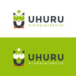
Logo & house style for children's practice Uhuru (Kinderpraktijk Uhuru)
Contest details:
- Contest holder: ACornel
- Category: Logo & stationery
- Total budget: € 250.00
- Start date : 30-11-2017 23:17
- Ending date : 14-12-2017 00:00
- Status : Ended
- Required formats: jpg,psd,ai,pdf
- Relevant files: None
-
Available languages:


- Number of designs: 58
-
Response rate:
low high
Needs:
Child practice Uhuru will soon offer intergrative child therapy for children between the ages of 4 and 12. It should therefore appeal to both children in this age group and the parents.
The target group will be Dutch. So use the word 'Kinderpraktijk' instead of practice.
It’s therapy through play.
The purpose of the therapy is to ensure that the child gets control over what it is bothering him. The child learns to rely on his or her own strength and to develop choices with regard to the complaint, so that the child can develop freely again.
Uhuru is Swahili for freedom. For me it is a symbol that everyone can realize their dreams and feel free.
This name is also used for the highest point in Africa, the summit of the Kilimanjaro, Uhuru Peak.
There are a number of reasons why I chose this name, these are:
- The meaning behind it is not immediately known to people who read it. A Dutch name like 'Vrijheid' ('freedom'), 'Sprankel' ('sparkle'), 'In je kracht' ('In your strength') is too soft and heavy for me, and that not the feeling the logo should give;
- It is, in my opinion, a playful word that children can speak with pleasure;
- For me personally a band because of my trip to the top of the Kilimanjaro, which symbolizes my love for the mountains.
- I like the symbolism behind the word Uhuru and the reference to Uhuru Peak:
1. Have your goal / dream in mind;
2. Step by step closer to your goal / dream;
3. Achieve your goal / dream;
4. Overcoming difficulties;
5. Ups and downs in life;
6. After overcoming obstacles you feel free.
- I see it before me that an Owl pronounces the word, which in itself stands for freedom. And a bird has the opportunity to spread its wings.
I myself have come up with a little idea that I have enclosed, which can be used as input (it certainly isn't a must).
One file gives the name Uhuru, which in letter height mimics the shape of a mountain. The implementation is certainly not near my desired result, but the idea appealed to me.
The second file shows the fur of the owl, which is made up of a multitude of U's (the first letter from the first file). I can see this for example on the back of the business cards or on part of the background of the website. Where within some U's (probably one per expression) a picture can be made visible, the rest of the U's then have a uniform background.
If you want to embroider on this, then I want to indicate that you must feel free to alter the line thickness. In addition, feel free to play with the ratio height width, as well as whether it has to be more angular or rounder, etc .. Again the idea of the fur of the owl with the possibility of using pictures in the U speaks to me above all. For example, placing an image of a flag on the top right and the other U's symbolizing the cascading journey upwards.
As mentioned before you may use the enclosed files as input, but that is certainly not a must.
Thanks in advance for the effort.
Company description:
Therapy through play.
The purpose of the therapy is to ensure that the child gets control over what it is bothering him. The child learns to rely on his or her own strength and to develop choices with regard to the complaint, so that the child can develop freely again.
Target group:
Children in the age of 4 to 12 and the parents.
Colors, favourites and other requirements
Red and Green are colours that I like. You do not have to use both colours.
I really like the fact to have an element in the logo which I can use without the entire name Uhuru and Kinderpraktijk.
VirtualLies
-
-
Description by designer VirtualLies:
Good evening Annelies,
attached you find a new variation of my previous proposals. I changed the appearance of the owl a bit, to get it to look a little less stiff ;)
I thought a while and got to the conclusion, that, in my opinion, a star fits best, and gives space for identification with your personal favorite.
If you like it and have suggestions to improve the design, I'll remain at your disposal,
kind regards, Dagmar -
This contest is finished. Its not possible to reply anymore.
-
-
-
Description by designer VirtualLies:
Good morning Annelies ;)
Took a bit, but attached now you find a first design for an according housestyle. In this one I used a box over the owl, as a container that could include various things. I also added a little light to the iris of the eyes to give a slightly cuter look. Hope you like it and look forward to hear your opinion,
best regards, Dagmar -
This contest is finished. Its not possible to reply anymore.
-
-
-
Description by designer VirtualLies:
Good morning Annelies,
thank you again for your feedback. Attached the revision with the eyes from the first proposal and a different idea for the image on top... curious to know, if you like this variation ;),
kind regards, Dagmar -
ACornel says :
Hi Dagmar,
Thanks for the new version. The eyes now are just perfect. What should be on the question mark stays a question mark to me :-D
The question mark is not working for me, it is now something hanging above the owl, instead of something part of the owl.
I will try to think of something we can use there. For now this is okay.
Kind regards,
Annelies -
VirtualLies says
Hi Annelies,
thanx again ;) for the rating and feedback. The question mark was meant to be a mixture of the mark and a light bulb, a bit like question and answer/idea. What about a tiny mouse instead?
Does it make sense to already design the according housestyle?
Kind regards, Dagmar -
ACornel says :
Hi Dagmar,
Ah I see what you meant. I don't know about the tiny mouse. What about eyebrows for the owl shaped like flags, like a target, on top of a mountain, triangle shaped flags. I will add a example as an attachement, but offcourse I am not good enough to make it look good enough.
I still like the design you made, its between you and another, so yeah I am curious about a housestyle from you.
Thanks in advance.
Greetings,
Annelies
-
ACornel says :
It's file 3, attached in the description. If you have it I will delete it again
-
This contest is finished. Its not possible to reply anymore.
-
-
-
Description by designer VirtualLies:
Good morning ;)
Thank you for your positive feedback and rating. Attached you find a first revision, I will get back to you soon with some more ideas about the owl eyes and the toys on top ;) Looking forward to your reply,
kind regards, Dagmar -
ACornel says :
Thanks Dagmar,
I think we are moving in the wrong direction with the eyes. We are moving away from the simplicity. I think the eyes of the owl with the white eye-white on your first version were perfect. Now seeing your new version I think the "creepy" thing about the owl with green eye-white was the fact that the iris is a lighter color than the 'eye-white', it looks like a negative. If you make the iris color darker, just like you did on your second version, probably it will be perfect.
I think the wooden blocks on top is not in proportion, it is to big. Or maybe the thing working for the Plus is the fact that bottom up it has the same angle as the top ends of the U. Maybe we can find something that truly works, because I think it works to have something there. In hindsight maybe toys wasn't the best suggestion from me, because I can't think of a toy that speaks to all ages, and does not give the wrong suggestion. For instance using brushes gives the idea that is stands for a hobby club. But maybe you can make it work. But you don't have to limit yourself to toys :-D
Thanks for your quick reply. -
This contest is finished. Its not possible to reply anymore.
-
-
-
Description by designer VirtualLies:
Good morning ACornel,
attached my first design for your contest. I picked up your idea with the owl and incorporated it to the U letter of your name. Hope you like it,
kind regards, Dagmar -
ACornel says :
Wow that looks great. I really like the simplicity of the design, and I really like the color green you have chosen.
Only the thing is the owl with the green eyes looks a bit creepy (too big a word, but I hope you know what I mean) to me, I think a small alteration can make a big difference.
One other thing I don't especially like is the plus sign, in my opinion this makes the Owl to clinical/ creates a link to nurses/hospitals. I forgot to mention that the therapy is through playing. So can the plus be replaced by something like a toy, or something else you think is suitable?
Just as I said the simplicity is great. I also can imagine some variations on the owl by playing around with only the eyes. For instance next to a text about shyness an image of the owl is present with the eyes turned down. Confusion, the eyes are all around the place. Scared, big eyes etc.
So I see a lot of possibilities in the figure of the owl.
I hope you can make the suggested alterations. Thanks in advance. -
This contest is finished. Its not possible to reply anymore.
-

