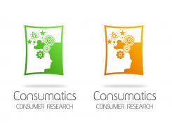
Logo & layout for a happy and professional organisation!
Contest details:
Gold
- Contest holder: CONTRAST
- Category: Logo & stationery
- Total budget: € 449.00
- Start date : 10-07-2013 12:34
- Ending date : 15-08-2013 12:29
- Status : Ended
- Required formats: jpg,psd,ai,
- Relevant files: None
-
Available languages:


- Number of designs: 99
-
Response rate:
low high
Needs:
We are looking for a great new logo and layout (for business cards, PPT, e-mail, website etc).
Consumatics is a quickly deveoping, young and enthusiastic organisation. On the other hand we work for big international companies and our layout has to fit better to our target group than the current solution.
Good luck and hope to see your input quickly!
Company description:
Consumatics is a young company with an ambitious, driven team. Consumatics adapts to the (unconscious) behavior of customers. We continuously conduct research in and for the customer environment. Think about scientific research in restaurants to see the effects of customer behavior of different music or menu cards.
Secondly, we give advice in communication, presentation and ambiance to improve the customer experience and in the end the revenue of our clients.
And why the focus at unconscious behavior? 95% of our behavior, happens unconsciously (or subconsciously). It is not, or extremely difficult, for the customer to explain that, but has influence on the loyalty and spending.
The services of the company are research and consultancy/training.
Target group:
The company focuses on three industries: hospitality, retail and airports. 80% of the revenue is from Dutch companies, 20% from European companies. The expectation is that the international focus will rise the coming years. In the companies we have contact with market insight teams, marketeers and director of operations.
Colors, favourites and other requirements
At the moment the logo is green with orange and grey. Only grey with one of the colours is fine, but feel free to show something completely different. We hope that a part of the logo can be used for PPT e.g. At the moment the circles at the end of the logo show up in all our communication for example. It would be nice if something like that will be possible in the future too.
saiyanflex
-
-
Description by designer saiyanflex:
Something like this maybe?
-
This contest is finished. Its not possible to reply anymore.
-
-
-
No comments
-
This contest is finished. Its not possible to reply anymore.
-
-
-
CONTRAST says :
I really like the idea of seeing two things when you look better. I will try to explain myself in English :)
I can see the two faces en something that's happening in their heads and around them. But I can also see the figure in green and orange, but I don't know what this is. If that's also symbolizing something from Consumatics and you can easily see what it is meant to be, I would be very enthousiastic.
It's a little bit too full, too many symbols. Maybe you can make it al little bit calmer.
Good luck! -
saiyanflex says
Well I wanted to make it like two consumers who have different thoughts that's why there are orange and green colors :) But I will try to make it with less symbols as you asked
-
This contest is finished. Its not possible to reply anymore.
-
-
-
CONTRAST says :
Wat een fris ontwerp, mooie kleurencombinatie ook. Het lettertype mag wel at stoerder.
-
This contest is finished. Its not possible to reply anymore.
-
-
-
CONTRAST says :
Bedankt voor de ontwerpen! Leuk om weer even heel andere ideeën te zien. Ik vind de kleur en het grijs heel mooi samengaan. In het logo zie ik een gezicht en wat symbolen. Leuk hoe dat verwerkt is! Rechts zie ik de kleur, is er gij die vorm ook een bewuste keuze gemaakt? Ik zoek namelijk of ik er wat in zie. Ik vind het namelijk ook leuk hoe je onderbewustzijn bij een tekening de ene keer het ene ziet en de andere keer het andere. Ken je die tekening van twee gezichten die naar elkaar kijken en ertussen een beker vormen? Daar doet het me aan denken, maar ik kan nu dus niks zien in die kleur.
Misschien kan je hier wat mee! -
saiyanflex says
I'm glad you like it :) Also, might I ask you to tell me what you want me to change exactly but in english? I hope it's not too much to ask. Thank you in advance
-
CONTRAST says :
Ofcourse, I'm sorry :)
Thank toy very much fot your designs!
I really like you've used different kinds of symbols. Maybe it is a little bit too much, but I like the idea. I'm wondering what the thing that is coloured is representing. I will also react on the other designs. -
This contest is finished. Its not possible to reply anymore.
-

