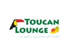
Logo & Slogan & Color Concept & Slide Master
Contest details:
- Contest holder: toucan lounge
- Category: Logo & stationery
- Total budget: € 200.00
- Start date : 10-10-2012 22:04
- Ending date : 10-11-2012 21:52
- Status : Ended
- Required formats: jpg,psd,ai,pdf
- Relevant files: None
-
Available languages:


- Number of designs: 55
-
Response rate:
low high
Needs:
Therefore we need a logo (emblem), a a graphically visualized slogan, a sound general color concept and a simple Powerpoint Master-Slide. In the following we'll elaborate on all requirements:
1)
The Logo: The logo should center around the exotic bird Toucan. This Toucan should be linked to a cloud of smoke and/or refer to fruits. Summing up, the main ingredients of the logo are: Toucan, Cloud of Smoke and Fruits.
The Toucan must not necessarily be presented in a lifelike manner; coloring can deviate, however, it should fit into the overall developed color concept.
The Toucan should be "simple" (in a positive way) and should make a hip impression. He certainly shouldn't be too "detailed" or "comic-like".
The logo should include the startup's name "Toucan Lounge" (spelling can deviate, for example, capitalization can be changed).
2)
Slogan: The slogan "exotic sensation of taste" (small letters, without quotation marks) should be presented in a way that soundly fits into the overall concept. For example, the slogan should fit under the logo.
3)
Overall Color Concept: We generally look for a simple (in a positive way) color concept for our startup, which can be associated with attributes as exotic, tropical, colorful, healthy, light, nature, jungle, etc.
The color concept should be in harmony with the logo, however, it doesn't have to have the same coloring.
4)
Master-Slide Concept: We are looking for a Powerpoint master, which picks up the overall color concept and embeds the logo and the slogan. This Powerpoint master should cover the same scope as usual Powerpoint masters. However, especially a master for the title-slide of the entire presentation, a title-slide for subparts of the presentation, a table-of-content-slide, a listing-slide and a normal content-slide should be included.
In the context of creating the slide master a corporate font must be designed/defined, which fits into the overall design concept.
Company description:
The Startup Toucan Lounge offers the consumption of exotic "smokeables", which create a fruity sensation of taste in a laid-back and exotic atmosphere. The Toucan Lounge delivers harmless, fresh and fruity enjoyment!
Target group:
The Toucan Lounge aims at energetic city-type persons who like to experience new things and whose curiosity is piqued by design.
Colors, favourites and other requirements
Generally we expect a design which is modern, hip and colorful and addresses the brand values of the Toucan Lounge (exotic, fruity, color, modern). It should appeal friendly and inviting and should not be too detailed.
What we have not in mind: ...is a dark design which is showy or snobbish and comes across as cheap or dubious.
A general remark: If you feel that our design ideas should go into another direction than pointed out by us, feel free to be creative and surprise us with your point of view. If you think it makes sense to deviate from our expectation we generally don't mind and look forward to your suggestions.
Orange Design
-
-
Description by designer Orange Design:
A first idea, I would like to know if it goes towards what you have in mind...
-
toucan lounge says :
Hello, thank you for your design!
However, there is still room for improvements..
Here are some suggestions concerning your design, which will point out the direction in which we want to go:
The most important part of the logo is the toucan and not the name „toucan lounge“, so the name should be much smaller and the bird bigger, because the toucan is the main object of the logo.
The slogan “exotic sensation of taste“ should not be in the logo (please also refer to the requirements description).
Generally, the elements of the design should be the toucan and a cloud of smoke which is missing. So ideally there should be a colorful cloud of smoke which interacts with the bird.
Concerning the toucan: The toucan shouldn‘t look like an actual, real-life toucan. It should be presented in a modern and simplified way. Moreover, we‘d like the idea of presenting the toucan in a colorful way.
Concerning the fruits: The fruits on the right side appear as too distanced and not really necessary. Also, they are not sound with the elements and appear rather as alien elements. It is the goal to embed the fruits in the overall logo: toucan, the cloud of smoke and the fruits should go well together! In addition, please don‘t put emphasis/focus on specific fruits (in your case, bananas and so on) since we don‘t know if we‘ll offer this flavor in our range of products; try to rather display a variety of fruits or just hint at fruits in a minimalist way.
Concerning the overall logo: Try to bring focus to the logo. Remember the toucan is the most important object and not the name. We guess that putting the entire design into a circle might bring focus to the idea.
Again, thank you very much for your efforts.
We are looking forward to your improvements.
All the best!
The Toucan Lounge Team.
-
This contest is finished. Its not possible to reply anymore.
-

