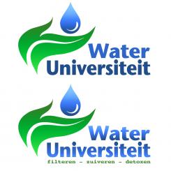
Logo&"home design" Dutch site "Water University" - design needed with FLOW & healthy radiance
Contest details:
- Contest holder: thomashawker
- Category: Logo & stationery
- Total budget: € 249.00
- Start date : 01-11-2012 13:41
- Ending date : 20-11-2012 13:04
- Status : Ended
- Required formats: jpg,psd,ai,pdf, png
- Relevant files: None
-
Available languages:


- Number of designs: 51
-
Response rate:
low high
Needs:
Mail focus is on a logo and business card.
The goal of the site is to share knowlegde and practical tips about water (in relation to health and happiness)
It's an idea to have a logo/mascotte in the logo that radiates the values health&hapiness. As an example see the characters in the Spirit Science videos on youtube (http://youtu.be/XtDennZr5fA.
As possible sub are the words kraanwater - filteren - zuiveren - detoxen
This means tapwater - filtering - purifying - detoxing in Dutch.
If this makes everything "too much" it can be left out
Optional colors are blue and green but this is not required
Company description:
Water-universiteit.nl will share available knowledge about purifying, filtering and modifying tapwater. A information marketing model wil be implemented on the site. (example http://internetmarketinguniversiteit.nl/)
A "keep it simple" and accessible design is required. The focus is on individuals (not business)
Target group:
Individuals that are looking for healthy water. There is lots of information online (often contradictory).
Te site will act to make education available so people will be able to define what techniques is good for them personally (not running after the "experts" or "guru's"
Colors, favourites and other requirements
(example http://internetmarketinguniversiteit.nl/)
open, accessible, playful,fun
Example are the figures in SpiritScience op youtube (http://youtu.be/XtDennZr5fA).
theo k.
-
-
Description by designer theo k.:
a Feedback would be welcome...
-
thomashawker says :
Hello !
Thanks for submitting this. It is greatly appreciated. I like the playfulness, but power of the top font. The bottom is a little too common for my taste
I like the idea of the drop on the leaf, but I am looking for something that a little more personality. The idea of the mascotte is so prople will feel a connection/relationship with the personality. Also it is important to relay the emotions health and happiness.
Any ideas??? Thanks for the input... -
theo k. says
I think the mascotte is a great idea but i should have no connection with the Logo. You should look for universal logo you can use for business card and letter heads.
-
This contest is finished. Its not possible to reply anymore.
-

