Naming Agency searching for Logo and Stationary!
Contest details:
- Contest holder: RedPearl
- Category: Logo & stationery
- Total budget: € 100.00
- Start date : 10-02-2015 21:29
- Ending date : 19-03-2015 21:17
- Status : Ended
- Required formats: jpg,psd,ai,pdf
- Relevant files: None
-
Available languages:


- Number of designs: 67
-
Response rate:
low high
Needs:
We are the 'Men of Letters'. A new agency for creative naming practices.
We develop names for companies, organizations, brands, products and services. We also create pay-offs and slogans.
We offer a number of packages that are affordable. We quickly develop an excellent new name to match the needs of the customer.
The concept:
1. The customer chooses one of the packages (price increases as we develop more names, offer multiple name revisions and when the deadline is tighter).
2. The customer then tells about his/her business, product or service. What are the core values, what are they looking for. Then we ask for some examples of names that they have a lot of affinity with.
3. Payment will be performed and we will start with development.
Company description:
Men of letters comes from the distinction which formerly was made between those who could read and write and those who could not; literate thinkers. The name has been forgotten since it was replaced by the term "intellectuals".
The choice of the name Men of Letters has to do with this story, also 'Letters' in both Dutch and English have a similar definition, letters are part of the alphabet; and there lies the foundation for naming itself. Men of Letters is a powerful name that exudes craftsmanship and quality. This we link to fresh out-of-the-box thinking. Together we try to create the desired overall picture. Finally the abbreviation of Men of Letters; MOL, form the first three letters of the surname of the naming agency.
Target group:
Colors, favourites and other requirements
In terms of design of the logo and stationary we seek balance between craft, quality and tradition and creativity on the other hand, out-of-the-box thinking and fresh youthful zest. We are open to all interpretations; logo next to the name, incorporated, the abbreviation MOL as center piece, color combinations, etc. as long as they fit the overall picture and values; the idea behind it.
Get Creative!
ZnortComics
-
-
No comments
-
This contest is finished. Its not possible to reply anymore.
-
-
-
RedPearl says :
Excuus, maar het idee is voor ons te basis. Wellicht kunt u wat met de recente voorbeelden van Budget Media (man in pa erbij).
-
This contest is finished. Its not possible to reply anymore.
-
-
-
Description by designer ZnortComics:
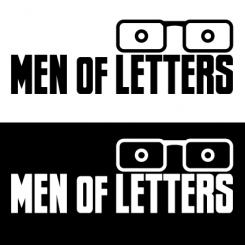
Duidelijkheid, solidariteit, intelligentie en vooral stevigheid doen mij denken aan de de "men of letters".
Ik wilde het logo simpel maar effectief houden.
Door het gebruik van een robuust lettertype straalt dit logo ambacht uit.
Boven de letters vindt u de bril, welke op zijn beurt weer verwijst naar zakelijkheid en intelligentie.
Uiteraard is de bril ook los te krijgen zodat deze als "icon" gebruikt kan worden voor social media accounts.
Ik snap dat het logo "out of the box" is, en hopelijk komt de boodschap goed over.
Succes met de keuze! -
RedPearl says :
Ik vind persoonlijk de bril niet echt bij het Men of Letters idee horen. Uw meedenken wordt wel gewaardeerd overigens.
-
This contest is finished. Its not possible to reply anymore.
-


