Naming Agency searching for Logo and Stationary!
Contest details:
- Contest holder: RedPearl
- Category: Logo & stationery
- Total budget: € 100.00
- Start date : 10-02-2015 21:29
- Ending date : 19-03-2015 21:17
- Status : Ended
- Required formats: jpg,psd,ai,pdf
- Relevant files: None
-
Available languages:


- Number of designs: 67
-
Response rate:
low high
Needs:
We are the 'Men of Letters'. A new agency for creative naming practices.
We develop names for companies, organizations, brands, products and services. We also create pay-offs and slogans.
We offer a number of packages that are affordable. We quickly develop an excellent new name to match the needs of the customer.
The concept:
1. The customer chooses one of the packages (price increases as we develop more names, offer multiple name revisions and when the deadline is tighter).
2. The customer then tells about his/her business, product or service. What are the core values, what are they looking for. Then we ask for some examples of names that they have a lot of affinity with.
3. Payment will be performed and we will start with development.
Company description:
Men of letters comes from the distinction which formerly was made between those who could read and write and those who could not; literate thinkers. The name has been forgotten since it was replaced by the term "intellectuals".
The choice of the name Men of Letters has to do with this story, also 'Letters' in both Dutch and English have a similar definition, letters are part of the alphabet; and there lies the foundation for naming itself. Men of Letters is a powerful name that exudes craftsmanship and quality. This we link to fresh out-of-the-box thinking. Together we try to create the desired overall picture. Finally the abbreviation of Men of Letters; MOL, form the first three letters of the surname of the naming agency.
Target group:
Colors, favourites and other requirements
In terms of design of the logo and stationary we seek balance between craft, quality and tradition and creativity on the other hand, out-of-the-box thinking and fresh youthful zest. We are open to all interpretations; logo next to the name, incorporated, the abbreviation MOL as center piece, color combinations, etc. as long as they fit the overall picture and values; the idea behind it.
Get Creative!
webdesignaktie
-
-
RedPearl says :
Deze is al beter, al mag het chiquer.
-
webdesignaktie says
Gaan we aan werken
-
This contest is finished. Its not possible to reply anymore.
-
-
-
Description by designer webdesignaktie:
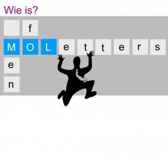
Het WC mannetje weggehaald.
-
RedPearl says :
Persoonlijk trekt dit me niet echt. Ik zoek echt een logo van statuur. :-)
-
This contest is finished. Its not possible to reply anymore.
-
-
-
Description by designer webdesignaktie:
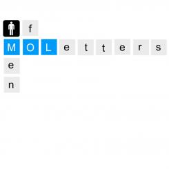
Bij deze mijn ontwerp.
Het is gebasseerd op het idee van scrabble. Het spel scrabble werkt ook met letters. Uiteraard kunnen lettertype en kleuren aangepast worden.
Graag ontvang ik feedback -
RedPearl says :
Op zich in de basis een leuk idee, al vind ik het te simplistisch, geen mooi lettertype bovendien en het mannetje is zeg maar het standaard toiletdeur mannetje. Bovendien is deze variant al eens door een naamgevingbureau uit Frankrijk gebruikt, zie rechtsboven; http://www.werner-brandl.de/index.php?l=en
-
This contest is finished. Its not possible to reply anymore.
-


