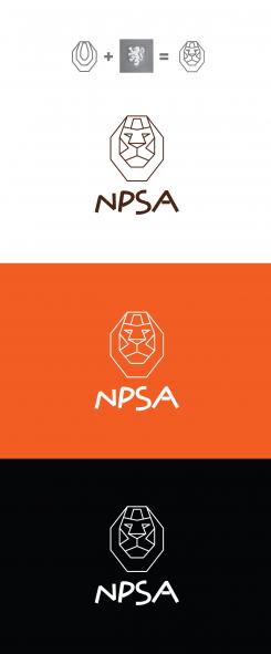
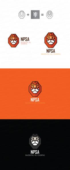
New identity for Dutch sports association (IPSC)
Contest details:
Silver
- Contest holder: IPSC-NL
- Category: Logo & stationery
- Total budget: € 419.00
- Start date : 18-03-2014 23:20
- Ending date : 26-03-2014 23:18
- Status : Ended
- Required formats: jpg,psd,ai,,eps,
- Relevant files: None
-
Available languages:


- Number of designs: 69
-
Response rate:
low high
Needs:
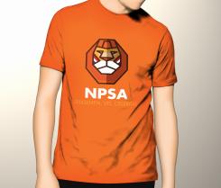
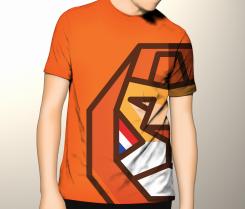
Initially, the demand is for a logo and new identity, however, the new corporate identity will be the base for the development of the new website, team shirts for the Dutch team that will go into the U.S. at the World Championships in October and use of the magazine, advertisements, social media et cetera.
Company description:
The NPSA is the national sports federation en Dutch official representation for IPSC shooting in the Netherlands.
Practical shooting is a dynamic branch of shooting, which is practiced worldwide by young and old, male and female, indoor and outdoor. In 90 countries shooters measure themselves with each other regularly in national and international competitions. IPSC can be shot with small arms and rifle.
The motto of IPSC is "DVC" which originates from the Latin Diligentia, Vis, Celeritas (precision, power, speed ). Besides the number of points you shoot also the time you need to shoot thosepoints matters. And because every game is different also an appeal is made to the strategic insight of the shooter. The combination of these elements makes IPSC shooting an exciting and versatile form of shooting.
NPSA : http://www.ipsc.nl
IPSC International: http://www.ipsc.org
Target group:
In addition to all the existing IPSC members all shooters in other disciplines in the Netherlands are an important target group, as well as those interested in the shooting sports but who are not yet members of a shooting club (but who may be interested to join us in the future).
Colors, favourites and other requirements
The logo and corporate identity should get a look that fits an national sports association that the NPSA is. This should also definitely come back in the logo and color scheme of the identity (The overall known national color for The Netherlands is orange). Furthermore, the logo should convey the sport! Preferably no guns or rifles in the logo, the focus should be on the sportive character of this great sportsdiscipline .
The motto DVC ( see logo IPSC International ) Diligentia , Vis , Celeritas (precision , power, speed ) may certainly be incorporated in the new logo but isn’t a must.
The logo itself can contain the orange color but also The Dutch colors of the national flag (red white-blue) can be incorporated... creativity is appreciated.
Initially, the demand is for a logo and new identity, however, the new corporate identity will be the base for the development of the new website, team shirts for the Dutch team that will go into the U.S. at the World Championships in October and use of the magazine, advertisements, social media et cetera.
demetriax
-
-
No comments
-
This contest is finished. Its not possible to reply anymore.
-
-
-
demetriax says
Can u give me a feedback please?
i'ld love to know what u doesn't like in my concept.
Thx -
IPSC-NL says :
At first I loved the thought behind the design but the problem is that it might just be too nowadays, maybe somewhat cartoonlike. We feel that the logo might not be something we can hold on to for years to come.
The idea in itself is great but a more traditional shape/lion might help. -
This contest is finished. Its not possible to reply anymore.
-
-
-
No comments
-
This contest is finished. Its not possible to reply anymore.
-
-
-
No comments
-
This contest is finished. Its not possible to reply anymore.
-


