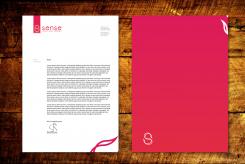
New logo and corporate identity for a new consultancy firm for economic advice in developing countries
Contest details:
Silver
- Contest holder: mwarnoldus
- Category: Logo & stationery
- Total budget: € 349.00
- Start date : 27-08-2012 11:38
- Ending date : 06-09-2012 11:37
- Status : Ended
- Required formats: jpg,psd,ai,pdf
- Relevant files: None
-
Available languages:


- Number of designs: 104
-
Response rate:
low high
Needs:
There are several versions of the tagline, so the designer needs to play around with both versions before I can make a decision.
Company description:
Sense is an economomic consultancy firm with experienced consultants that have decided to work independetly and start their own business.
We offer economic development advice for developing countries to governments, NGO's (ICCO, SNV, Technoserv), and development organisations such as World Bank, UN, FAO, USAID, DIFID, GIZ etc. We also work for investment funds in developing countries (www.Annona.nl) and business. We mostly focus on the agricultural sector in Africa (and agro-business and processing).
We offer roughly four types of advice: Economic Sense helps development organisations decide which sectors to focus new projects on (i.e. rice, vegetables, cattle, goats), and design the development programs. Development Sense helps these organisations who have existing programs solve problems; i.e. the poultry sector does not develop as well as hoped and we are called in to help. Business Sense helps investment funds decide whether to invest or not in a business, and can also be advice to the entrepreneur to develop their business faster. Common sense are short 1-2 week practical trainings for practioners, i.e. in value chain analyses, market research etc.
Our root strength is our in-depth knowledge of the business world in both Europe and Africa. While most competitors have never actually worked in a real business and are much more naieve, anti-business we have all worked in business and have been entrepreneurs ourselves. We also know Africa well because we are African, as apposed to most people with business knowledge. Hence we are the best of both worlds for the job...
Target group:
Decision makers in development organisations. They realise that development aid needs to be much more about developing the private sector (businesses) together with large and small businesses. They are idealistic but realise that most programs in the past were to naive and idealistic and they are looking for a more business like approach based on a real thorough economic analyses. Helping women i Mozambique sell pots o honey sounds nice, but how much honey do you eat in a year? Is that model really scalable?
They use consultants because they lack time themselves, but often receive poor quality work. Reports that leave them with the feeling, ok, intersting but what now? They need reliable consultants who understand business and Africa. Someone who helps them get results by doing a thorough analuses of the real problems and can offer new insights an solutions that go beyond the obvious cliches. Simple piece of advice that makes it clear what the next steps are for them to take. Something that makes Sense!
Our differentiating factor is thus that we are the only consultants that have the skills to make sense of complex development issues and come with development strategies that inspire to action because they simply make sense. We think different that others and make meaningfull connections with developments in other countries and sectors.
We need to distinguish ourselves through our professionally, few competitors have professional modern logo's and identities.
Colors, favourites and other requirements
Key words for the logo/ identity: Professionalism, simplicity, clear, modern, innovative, inspiring. We are looking for a modern, elegant, simple professional style that evokes confidence and oozes professionalism. An added (abstract) style element would be nice to make it more interesting. Logo's i like are Apple, AH, vodafone, http://www.vidaecaffe.com
Colours could be orange, deep (brownish) read, purple-red with white-grey. But open to other suggestions.
I would like a version with tagline and without; there are 2 optins I would like to try as a tagline: - Economic Sense. Business Sense. Development Sense.
Making Sense of development
I also need a version that works well in black&white, a light and a dark background.
Egel D
-
-
Egel D says
Dag,
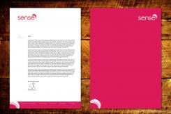
Hier een voorbeeld van hoe het briefpapier bij dit logo kan zijn.
Ik kijk uit naar uw reactie! Als u ook nog kun reageren op de andere ideeën zou dat fijn zijn.
Groet,
Sander -
Egel D says
Druk op de afbeelding voor groot formaat zodat alles tot z'n recht komt
-
This contest is finished. Its not possible to reply anymore.
-
-
-
Egel D says
Hier nog een totaal andere logo, maar nog steeds simpel en strak.
Ik kijk uit naar uw reactie.
Groet,
Sander -
This contest is finished. Its not possible to reply anymore.
-
-
-
No comments
-
This contest is finished. Its not possible to reply anymore.
-
-
-
No comments
-
This contest is finished. Its not possible to reply anymore.
-
-
-
Egel D says
een van de varianten uitgewerkt.
Groet,
Sander -
This contest is finished. Its not possible to reply anymore.
-
-
-
Egel D says
Bedankt voor uw feedback, hier heb ik varianten gemaakt op uw feedback.
-
This contest is finished. Its not possible to reply anymore.
-
-
-
Egel D says
Hoe het briefpapier eruit zou kunnen zien
-
mwarnoldus says :
ik geef vanavonf ff feedback
-
mwarnoldus says :
Pragtig briefpapier met mooie stijlelementen
-
This contest is finished. Its not possible to reply anymore.
-
-
-
No comments
-
This contest is finished. Its not possible to reply anymore.
-
-
-
Egel D says
Bedankt voor uw reactie, hier nog een paar varianten.
-
mwarnoldus says :
Alle varianten zijn mooi, de vierkante is het mooist. Echter wat ik minder vindt is dat de S los lijkt te staan van Sense. Is er een mogelijkheid het meer te integreren?
-
This contest is finished. Its not possible to reply anymore.
-
-
-
Egel D says
Dag,
Hierbij mijn eerste inzendingen.
Ik heb dit logo op gevoel gemaakt zonder echt een idee erachter te hebben, en voor mij gevoel straalt het logo ook wel 'sense' uit. Daarnaast heb ik gelet op de kernwoorden 'proffesioneel' en 'kalmte'.
Op het logo zelf heb ik 3 variaties gemaakt zoals u ziet. Zelf zou mij voorkeur uit gaan naar inzending 2 of 3.
Ik hoop dat u het wat vind en ik hoor graag van u.
Druk op de logo om het groot te openen, zodat het logo en de kleuren tot z'n recht komen.
Groet,
Sander -
mwarnoldus says :
Het is inderdaad erg kalm en rustig, 2 en 3 zijn inderdaad betere kleuren, ik denk haast dat 3 de beste is. Fraai font moet ik zeggen. Ik moet er vanavond even naar kijken om wat meer richting te geven...
-
This contest is finished. Its not possible to reply anymore.
-
-
-
No comments
-
This contest is finished. Its not possible to reply anymore.
-
-
-
No comments
-
This contest is finished. Its not possible to reply anymore.
-

