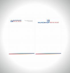
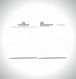
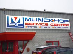
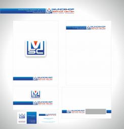
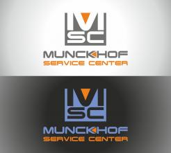
New logo and new corporate identity for a spraying and blasting company
Contest details:
- Contest holder: autoschadehorst
- Category: Logo & stationery
- Total budget: € 225.00
- Start date : 13-05-2014 20:30
- Ending date : 07-06-2014 20:26
- Status : Ended
- Required formats: jpg,ai,pdf
- Relevant files: None
-
Available languages:


- Number of designs: 53
-
Response rate:
low high
Needs:
Company description:
We are a family business for over 50 years, therefor the family name Munckhof. Because we are a small and flexible company, we can take on a wide variety of vehicles and objects to treat. Our services range from spraying and blasting of mainly heavy transport, such as trucks, trailers, buses, agricultural machinery and, to a lesser extent, passenger cars. Also industrial painting and "schoopering" of loose parts and all kinds of machines. And fences, radiators, wheels, furniture can be preprocessed and painted. Therefor the name Service Center.
Target group:
Individuals (10%), companies (90%) Companies: Transport, body shops-, garage-, construction-, taxi, bus, agricultural, and dealerships.
Colors, favourites and other requirements
The old logo was designed through Brand Supply! So we have good experiences gained. The colors of the old logo may be used, but is not a must. Old logo, see annexes. We would like to let the 3 core tasks coming back at the new logo: Spuiten – Stralen – Schadeherstel (spray, blasting and body repair).
niki
-
-
No comments
-
This contest is finished. Its not possible to reply anymore.
-
-
-
No comments
-
This contest is finished. Its not possible to reply anymore.
-
-
-
No comments
-
This contest is finished. Its not possible to reply anymore.
-
-
-
autoschadehorst says :
Hallo Niki, can you make another example like "bestand 3", the attachment above. Munckhof Service Center in 1 line, and than Munckhof bigger than Service Center?
-
This contest is finished. Its not possible to reply anymore.
-
-
-
autoschadehorst says :
Hallo Niki, Thank you again. We like the design very much. We prefer the name bigger. I 've enclosed an attachment for example. Can you make something like that? (Do you prefer writing in German?)
-
niki says
Thanks for rating
-
This contest is finished. Its not possible to reply anymore.
-
-
-
autoschadehorst says :
Hallo Niki, Munckhof please a bit bigger (like your first design) and the 3 core tasks still slightly thicker, with a similar triangle?
We have just asked for an extension because we can not decide yet. However, we are going tomorrow for a long weekend away and can then react on Monday. Maybe it's good to rest and then take a fresh look at the designs again on Monday. Thanks in advance! -
This contest is finished. Its not possible to reply anymore.
-
-
-
autoschadehorst says :
Dat is snel! En mooie kleuren. Een paar vraagjes: Munckhof mag groter (net als eerste inzending)- de gekleurde driehoek in de K van Munckhof mag er weer in (net als in de eerste inzending)- de 3 kerntaken nog iets dikker, met zo'n zelfde driehoekje ervoor?
Alvast bedankt. -
autoschadehorst says :
That's fast! And beautiful colors. A couple more questions: Munckhof please a bit bigger (like your first design) -the colored triangle in the K of Munckhof may again (as in the first design)-the 3 core tasks still slightly thicker, with a similar triangle?
Can you also make 1 version with the logo left, the name Munckhof to the right, also right, below Munckhof, Service Center and the 3 core tasks under everything? Thanks in advance.
-
This contest is finished. Its not possible to reply anymore.
-
-
-
autoschadehorst says :
Hallo Niki,
Dit ontwerp is het niet. Je eerste was leuker. Wil je aan je eerste inzending nog iets aanpassen? Het logo heeft wel wat. Kun je het logo links plaatsen, de naam Munckhof met daaronder Service Center, rechts en de kerntaken onder het geheel? De kleuren mogen wat frisser. Zowel de witte als zwarte versie spreken ons aan. Alvast bedankt. -
niki says
Please email me English
-
This contest is finished. Its not possible to reply anymore.
-
-
-
autoschadehorst says :
Bedankt voor je inzending. De kleuren zijn een beetje grijze muizig. Het lijkt op een etiket voor een verfblik. Het logo heeft wel wat. Kun je het iets frisser maken, met vermelding van de 3 kerntaken?
-
This contest is finished. Its not possible to reply anymore.
-

