Predict
Contest details:
Silver
- Contest holder: Meindert
- Category: Logo & stationery
- Total budget: € 349.00
- Start date : 12-02-2013 13:01
- Ending date : 28-02-2013 12:40
- Status : Ended
- Required formats: jpg,ai,pdf
- Relevant files: None
-
Available languages:


- Number of designs: 83
-
Response rate:
low high
Needs:
The style should be professional, but also young and fresh.
We want to distinguish ourselves from the current financial service providers / auditors.
The name of the company is Predictable. Company name is part of the logo.
Company description:
Service we provide is in the field of Accounting / predicting and forecasting.
Target group:
Young entrepreneurs and medium sized companies with potential to grow. We would like to have an international presence and the logo and the style of the company has to match. Most of our services will run through the internet so if has to be visible attractive to see and visit our portals.
Colors, favourites and other requirements
Fresh look, modern and business look and feel
Alpi
-
-
Description by designer Alpi:
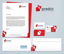
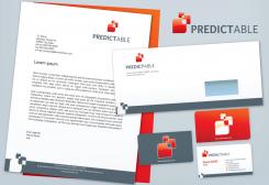
Here is another version of the stationery.
Best regards,
Aleksandra -
This contest is finished. Its not possible to reply anymore.
-
-
-
Description by designer Alpi:
Hello,
here is my stationery proposal.
Regards,
Aleksandra -
This contest is finished. Its not possible to reply anymore.
-
-
-
Description by designer Alpi:
Thank you for the stars rating and for the feedback. I hope this colors are good now. Please let me know if you would like me to change anything else before I make the corporate identity.
Best regards,
Aleksandra -
This contest is finished. Its not possible to reply anymore.
-
-
-
Description by designer Alpi:
I changed the colors for this one too. I used some pastel tones. If you had something different in mind please let me know.
Best regards,
Aleksandra -
Meindert says :
We like this square logo design, however we believe we have to go for a grey/red/orange color combination.
-
This contest is finished. Its not possible to reply anymore.
-
-
-
Description by designer Alpi:
Hello,
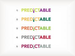
thank you for the feedback. Here are 5 new proposals for a different color combinations. I combined only 2 colors for each. If you have any color preference, please let me know.
Aleksandra -
Meindert says :
We prefer your other design. The i in the logo is to much a gimmick. With some imagionation it looks like a tie and is therefore to funny.
-
This contest is finished. Its not possible to reply anymore.
-
-
-
Description by designer Alpi:
No 2a, with a small variation to the "i".
-
Meindert says :
colour of the logo is quite difficult on paper and business cards...... the I gimmick is quite good
-
Meindert says :
colour of the logo is quite difficult on paper and business cards...... the I gimmick is quite good
-
Meindert says :
colour of the logo is quite difficult on paper and business cards...... the I gimmick is quite good
-
Meindert says :
Most accounting firms do have in one way or another .. blue or gray with yellow .. Rather no blue in color..
KPMG - Blue
Deloitte - Blue
Enst and Young - Yellow Grey
Accon - Yellow Grey
Mazars - Brown?
Birch - Blue
MTH, no obvious color - but that is most like Red ..
PwC, has something orange ..
-
This contest is finished. Its not possible to reply anymore.
-
-
-
Description by designer Alpi:
Hello, here are my proposals. This is proposal No 1.
-
Meindert says :
We like the figure in front of the name however we have discussion on the use of the colours of the logo
-
This contest is finished. Its not possible to reply anymore.
-

