Princess Amsterdam Hostel
Contest details:
Silver
- Contest holder: Princess Amsterdam Hostel Museumsquare
- Category: Logo & stationery
- Total budget: € 419.00
- Start date : 24-01-2014 12:16
- Ending date : 04-03-2014 12:11
- Status : Ended
- Required formats: jpg,ai,pdf
- Relevant files: None
-
Available languages:


- Number of designs: 110
-
Response rate:
low high
Needs:
Dear Everyone,
Hotel Princess Amsterdam is a 1 star hotel located near the Leidse/Musuem square in Amsterdam. With the economy being down we have decided to change our Unique selling point. We have decided to reposition ourselves from a 1 star hotel into a Hostel. Our new name will be Princess Amsterdam Hostel Musueumsquare.
With the name change we need a new logo that we can use for all our external communications. The logo will be used for our visiting cards, letterheads, facebook page, outside lighting.
The logo should be simple and neat focusing on young travel loving backpacking guest that appreciate budget friendly hostel in a central location of Amsterdam.
Company description:
Target group:
Colors, favourites and other requirements
Navy blue
mint green
White
BlowHaze
-
-
No comments
-
This contest is finished. Its not possible to reply anymore.
-
-
-
BlowHaze says
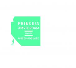
The color is supposed to be CMYK (67;0;35;0) more like a mint green/blue.
-
This contest is finished. Its not possible to reply anymore.
-
-
-
Description by designer BlowHaze:
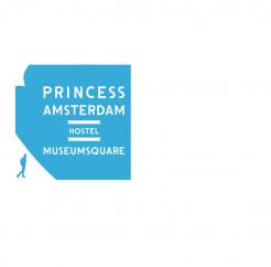
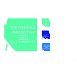
The name of the hostel is quite long, so I wanted to make it the clearer possible. Amsterdam being a great place for art, the bak ground of the logo shapes a paint brush. The font is also related to art, like it was drawn by hand. The little guy in the corner sets up the type of customer.
-
This contest is finished. Its not possible to reply anymore.
-


